Andy Warhol
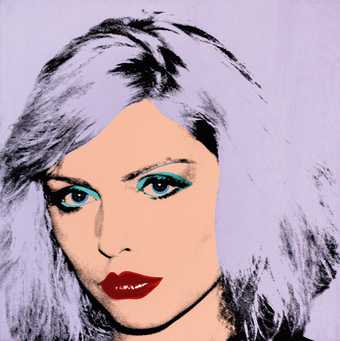
Debbie Harry 1980
Private Collection of Phyllis and Jerome Lyle Rappaport
© 2020 The Andy Warhol Foundation for the Visual Arts, Inc. / Licensed by DACS, London.
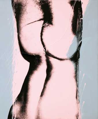
Andy Warhol Torso 1977 ZOYA Gallery, Slovakia © 2020 The Andy Warhol Foundation for the Visual Arts, Inc. / Licensed by DACS, London.
Andy Warhol
Marilyn Diptych
(1962)
Tate
© 2023 The Andy Warhol Foundation for the Visual Arts, Inc. / Licensed by DACS, London
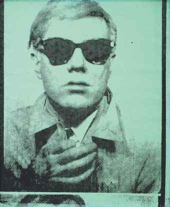
Andy Warhol
Self-Portrait 1964
Private Collection
© 2020 The Andy Warhol Foundation for the Visual Arts, Inc. / Licensed by DACS, London.
Introduction
Andy Warhol is known for his bright, colourful paintings and prints of subjects ranging from celebrities including Marilyn Monroe and Mohammed Ali, to everyday products such as cans of soup and Brillo pads. But behind these iconic images are some surprising approaches and ideas. Through artworks in the ARTIST ROOMS collection, explore some of the things that made this iconic artist tick.
Themes, Ideas and Inspiration
Early experimentation
Andrew Warhol (or Andrew Warhola as he was christened) was born in Pittsburgh, Pennsylvania in 1928. His parents were Carpatho-Rusyns who immigrated from what is now known as eastern Slovakia. Andy was the youngest of three sons. His father recognised his son’s artistic talents and saved enough money to pay for his college education. Warhol studied at the Carnegie Institute, and in 1949 graduated with a degree in Pictorial Design.
Drawing and repetition
After graduating, Andy Warhol moved to New York to become a commercial illustrator. The drawings he made in the 1940s and 1950s were light-hearted and often fantastical. Many of them used a ‘blotted-line’ technique, a basic form of printmaking.
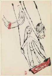
Andy Warhol
Cano
(1948)
ARTIST ROOMS Tate and National Galleries of Scotland
© 2023 The Andy Warhol Foundation for the Visual Arts, Inc. / Licensed by DACS, London
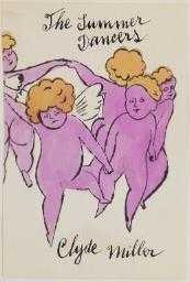
Andy Warhol
“The Summer Dancers”
(1955)
ARTIST ROOMS Tate and National Galleries of Scotland
© 2023 The Andy Warhol Foundation for the Visual Arts, Inc. / Licensed by DACS, London
To make these blotted-line images, he began by making a drawing (either by hand or tracing it from a found image). He then went over the lines of this drawing with ink or watercolour. The final stage in his process was to press a clean sheet of paper onto the wet lines to make a ‘printed’ image. He did this several times using the same ‘master drawing’. The resulting images were spontaneous and expressive. This technique was the first of many that Warhol used to explore the creative possibilities of repeating images.
Collaborations
Head with Flowers 1958 is typical of Warhol’s illustrations. But he isn't the only artist behind the work. He would often hold ‘colouring parties’, inviting his friends to add coloured inks to drawings like this one.
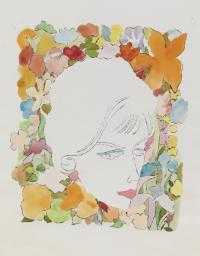
Andy Warhol
Head with Flowers
(1958)
ARTIST ROOMS Tate and National Galleries of Scotland
© 2023 The Andy Warhol Foundation for the Visual Arts, Inc. / Licensed by DACS, London
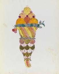
Andy Warhol
Ice Cream Dessert
(1959)
ARTIST ROOMS Tate and National Galleries of Scotland
© 2023 The Andy Warhol Foundation for the Visual Arts, Inc. / Licensed by DACS, London
This collaborative, detached attitude to making art is one we see later in his career. In his 1960s studio – known as the Factory – he employed studio assistants to make his work for him. Warhol realised that he could increase the commercial productivity of his art more quickly by getting others involved in making it.
Activity: Blotted Lines
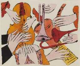
Andy Warhol
Instruments with Hands
(1957)
ARTIST ROOMS Tate and National Galleries of Scotland
© 2023 The Andy Warhol Foundation for the Visual Arts, Inc. / Licensed by DACS, London
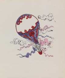
Andy Warhol
Hot Air Balloon
(1958)
ARTIST ROOMS Tate and National Galleries of Scotland
© 2023 The Andy Warhol Foundation for the Visual Arts, Inc. / Licensed by DACS, London
Warhol’s blotted-line technique meant he could create multiple versions of the same image quickly. Have a go at making your own blotted-line drawing.
- Trace an image or draw a picture free-hand on paper.
- Draw over the lines with a wet material such as ink or paint.
- Blot the wet lines with another sheet of paper to create a 'print' of the drawing.
- See how many different times you can reproduce the same image from your original drawing in this way. Try using different colours and materials to create your wet lines.
Fame, Celebrity and Fashion
From a young age Warhol was infatuated with fame, fashion, celebrity and Hollywood. As a boy living in Pittsburgh he found escape from his ordinary working class life in popular teen magazines and by collecting autographs from film stars.
In 1949 when Warhol first moved to New York, the art editor of Glamour fashion magazine, Tina Fredericks, bought one of his drawings and commissioned a series of shoe illustrations. One commission led to another and Warhol was soon in high demand as an illustrator for prestigious clients including the Conde Nast organisation, the New York Times, Vogue and Harper’s Bazaar. His involvement with the fashion world during this time reflects his fascination with New York’s glamorous celebrities, a subject that would be important in his later work.
In the early 1960s, while living and working in New York, he began a series of portraits of stars including Elizabeth Taylor, Elvis Presley and Jackie Kennedy. He used photographic silkscreen printing to create his celebrity portraits. This meant he could directly reproduce images already in the public eye, such as publicity shots or tabloid photographs. The technique also allowed him to easily produce multiple versions and variations of the prints.
When the film star Marilyn Monroe died in 1962 Warhol almost immediately started making portraits of the actress. His paintings and prints were based on a photograph taken by Gene Kornman in 1953 to advertise the film Niagara which Monroe had starred in.
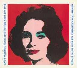
Andy Warhol
Liz
(1965)
ARTIST ROOMS Tate and National Galleries of Scotland
© 2023 The Andy Warhol Foundation for the Visual Arts, Inc. / Licensed by DACS, London

Andy Warhol
Marilyn Diptych
(1962)
Tate
© 2023 The Andy Warhol Foundation for the Visual Arts, Inc. / Licensed by DACS, London
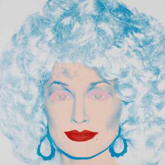
Andy Warhol
Dolly Parton 1985
The Doris and Donald Fisher Collection at the San Francisco Museum of Modern Art
© 2020 The Andy Warhol Foundation for the Visual Arts, Inc. / Licensed by DACS, London.
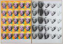
Marilyn Diptych 1962 is perhaps one of Warhol’s most iconic works. It was exhibited in his first New York exhibition in 1962. The work is made up of two canvases, each featuring 25 Marilyns printed in a grid pattern. (Two-part works such as this one are often referred to as diptychs). The rows of repetitive heads suggest postage stamps, billboard posters or, perhaps more fittingly, film strips.
One of the canvases is vibrant and bursting with energy, representing the star’s flamboyant public personality. The other is monochrome and sombre, the uneven application of ink causing her face slowly to disappear. The two contrasting sides of this work capture the contrast between Marilyn’s artificial public persona on the left and the harsh reality of her troubled private life on the right. Warhol did not originally intend these two canvases to be shown together as a single artwork. It was the collector who bought the artwork from Warhol who suggested the idea: '[when] I said I thought they should be presented as a diptych, Andy replied ‘gee whiz yes’'
Image and Identity
In the future, everyone will be world-famous for 15 minutes.
Andy Warhol, Catalogue Moderna Museet, Stockholm
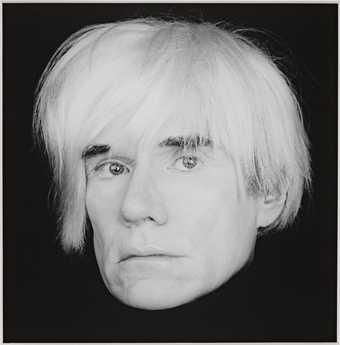
Robert Mapplethorpe
Andy Warhol
(1986)
ARTIST ROOMS Tate and National Galleries of Scotland
Andy Warhol is now an American cultural icon, and images of him are as famous as the art he created. The art dealer Ivan Karp of the Leo Castelli Gallery first suggested that Warhol should make self-portraits. Karp said:
People want to see you. Your looks are responsible for a certain part of your fame, they feed the imagination.
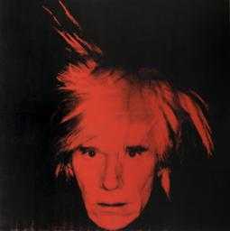
Andy Warhol
Self-Portrait
(1986)
Tate
© 2023 The Andy Warhol Foundation for the Visual Arts, Inc. / Licensed by DACS, London
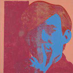
Andy Warhol
Self-Portrait
(1967)
Tate
© 2023 The Andy Warhol Foundation for the Visual Arts, Inc. / Licensed by DACS, London
Warhol understood the superficial nature of celebrity in American society. Images of public figures are created by marketing companies to make money, but in reality say little about the person behind the mask. Warhol succeeded in creating a powerful public image for himself – the Andy Warhol ‘brand’ – with his trademark straight blonde hair and dark glasses. He became a master at cultivating his own celebrity profile as his fame grew. He constantly documented his daily life through photography and film, an early version of today’s social media.
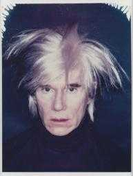
Andy Warhol
Self-Portrait with Fright Wig
(1986)
ARTIST ROOMS Tate and National Galleries of Scotland
© 2023 The Andy Warhol Foundation for the Visual Arts, Inc. / Licensed by DACS, London
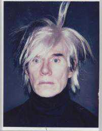
Andy Warhol
Self-Portrait with Fright Wig
(1986)
ARTIST ROOMS Tate and National Galleries of Scotland
© 2023 The Andy Warhol Foundation for the Visual Arts, Inc. / Licensed by DACS, London
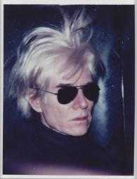
Andy Warhol
Self-Portrait with Fright Wig
(1986)
ARTIST ROOMS Tate and National Galleries of Scotland
© 2023 The Andy Warhol Foundation for the Visual Arts, Inc. / Licensed by DACS, London
In his self-portraits, Warhol often exaggerated, transformed or disguised himself so that the images became caricatures of his real face. In his Self-Portrait with Fright Wig series of 1986 his ghostly, white head is isolated from his body by his dark clothing, making it appear almost to float against the dark background like a skull. He wears a silver wig, which he often used in his range of disguises. The wig hair is wild and messy while his blankly staring eyes look straight ahead. This self-portrait is one of the last series of self-portraits that Warhol completed before his death in 1987.
Warhol also frequently used art to explore his homosexual identity. In his early line drawings of young men we see his fascination with the male body.
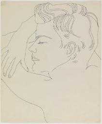
Andy Warhol
Resting Boy
(1955–7)
ARTIST ROOMS Tate and National Galleries of Scotland
© 2023 The Andy Warhol Foundation for the Visual Arts, Inc. / Licensed by DACS, London
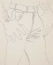
Andy Warhol
Male Torso
(1956)
ARTIST ROOMS Tate and National Galleries of Scotland
© 2023 The Andy Warhol Foundation for the Visual Arts, Inc. / Licensed by DACS, London
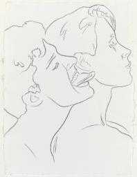
Andy Warhol
Tongue in Ear
(1980)
ARTIST ROOMS Tate and National Galleries of Scotland
© 2023 The Andy Warhol Foundation for the Visual Arts, Inc. / Licensed by DACS, London
This is also seen in his portrait film of the poet John Giorno, Sleep 1963. By the 1980s homosexuality was becoming more accepted in parts of America and Warhol’s Tongue in Ear 1980, with its more explicit content, reflects this shift.
Money
I like money on the wall. Say you were going to buy a $200,000 painting. I think you should take that money, tie it up, and hang it on the wall. Then when someone visited you the first thing they would see is the money on the wall.
The Philosophy of Andy Warhol (From A to B and Back Again) (1975)
Money was one of Andy Warhol’s favourite subjects and he spoke openly about how much he loved it. Born into a poor family, he determinedly worked his way upwards into the high society he had always idolised as a child. Early on in his career he realised the potential to make money from art. In 1962 he made the work 192 Dollar Bills, featuring rows of printed dollar bills silkscreened across the surface of a canvas. He returned to this theme in 1981 with a set of drawings and paintings including Dollar Sign 1981. The image is made from a marker pen-and-ink drawing that was screen-printed onto a white canvas. In these works Warhol blatantly presented the idea of art-as-money.
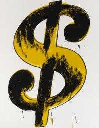
Andy Warhol
Dollar Sign
(1981)
ARTIST ROOMS Tate and National Galleries of Scotland
© 2023 The Andy Warhol Foundation for the Visual Arts, Inc. / Licensed by DACS, London
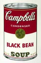
Andy Warhol
Black Bean
(1968)
Tate
© 2023 The Andy Warhol Foundation for the Visual Arts, Inc. / Licensed by DACS, London
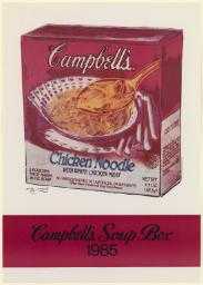
Andy Warhol
Campbell’s Soup Box 1985
(1985)
ARTIST ROOMS Tate and National Galleries of Scotland
© 2023 The Andy Warhol Foundation for the Visual Arts, Inc. / Licensed by DACS, London
The artworks that Warhol is perhaps best known for are his Campbell’s soup can paintings. In December 1961 Warhol supposedly paid the interior decorator and gallery owner Muriel Latow $50 for the idea to use this iconic image. According to his friend Ted Carey, Latow had said:
You’ve got to find something that’s recognisable to almost everybody. Something like a can of Campbell’s soup.
Warhol went on to make artworks depicting Campbell’s packaging throughout his career, exploring their simple graphic designs as symbols of ordinary American life. He often repeated images of soup cans in grid formations, transforming these everyday items into minimalist artworks.
The soup can artworks were hugely successful and made Warhol lots of money. In 1985 the Campbell’s Soup company commissioned Warhol to create a series of paintings of their dry-mix soups. Campbell’s Soup Box 1985 is one of these. It shows a chicken noodle package, combining photographic print with hand-drawn elements.
When Warhol produced the original Campbell’s paintings in the 1960s they were seen as powerful statements about the boring repetition of advertising. Twenty years later many critics felt this imagery had lost its edge, and that Warhol had sold out. But Warhol argued that throughout his career he ‘was always a commercial artist’.
Death
Death was an important theme in Andy Warhol’s work from the early 1960s right up until his death in 1987. He said his interest in the subject came from his friend Henry Geldzahler, a curator at the Metropolitan Museum of Modern Art in New York. In 1962, Geldzahler had said to Warhol:
That’s enough affirmation of life … Maybe everything isn’t always so fabulous in America. It’s time for some death.
High profile events like the death of Marilyn Monroe and the assassination of John F. Kennedy were as interesting to Warhol as car crashes, suicides, riots and legal executions. His images of human or animal skulls present death as a universal subject. At the same time he explored his own mortality through photographs, prints and paintings in which he coupled his own image with an emblem of death.
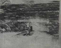
Andy Warhol
Electric Chair
(1964)
Tate
© 2023 The Andy Warhol Foundation for the Visual Arts, Inc. / Licensed by DACS, London
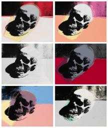
Andy Warhol
Skulls
(1976)
ARTIST ROOMS Tate and National Galleries of Scotland
© 2023 The Andy Warhol Foundation for the Visual Arts, Inc. / Licensed by DACS, London
In Skulls 1976 Warhol repeats the same image six times using a photograph he bought in a Paris flea market. He was interested in the historical use of skulls as a symbol of memento mori (‘remember you must die’) works; and also in the ways that modern artists such as Pablo Picasso had updated the skull motif. Warhol juxtaposes bright, candy colours with the deep, black eye sockets of the skull, reminding us that death is a part of even the most colourful of lives.
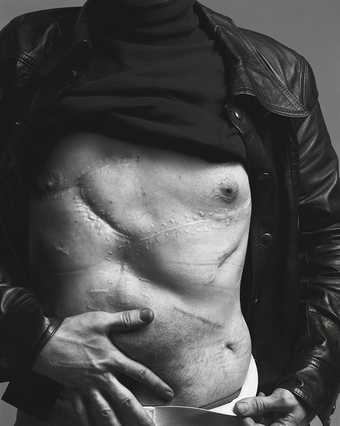
Richard Avedon
Andy Warhol, artist, New York, 20 August 1969
Nicola Erni Collection
© The Richard Avedon Foundation
In 1968 Andy Warhol was shot and badly injured by the radical American feminist Valerie Solanas. This made him even more fascinated by death. The weapon depicted in Gun 1981 is similar to the .22 snub-nosed pistol that Solanas used. By using the gun in his art, Warhol draws attention to an object that has become an American cultural icon. He depicts it in the same cold, impersonal way, as he represented consumer goods in his earlier artworks, suggesting the emptiness of modern life as represented by its objects.
What Do You Think? Symbols and Meanings
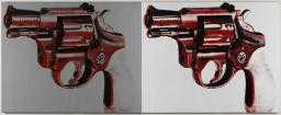
Andy Warhol
Gun
(1981)
ARTIST ROOMS Tate and National Galleries of Scotland
© 2023 The Andy Warhol Foundation for the Visual Arts, Inc. / Licensed by DACS, London

Andy Warhol
Skulls
(1976)
ARTIST ROOMS Tate and National Galleries of Scotland
© 2023 The Andy Warhol Foundation for the Visual Arts, Inc. / Licensed by DACS, London
Warhol often used objects as symbols in his work to tell us something more about modern life.
- What does his Gun tell us about American society?
- Is this image still relevant today?
- He also explored the hidden meanings within certain objects. How has he done this with his Skulls?
Time
One of Warhol’s obsessions was time, and he spent much of his career exploring ways of capturing its passing. In his photographs, prints and paintings he could freeze a moment in time and repeat it over and over again, while in his films he documented and slowed time down. In 1974 Warhol preserved time in his series of autobiographical Time Capsules. He filled 612 boxes filled with things collected from his daily life, such as magazines, books, taxi receipts, photographs and business files. He sealed these and put them in storage. (They are now held at the Andy Warhol Museum in Pittsburgh.)
Films and photography
Paintings are too hard. The things I want to show are mechanical. Machines have less problems. I’d like to be a machine. Wouldn’t you?
Andy Warhol, Time magazine, 1963
Warhol produced nearly 650 films between 1963 and 1968. His films were experimental and were driven by his desire to capture the ordinary experience of living. He said, ‘What I liked was chunks of time all together, every real moment’. His films are now recognised as radical explorations that went beyond the frontiers of conventional cinema.
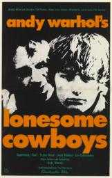
Andy Warhol
Andy Warhol’s Lonesome Cowboys
(1978)
ARTIST ROOMS Tate and National Galleries of Scotland
© 2023 The Andy Warhol Foundation for the Visual Arts, Inc. / Licensed by DACS, London
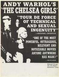
Andy Warhol
Andy Warhol’s ‘The Chelsea Girls’
(1966)
ARTIST ROOMS Tate and National Galleries of Scotland
© 2023 The Andy Warhol Foundation for the Visual Arts, Inc. / Licensed by DACS, London
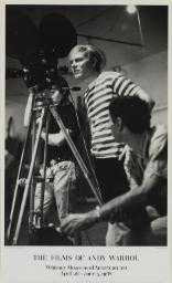
Andy Warhol
The Films of Andy Warhol
(1988)
ARTIST ROOMS Tate and National Galleries of Scotland
© 2023 The Andy Warhol Foundation for the Visual Arts, Inc. / Licensed by DACS, London
In 1970 Warhol famously withdrew all his films from circulation. This meant that critics and scholars had to write about them from memory, from reviews or from verbal descriptions. Fourteen years later he donated all his original films to New York’s Museum of Modern Art for cataloguing with the Whitney Museum’s Andy Warhol Film Project. He made the poster The Films of Andy Warhol in 1988 for the exhibition that opened at the Museum of Modern Art showcasing his extensive film work.
As well as making films Warhol was a keen photographer. In 1976, after being given a camera, he began to document seemingly insignificant aspects of his life. These range from photographs of himself or his friends, to everyday abstractions like footprints in sand and graffiti on the streets.
In 1986 he developed a series of images that became known as his stitched photographs. These were created by sewing several identical images together as in Self Portrait 1976–86. The threads used to join the photographs are left hanging, giving them a rough-and-ready quality. Like his early screen prints they are arranged in a repetitive grid formation. In this artwork, Warhol sits here in a dramatically-lit setting, wearing his recognisable silver ‘fright’ wig.
Belief
Andy Warhol was raised as a Byzantine Catholic, and as a boy went to church regularly with his family. As an adult he continued to go to church almost every Sunday, although he kept this aspect of his life very private, rarely speaking about it in public. He did however discuss the topic in an interview published in the March 1975 issue of Interview magazine. He simply said: 'I think it’s really pretty to go to church. The church I go to is a pretty church. They have so many masses'.
One of Warhol’s closest friends John Richardson wrote in a eulogy to Warhol after his death:
The knowledge of [his] secret piety inevitably changes our perception of an artist who fooled the world into believing that his only obsessions were money, fame [and] glamour.
It was only in the last 10 years of Warhol’s life that religion became an important subject in his work. The last series created before he died was a group of paintings, prints and drawings based on Leonardo da Vinci’s Last Supper (1495–8). In around 1985–6 Warhol was also working on a series called Ads and Illustrations, which were based on black-and-white newspaper clippings.
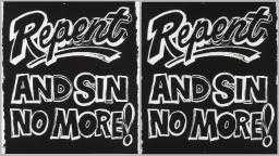
Andy Warhol
Repent and Sin No More!
(1985–6)
ARTIST ROOMS Tate and National Galleries of Scotland
© 2023 The Andy Warhol Foundation for the Visual Arts, Inc. / Licensed by DACS, London
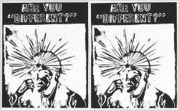
Andy Warhol
Are You Different?
(c.1985–6)
ARTIST ROOMS Tate and National Galleries of Scotland
© 2023 The Andy Warhol Foundation for the Visual Arts, Inc. / Licensed by DACS, London
Many of these works explored evangelical declarations such as Repent and Sin No More! (1985–6) and Heaven and Hell Are Just One Breath Away (1985–6). The statements in these artworks suggest that redemption is available for those who seek it, much like church posters calling for new members. They were never shown during Warhol’s lifetime, another example of the private nature of his religious beliefs.
Have a Go: Text and Message
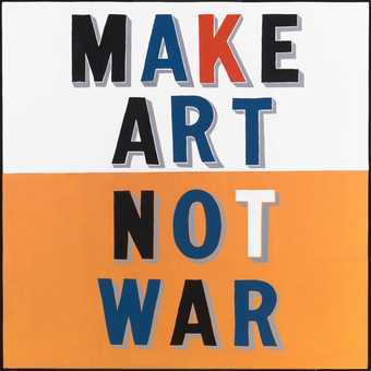
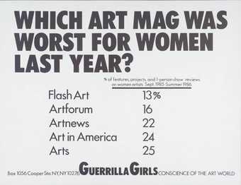
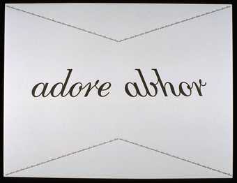
Text has been used by many artists to convey powerful messages, including religious ones like Andy Warhol’s.
Find a statement that means something personal to you and think of how you could turn it into a work of art. This might be by using a certain type of text, adopting a bold graphic or hand-drawn font style, or experimenting with different media to creaye your text piece.
Explore text-based artworks from Tate's collection in the slideshow above to get some inspiration.


