Bill Viola
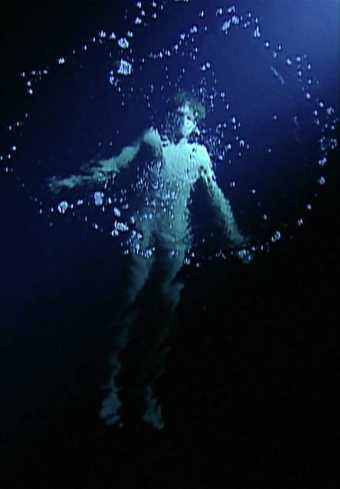
The Messenger
(1996)
Tate
Take the plunge
Video artist Bill Viola has used the idea of the submerged figure in his large installation The Messenger. On the huge video screen a figure slowly rises to the surface to take a breath before returning to the depths. It’s mesmerising, as you wait for the swimmer to reach the air, wondering if you could be underwater so long yourself.
Viola also sees a connection of water to the unconscious mind or dreams. Have you ever dreamed of being underwater?
Water also features in our memories. Perhaps it’s because childhood memories often are of the long summer holidays. Splashing about in water tends to feature, whether it’s a dip in the sea or a trip to the local swimming baths.
Eileen Agar
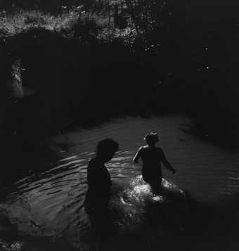
Photograph of Catherine de Villiers and Princess Dilkusha de Rohan getting into a river in Sussex for a swim
(June 1941)
Tate Archive
Dame Ethel Walker
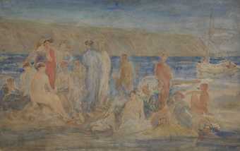
The Bathers
(c.1910–20)
Tate
Nicholas Hlobo draws on the traditional Xhosa belief where boys throw rocks into the river before diving in as a sign of respect towards the river. They acknowledge that they are visitors in a space that is not their own.
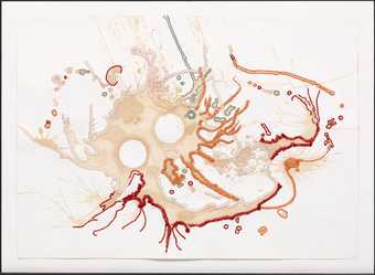
Nicholas Hlobo
Macaleni Iintozomlambo
(2010)
Tate
Sometimes just discarded clothes on the riverbank are enough to remind us how it feels to jump into the cool river on a hot day.
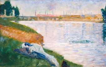
Georges Seurat
Clothes on the Grass
(1883)
Tate
How does the idea of being underwater make you feel? Are you cocooned by warm bath water? Or do you feel cooled by the water on a hot day? Do you feel light, weightless - maybe almost as if you’re flying.
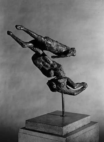
Ralph Brown
Swimming
(1959–60)
Tate
Underwater life
Of course, humans are not usually under the water for long. And it’s almost impossible to sketch or paint underwater! But artists have found ways to depict the swirl of life under the water.
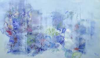
Mary Kessell
Still Life under the Sea
(1960)
Tate
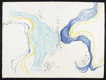
Birgit Skiöld
Sea Image
(1968)
Tate
The flashing shining forms of fish have inspired many artists.
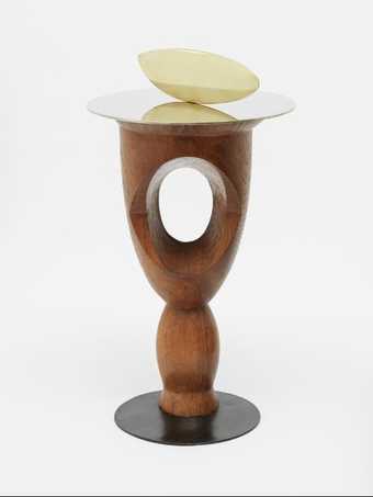
Constantin Brancusi
Fish
(1926)
Tate
© Succession Brancusi – All rights reserved. ADAGP, Paris and DACS, London 2023.
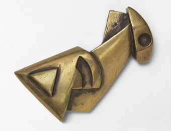
Henri Gaudier-Brzeska
Fish
(1914)
Tate
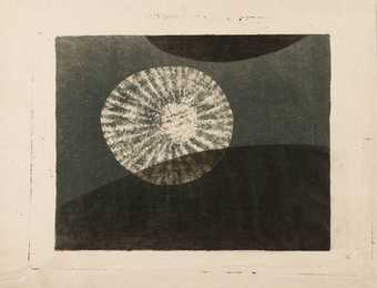
Prunella Clough
Jelly Fish
(1950)
Tate
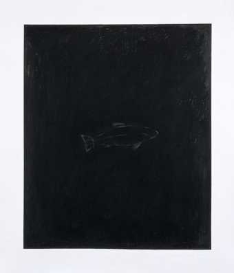
Kate Whiteford
Shadows - Fish
(1987)
Tate
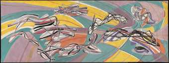
Stanley William Hayter
Fish in the Escoutay
(1951)
Tate
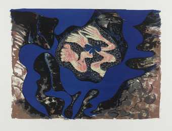
But fish are not the only things to live underwater. Paule Vezelay created abstract flowing shapes in her paintings, and she began expanding these forms into three dimensions.
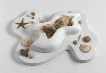
Paule Vézelay
Garden
(1935)
Lent from a private collection 2016
Adding found objects to their work was something many artists were experimenting with in the early years of the twentieth century. They hoped to make us look again at the world around us by putting familiar things in surprising places.
“Of my own work I must say that I hope to give intense pleasure to the eye of the beholder, enticing his regard to remain on colours and forms more pleasing than can easily be found in actuality, or seen by his own unaided imagination.”
(Paule Vézelay, Paris 1933, unpublished text, Tate Archive TGA 9027/1/2/1.)
How do we see these underwater shells and forms when they are presented on a table?
Have you ever heard the term ‘A fish out of water?’ What happens when you take something out of its natural habitat?
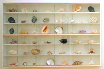
Damien Hirst
Forms Without Life
(1991)
Tate
How do those fish out of water support human life too – what questions does this raise about our eating habits? And about our use of the natural world?
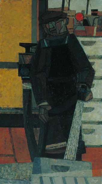
Prunella Clough
Man Hosing Metal Fish Boxes
(1951)
Tate
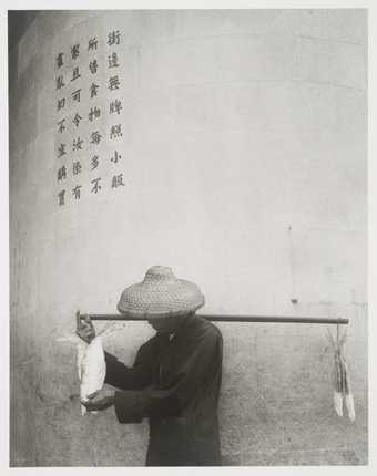
Yau Leung
Salt Fish and Government Warning
(1966)
Tate
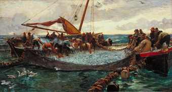
Charles Napier Hemy
Pilchards
(1897)
Tate
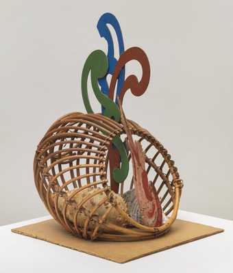
Eileen Agar
Fish Basket
(c.1965)
Tate
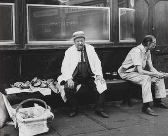
Dorothy Bohm
Billingsgate Fish Market, London
(c.1960)
Tate
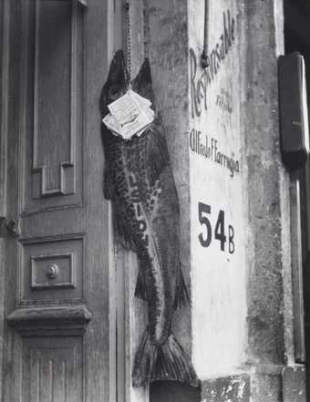
Manuel Álvarez Bravo
The Big Fish Eats the Little One
(1932, printed c.1980s)
Tate
Shipwreck, Migration and Slavery
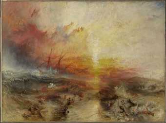
Shipwrecks have often been an inspiration for artists – ships going down have always been important news events. They represent of course tragic loss of life, but they also point to other social and political messages. Where were the boats going? Who was on board? Did they make those journeys by choice or by necessity? Or even by force?
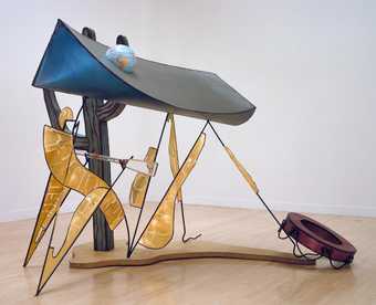
Bill Woodrow
The Glass Oar
(1989)
Tate
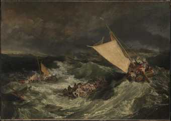
Joseph Mallord William Turner
The Shipwreck
(exhibited 1805)
Tate
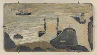
Alfred Wallis
Wreck of the Alba
(c.1938–9)
Tate
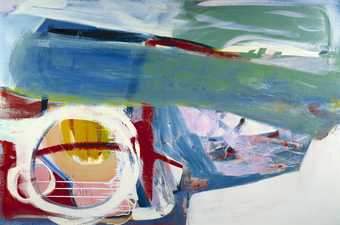
Peter Lanyon
Wreck
(1963)
Tate
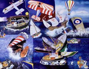
Malcolm Morley
Mariner
(1998)
Tate
Lubaina Himid’s Between the Two My Heart is Balanced suggests the struggles for identity and belonging faced by people migrating across oceans and seas.
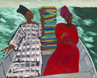
Lubaina Himid CBE RA
Between the Two my Heart is Balanced
(1991)
Tate
© Lubaina Himid, courtesy the artist and Hollybush Gardens, London
Maggi Hambling made this work in response to the ongoing crisis of people drowning in small boats crossing the English Channel from France.
She said: ‘I kept seeing pictures, on television and elsewhere, of these people, and hearing on the news that a whole boat had gone down … Boats were being abandoned by the traffickers and left to drift and disappear.’
Artists have responded to the forcible movement of enslaved people during trans-Atlantic slave trade. Kara Walker’s Grub for Sharks: A Concession to the Negro Populace was created for the Project Space at Tate Liverpool, which is located on the Albert Dock. Liverpool was the main port for slave ships in England in the 18th Century. ‘Grub for Sharks’ refers to the people thrown to their deaths in the sea to lighten ships before a storm – schools of sharks were known to trail ships for this reason.
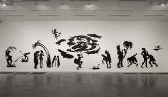
Kara Walker
Grub for Sharks: A Concession to the Negro Populace
(2004)
Tate
“I am interested in drawing out ambiguities relating to the Institution (Tate) and its relationship to the [Liverpool] Dock and resultant trepidation regarding pleasing the surrounding Black populace, descendants of the colonialism, slavery, inheritors of big chips on large shoulders.”
Kara Walker 2004
People who became sick or who were found to be pregnant on the journey from Africa to North America or the UK were also often thrown overboard, treated as merely cargo, not as humans.
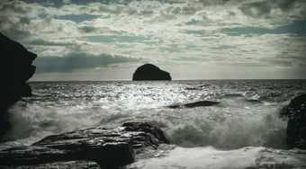
The idea of a mythical underwater region Drexciya or a Black Atlantis populated by an underwater people descended from those unborn children, was imagined by electronic musicians James Stinson and Gerald Donald in the late 1990s.
In their work Hydra Decapita, The Otolith Group use this imagined world as a starting point to explore globalisation, capitalism and climate change. The film focuses on a legal case from 1781 in which a slave ship called Zong, travelling from Jamaica to Liverpool in England, became lost and the captain of the ship decided to murder all 133 enslaved people on board by throwing them overboard so that he could claim insurance for the ‘loss of cargo’. In this film, The Otolith Group relate this event to a wider understanding of how financial capitalism still operates.
The Otolith Group
Hydra Decapita
(2010)
Tate
Water as a medium
Watercolour demands a different approach from painting in oil or acrylics. You normally work from light to dark, leaving the lightest areas with the least colour and working up to the darkest areas. It’s almost like working in negative. You also have to deal with the unpredictability of wet washes which move and blend on the paper - but that can bring some of the most spectacular results too.
The British artist JMW Turner was the first artist to really make watercolours more than a tool for noting colours while sketching. He took advantage of innovation in paint making, and new synthetic colours to create his beautiful artworks. His technical skill, and his methods of layering washes of colour, bringing a sense of light into his subjects, raised the status of watercolour. His watercolour techniques and artworks are still admired today.
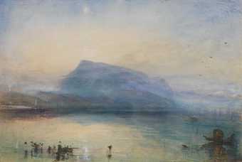
Joseph Mallord William Turner
The Blue Rigi, Sunrise
(1842)
Tate
Contemporary watercolour
Modern and Contemporary artists use watercolour not just for sketches for oil paintings, but for its own qualities. Luminous, light watercolour can create a very different mood to thicker oil or acrylic paints.
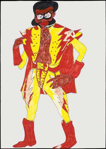
Chris Ofili uses the unpredictable blending of colours on the page to create striking but soft portraits. The paint colours often bleed into each other (though never leaking outside the graphic outlines), making both colour and texture in the paintings.
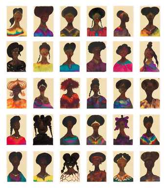
Chris Ofili
Untitled
(1998)
Tate
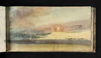
Maggi Hambling also uses watery paint, letting the colours bleed into one another to give us the feeling of the shifting colours of sunrise.
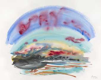
Maggi Hambling
Sunrise 11.7.90
(1990)
Tate
© Maggi Hambling. All Rights Reserved 2020 / Bridgeman Images
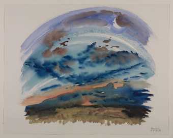
Maggi Hambling
Sunrise 16.8.90
(1990)
Tate
© Maggi Hambling. All Rights Reserved 2020 / Bridgeman Images
Other artists use less watery, and quick-drying paint to build up an image with shapes and marks.
In The Vale of the White Horse Eric Ravilious uses graphic lines and fine brush marks to build up a sense of the uncanny with the rolling hills under grey skies and sheeting rain. You can imagine exactly why ancient people would have chosen this site for their monument.
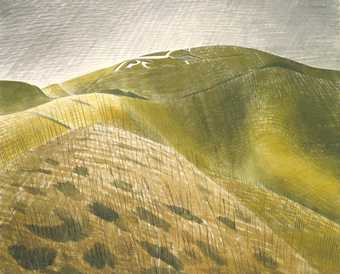
Eric Ravilious
The Vale of the White Horse
(c.1939)
Tate
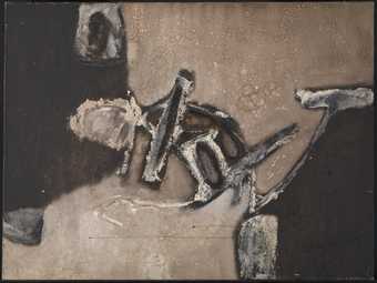
Other types of landscape mark making can be more abstract, but still give a real sense of light and dark, shape and form.
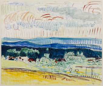
Cuno Amiet
Landscape from the Jura Mountains
(1924)
Tate
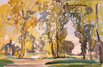
Evelyn Cheston
Betchworth Lane, October
(1917)
Tate
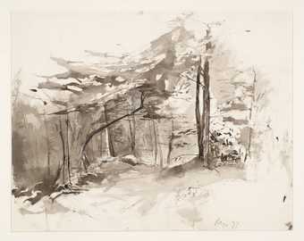
Rodrigo Moynihan
Trees and Undergrowth
(1977)
Tate
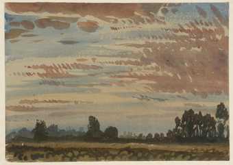
Derwent Lees
Métairie des Abeilles
(c.1912)
Tate
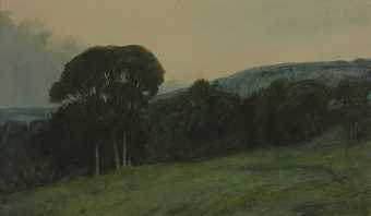
Sir Charles Holroyd
Wooded Landscape
(c.1906)
Tate
Watercolour is great for letting the paper do the work for you. The fact that the watercolours are semi-transparent means the colour of the paper shines through, and areas of paper can even be left unpainted to show different tones. Here, Gwen John uses white to bring out the cat’s white fur and face and black for its tabby stripes, letting the paper (and our brains) fill in the rest of the shape.
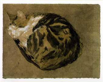
Gwen John
Cat
(c.1904–8)
Tate
Watercolour can also give deeper colours though. It can be applied in layers for very fine detail, or used for single stand out motifs, bringing its own texture to darker, and more dense colours.
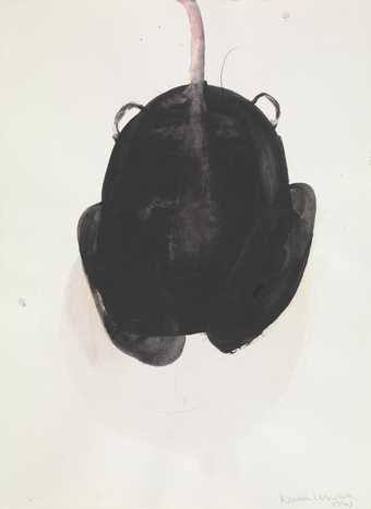
Lucia Nogueira
Untitled
(1990)
Tate
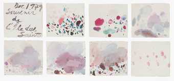
Cy Twombly
Souvenir de L’Ile des Saintes
(1979)
ARTIST ROOMS Tate and National Galleries of Scotland
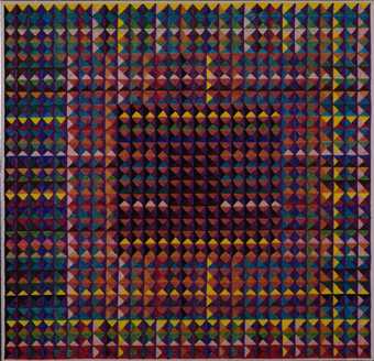
Mauro Kunst
[no title]
(c.1971)
Tate
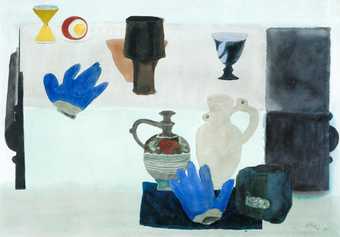
Sir William Gillies
Still Life with Blue Gloves
(1968)
Tate
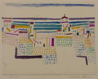
Paul Klee
Seaside Resort in the South of France
(1927)
Tate
Water colour makes a great medium for quick life sketches too as it dries quickly. It's perfect for blocking areas of light and shade or adding a quick wash of colour to a pencil sketch.
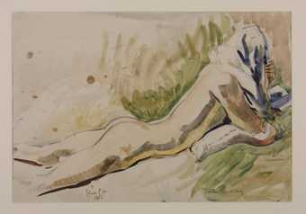
Lady Edna Clarke Hall
Justin Reading
(1932)
Tate
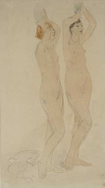
Dame Ethel Walker
Two Figures, Study for ‘The Excursion of Nausicaa’
(c.1919)
Tate
But watercolour can be fugitive. That means its washes of colour are less stable and can fade on exposure to light. Some artworks by the visionary (but poor) artist William Blake are now fading as he used cheaper watercolours, which have degraded over time.
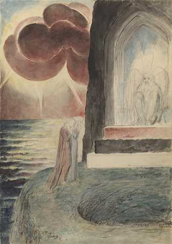
William Blake
Dante and Virgil Approaching the Angel Who Guards the Entrance of Purgatory
(1824–7)
Tate
Water as a subject
Roni Horn
[no title]
(1999)
Tate
Roni Horn
[no title]
(1999)
Tate
Roni Horn
[no title]
(1999)
Tate
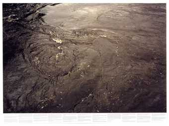
Roni Horn
[no title]
(1999)
Tate
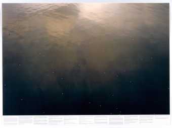
Roni Horn
[no title]
(1999)
Tate
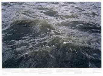
Roni Horn
[no title]
(1999)
Tate
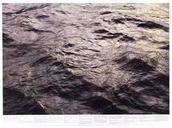
Roni Horn
[no title]
(1999)
Tate
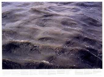
Roni Horn
[no title]
(1999)
Tate
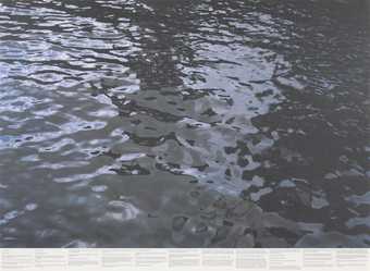
Roni Horn
[no title]
(1999)
Tate
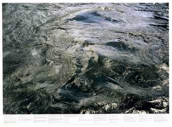
Roni Horn
[no title]
(1999)
Tate
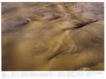
Roni Horn
[no title]
(1999)
Tate
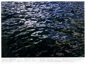
Roni Horn
[no title]
(1999)
Tate
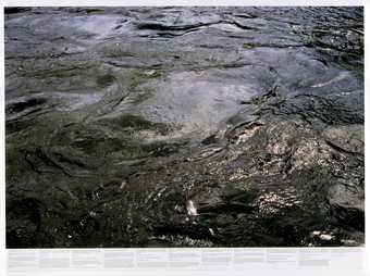
Roni Horn
[no title]
(1999)
Tate
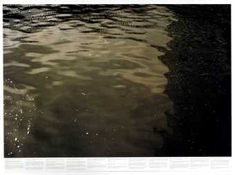
Roni Horn
[no title]
(1999)
Tate
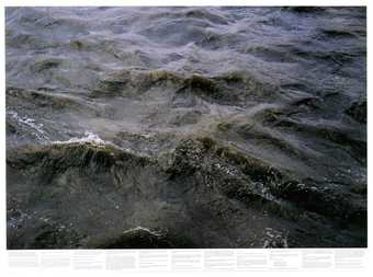
Roni Horn
[no title]
(1999)
Tate
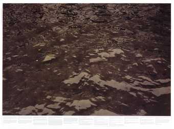
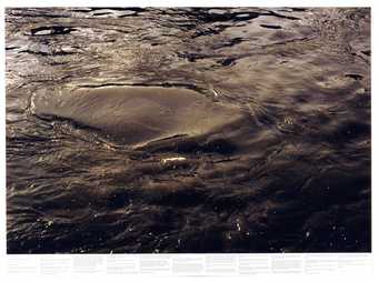
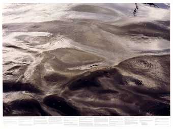
The slippery fluid nature of water has inspired many artists. We are of course about 60% water ourselves. We need water to survive, even though it may have destructive power too as a rushing river, a tidal wave or a powerful storm.
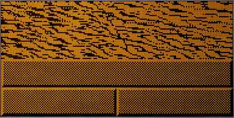
Keith Milow
River
(1997)
Tate
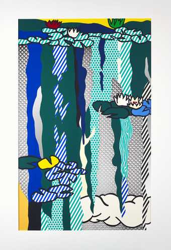
Roy Lichtenstein
Water Lilies with Cloud
(1992)
ARTIST ROOMS
Tate and National Galleries of Scotland. Lent by The Roy Lichtenstein Foundation Collection 2015
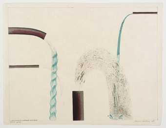
David Hockney
Water Pouring into Swimming Pool, Santa Monica
(1964)
Tate
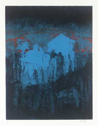
Anthony Benjamin
Prisms of Water
(1959,1999)
Tate
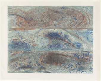
Pat Steir
The Wave - From the Sea - After Leonardo, Hokusai and Courbet
(1985)
Tate
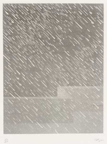
Summer rains or autumn drizzles change our landscapes.
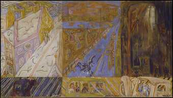
Heinz Koppel
Snow, Sunshine, Rain
(1957)
Tate
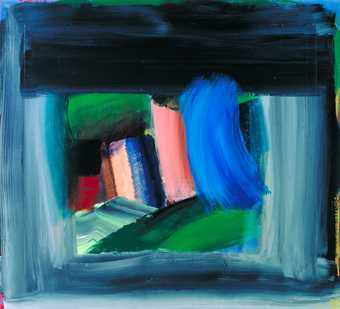
Howard Hodgkin
Rain
(1984–9)
Tate
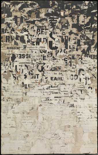
Gwyther Irwin
Letter Rain
(1959)
Tate
William Tillyer
Night Rain
(1972)
Tate

