In Tate St Ives
- Artist
- Pablo Picasso 1881–1973
- Medium
- Oil paint on canvas
- Dimensions
- Unconfirmed: 345 × 265 mm
frame: 610 × 510 × 95 mm - Collection
- Tate
- Acquisition
- Accepted by HM Government in lieu of tax and allocated to the Tate Gallery 1995
- Reference
- T06928
Summary
Picasso's Head of a Woman is a small, intimate painting of a female head in a classical, pensive pose. The colour is non-naturalistic and the features of the head summary. No specific sitter is known, and the anonymous title is probably an imposition as Picasso did not usually title his work. He signed and dated the painting 'Picasso 24', in the top right-hand corner, but the stretcher bears the inscription 'February 1925'. This may suggest that he began Head of a Woman at the end of 1924, and this tallies with Christian Zervos's placing of the work in the catalogue raisonné (reproduced Christian Zervos, Pablo Picasso, 1923-5, V, Paris 1952, p.155, pl.357). Labels on the back indicate that it was exhibited in the first retrospective of Picasso's art at the Galerie Georges Petit in Paris in June 1932, and that at one time it belonged to the British collector Hugh Willoughby.
The woman's face divides into two distinct halves, recalling the multi-facetted subjects of Picasso's Cubist paintings of the early 1920s. The divided portrait expresses two sides of the woman, as though viewed from different angles, or possibly a combined male-female head. Picasso marked out the features with a few schematic lines in dark brown paint on flat areas of pink and white. A muted earth tone covers the background and a patch of sienna designates the shoulder of the woman's dress. Picasso appears to have incised the lines in the thick impasto with the handle of a paintbrush. He used simple forms, such as the triangle and ellipse of the eyes. She is shown with her head on a claw-like hand, with an erratic line forming the woman's fingers.
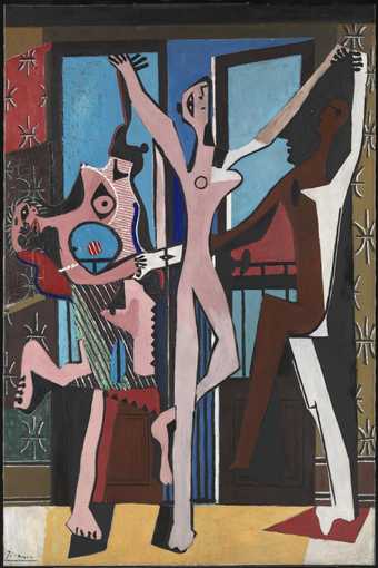
Head of a Woman typifies Picasso's freer style of 1923-4, in which he began to move away from his classicising tendency and his geometric Cubism. Alfred Barr (1902-81), the founding director in 1929 of the Museum of Modern Art in New York, named Picasso's art of 1923-4 'curvilinear' Cubism, due to its exclusion of rectilinear geometry. For Barr, this style was distinguished by 'a flattening of volume and space, the overlapping and transparency of planes and simultaneity of points of view, disintegration and recombination and generally the independence of colour, form, space and texture without abandoning all reference to nature' (Barr, p.132). During 1924, Picasso was being courted by the founder of the Surrealist group, André Breton (1896-1966), who viewed the artist's Cubist painting as a forerunner of Surrealism. This interest encouraged Picasso's new direction towards the powerful expression found in such paintings as The Three Dancers 1925 (Tate T00729).
Further reading:
Alfred Barr, Picasso: Fifty Years of His Art, exhibition catalogue, Museum of Modern Art, New York 1946, p.132
Christopher Green, Cubism and its Enemies: Modern Movements and Reaction in French Art, 1916-1928, New Haven and London 1987, pp.69-72
Pierre Daix, Picasso: Life and Art, New York 1993, pp.181-6
The Musée Picasso, Paris: II Drawings, Watercolours, Gouaches, Pastels, London and Paris 1988, p.279, pl.890
Kathleen Brunner
March 2000
Revised Matthew Gale March 2001
Does this text contain inaccurate information or language that you feel we should improve or change? We would like to hear from you.
Display caption
This small painting demonstrates Picasso’s ability to capture an image through very direct means: taut lines laid over four colours. The stylisation of the face makes reference to the flattened planes associated with Cubism, but the incised line also reflects the texture and layering that dominated his work of the 1920s. He was much admired by the Surrealists but, even though sharing their interest in the unconscious and the irrational, resisted any official connection.
Gallery label, November 2007
Does this text contain inaccurate information or language that you feel we should improve or change? We would like to hear from you.
Explore
- abstraction(8,615)
-
- from recognisable sources(3,634)
-
- figure(2,270)
- actions: postures and motions(9,111)
-
- head in hand / hands(278)
- woman(9,110)
- head / face(2,497)
You might like
-
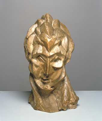
Pablo Picasso Head of a Woman (Fernande)
1909 -
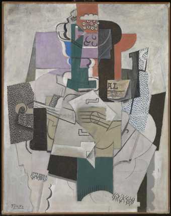
Pablo Picasso Bowl of Fruit, Violin and Bottle
1914 -
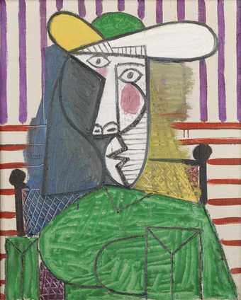
Pablo Picasso Bust of a Woman
1944 -
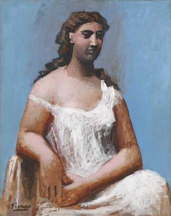
Pablo Picasso Seated Woman in a Chemise
1923 -
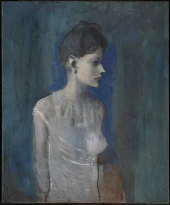
Pablo Picasso Girl in a Chemise
c.1905 -
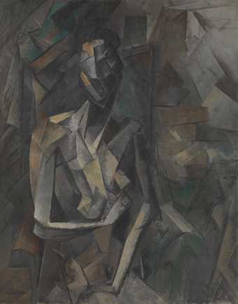
Pablo Picasso Seated Nude
1909–10 -
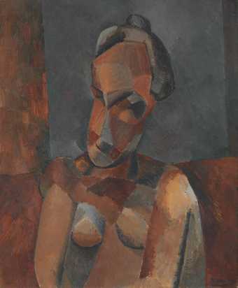
Pablo Picasso Bust of a Woman
1909 -
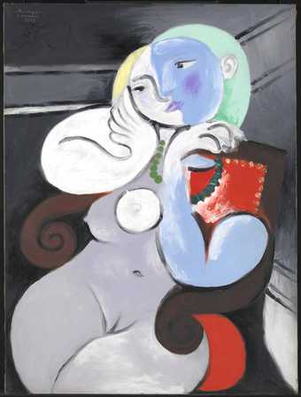
Pablo Picasso Nude Woman in a Red Armchair
1932 -
Pablo Picasso Head of a Young Boy
1945 -
Pablo Picasso Goat’s Skull, Bottle and Candle
1952 -
Pablo Picasso Dora Maar Seated
1938 -
Pablo Picasso The Three Dancers
1925 -
Pablo Picasso Dish of Pears
1936 -
Pablo Picasso Weeping Woman
1937 -
Pablo Picasso Weeping Woman
1937

