In 1927 Kurt Schwitters compiled a catalogue for a major touring exhibition of his work, which he published as an issue of his erratically appearing magazine Merz.1 He used the occasion of this publication and exhibition to give a full survey of his career to date and to outline the features of a number of ‘Merz’ activities, including sculpture, poetry and advertising, alongside the collage making for which he was then, and remains now, best known. It is in this publication that Schwitters recapitulated the anecdote concerning the origin of the word ‘Merz,’ a word he had originally claimed to have made up and which he defined on its earliest use as ‘the combination of all imaginable materials for artistic purposes.’2 Merz, he now informs his readers, is the second syllable of the word Kommerz (commerce):
Among the Merzpictures came about one picture on the lower abstract forms of which could be read the word Merz, stuck on and cut out of an advert for the KOMMERZ UND PRIVATBANK. Because this word MERZ had become part of the picture through its agreement with the other elements of it, it had to stay there. You can understand that I called a picture with the word MERZ the MERZpicture, just as I called a picture with ‘and’ the ‘Andpicture’ and a picture with ‘worker’ the ‘Workerpicture.’ When I exhibited these stuck and nailed pictures for the first time at the Sturm in Berlin, I looked for a collective name for this new genre, as I could not classify my pictures in old terms, like Expressionism, Cubism, Futurism or such-like. I called all my pictures as a genre, after the characteristic picture, Merzpictures.3
I have quoted this passage again not because I have an interest in reaffirming its status as a narrative of origination but to highlight the importance Schwitters places on words and terms. Merz may be a ‘new genre’ and may defy explanation and classification. But it is also deeply connected to the process of categorisation and related acts of interpretation and definition. Although Schwitters is keen to stress the novelty of his practice here, he still articulates the object status of his works through traditional language. They may now be ‘Merz’ but they are still ‘pictures’ (Bilder), carrying the associations of that word with image and reflection, and ultimately with fine art (bildende Kunst). At the time of the 1919 Der Sturm exhibition, Schwitters used the slightly different term, Merzmalerei (Merzpainting), to describe the making of the Merzpictures, framing his explanation in ways that would have appealed to an audience attuned into expressionism: ‘Merzpainting strives for immediate expression by shortening the path from intuition to the making visible of the artwork.’4
A regular visitor to the Sturm gallery, the Berlin Dadaist Walter Mehring, responded to the exhibition precisely in such expressionist terms, picking up on the abstractness of Schwitters’s practice and its primitivity.5 However, for the purposes of this article, what is interesting about Mehring’s review is his identification of different types of object in the exhibition. First of all, he describes ‘Cubist abstractions’ such as he had seen in previous Sturm shows, by which he must have been referring to a form of painting Schwitters had begun making in 1917. Then there were the ‘so-called’ Merzpictures, the etymology of which Mehring described as ‘the painter’s secret’. Finally, he mentions ‘drawings,’ which remain left without much description, but among which he discovers objects of a ‘third variety’ which he referred to as ‘the aphorisms, the smallest visual effects on large mounts’.6
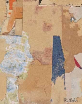
Kurt Schwitters
Aphorism
(1923)
Tate
It is unclear whether or not Mehring himself coined this term ‘aphorism’; there are a number of Schwitters works with this title from 1919 on. An example of what Mehring meant by describing them as ‘the smallest visual effects’ can be given by turning to a Schwitters Aphorism 1923 in Tate’s collection, the dimensions of which are a mere 89 x 73 mm, about the size of a playing card (fig.1). Its interest lies in the manner in which Schwitters has overlapped pieces of coloured and patterned paper so that each element is held in check by another and, even though some pieces are of strong colour, such as red, blue and orange, they do not individually dominate the composition. In fact, the buff-coloured paper used as a ground is made extremely active, such as in the lower centre where a semicircular tear gives it a powerful negative shape, an effect pronounced by the shadow it throws. While there is most going on in the top-left corner, the viewer’s eye is continually drawn back to the saw-toothed vertical blue shape to the centre right but its surface has been torn and scuffed away to dissolve into the background. It would certainly be possible to consider such effects painterly and in the 1927 catalogue Schwitters questioned why such works had fallen under the category of drawing:
I call small, stuck and sometimes painted over compositions Merzdrawings. The term ‘drawings’ is actually not a very good one, as it concerns a type of thing made according to painting, that is to say small works formed of coloured planes. But because of a mistake sometime, the incorrect expression crept in and now it is no longer possible to change the description. Please treat the small Merzdrawings just like paintings.7
Schwitters’s attempt to promote these modest objects from the category of drawing to painting may have simply been a piece of cynical Kommerz. The 1927 exhibition was a selling exhibition and the catalogue contains prices for all the nearly 150 works Schwitters intended to display. A third of these were early paintings, Merzpictures and reliefs of varying dimensions and prices. For example, Das Kegelbild (The Skittle Picture) of 1921, now in the Sprengel Museum, one of the smallest of such works on show at 360 x 480 mm, was priced at 500 Marks. The larger and more recent Bild 1926, 14 mit grünem ring (Picture 1926, 14 with Green Ring), now in the Landesmuseum fur Kunst und Kulturgeschichte in Münster, was somewhat larger, 510 x 620 mm, and was priced at 1,000 Marks. By far the most numerous category of objects in the exhibition were Merzdrawings, for which no dimensions were given. However, many of them are identifiable, such as Mz 231 Miss Blanche of 1923, today in a private collection, which is 159 x 127 mm, only just slightly larger than the standard commercial postcard, priced at 125 Marks, and Mz 1926, 12 Liegendes emm, also in the Sprengel Museum, which is even smaller, just 135 x 104 mm, at 120 Marks.
One Merzdrawing stands out in particular, Mz 94 Grünfleck, a 1920 work now lost but known to have been also around 160 x 130 mm, priced at 600 Marks, equivalent to, or even more expensive than, some of the much larger Merzpictures. According to the art historian Annegreth Nill, the high price indicates personal value to the artist, that is to say, he did not actually want to sell it.8
However, she also details Schwitters’s interest in the creation of a market around his work and the generation of interest in it among collectors. Grünfleck, whose collaged fragments refer to trade in luxury goods and commodities, may have been singled out as a work of particular importance in the artist’s career. It was certainly one of the earliest collages in the exhibition. Nill’s most intriguing statement, though, is an idea not pursued, that the term Merzpicture actually post-dated that of Merzdrawing and was a means to distinguish the larger, more exhibition friendly, cubo-futurist works from the small collages.9
By 1927, Schwitters may have seen this distinction as redundant and positioned the ‘drawings’ in the marketplace less as secondary, preparatory or peripheral works than as key works that typified Merz production.
Kurt Schwitters
Table Salt
(1922)
Tate
Notable in this regard is the fact that the Merzdrawings were accompanied in the 1927 exhibition by a number of ‘i-drawings,’ a type of work Schwitters had been producing since 1920 based on the most minimal of artistic interference. As Schwitters explained in an issue of Merz dedicated to ‘i’ works, the letter designated the process of selection and discrimination rather than manufacture. The letter ‘i’ was chosen as the simplest letter in the alphabet to form, to stand for the simplest art work to make, one based on the recognition of artistic value in found objects. ‘I am the artistic creator of the Hague tram ticket,’ stated Schwitters, ‘at least the right-hand corner. If you cut a square from the right-hand corner, you have an “I” drawing.’10
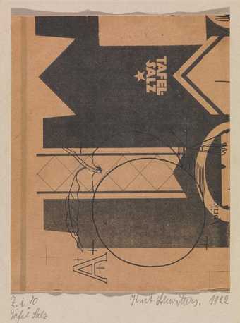
Many of the i-drawings are in fact taken from proof sheets where an image or text has been incorrectly printed over another, such as Z.i.20 Table Salt (Tafelsalz) of 1922 in Tate’s collection (which appeared in the 1927 catalogue priced at 100 Marks) (fig.2). In this instance, the outline of two pieces of fruit, the letter A and the word ‘Aprikose’ (apricot), perhaps intended for a children’s alphabet, have been printed onto an advert for a brand of table salt. Schwitters appears to have cut a section of the sheet out and rotated it so that the text runs vertically. His eye may have been drawn to the visual rhymes of double As, the contrast of sweet and savoury between fruit and salt, the way that so many shapes hover between letter and image, such as the round apricot which could be an O, and even the relationship between the printer’s registration marks and the star under the word salz, all features that can be readily found in his more heavily worked collages.11
In many ways he presented the i-drawings as the essence of Merz.
Schwitters’s claim that the designation ‘drawing’ was a historical accident needs further interrogation then. It is generally agreed that Schwitters’s first collage was Drawing A2: House [Hansi] (Zeichnung A2: Haus [Hansi ) of 1918. As will have become noticeable already, Schwitters used a confusing variety of number and letter sequences for his titles, sometimes including the year of production, sometimes abbreviations such as Mz (for Merzzeichnung, which can also be found as Merzz). In this case there is still some uncertainty regarding the meaning of A, which according to the compilers of the catalogue raisonné probably stands for ‘abstraction.’12
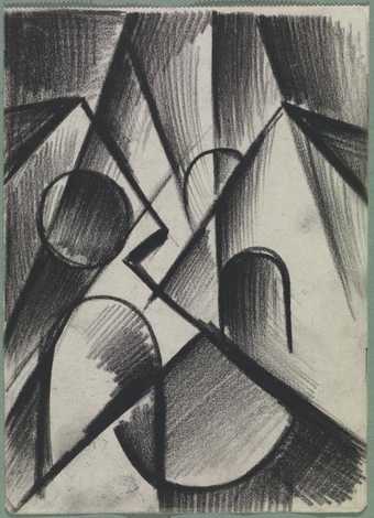
Although the collage is built up on a wrapper of a ‘Hansi’ chocolate bar manufactured by the Otto Rüger firm in Dresden, there has also been some dispute concerning the subtitle of the collage which, as written by Schwitters below in traditional script, can be read as ‘Haus’ (House) – without doubt the final letter is an s and is not followed by an i. This is not the place where the question of title can be determined but it does allow a comparison between the collage and a series of contemporary drawings Schwitters made several of which use the motif of houses, such as Z 105 Portals of Houses 1918 in Tate’s collection (fig.3).
Kurt Schwitters
Z 105 Portals of Houses
(1918)
Tate
Common to both drawing and collage is a particular size, slightly smaller than the standard A5 format used today and typical of a small sketchbook or notepad. Schwitters made many such drawings at the time, mainly of land and townscapes in which a process of abstracting from visual data is much in evidence; in this example we see the gable ends of two roofs and two shapes which might be read as doors but there is great uncertainty regarding the solidity of structures and the space they might occupy. A large circle to the upper left is more difficult to ascribe to an architectural feature, unless we imagine one of the buildings as a church and this as a large rose window.13
Dramatic striations indicating the fall of light or even lightning flashes streak across the page from top to bottom, producing a kind of faceting effect similar to cubist paintings. One of these lines starts as the side of a roof but then, as it cuts across the page from left to right, seems to relinquish its descriptive role as it passes in front of the façade of the opposite building to join an angle of what may be another roof in the immediate foreground. In turn, this roof cuts across one of the ‘portals.’ The hatchings on this door shape, which do not quite meet its top right hand edge, and the strong shadow behind it to the left cause it to flip between appearing empty and solid. It could as easily be a gravestone.
Turning to the collage, if we pass over possible iconographical connections for the moment, it is worth noting how it creates a complex space through overlapping.14
At first sight, it is apparently a piled up sequence of fragments, from chocolate wrapper as ground to a layer of translucent tracing paper on top mimicking a varnish or a glaze. However, on closer inspection, we can see how background and foreground are brought into dynamic relationship with one another by such techniques as the placement of the tip of the small red rectangle in the upper right behind the black shape, the right-hand edge of which is lined up with the top left hand corner of the piece of transparent paper visually linking front and back. The black shape is seen clearly to be on top of the wrapper by the way it cuts off bits of text but is pushed back into the ground by the placement of another piece of wrapper over its right-hand edge. Just as in the drawing, readings of shapes and colours as positive or negative interchange. Black is both void and solid, while the translucent paper with its rippled surface has the most sculptural, material presence.
Further analogy can be made between the collage and Schwitters’s drawing practice if we consider the importance of edges. In Z 105 Portals of Houses there is hardly a line that is not an angle, such as the ridge of a roof or the corner of a building. In fact, the lines are predominantly the meeting point between a heavily shaded and a white area. Schwitters’s account of the making of an i-drawing describes drawing as the act of cutting out. Not only are the collaged pieces of Zeichnung A2: Haus [Hansi] cut rather than torn, they are placed in order to ‘cut out’ other elements, particularly text, making words either illegible or take on new meanings. The fragment that has come in for most analysis in this regard is ‘ade,’ in the lower right, where the final syllable of the word for chocolate (Schokolade) becomes the word ‘goodbye.’15
Having pointed out the concealment of the right-hand edge of the black plane, it is worth noting how its left one blanks out further text to leave the word ‘DRESDEN’ exposed running vertically at the very extremity of the collage. This word is on the edge because of the way the wrapper has been unfolded and additional lines in the collage are provided by its creases, edges which have become interior. Zeichnung A2: Haus [Hansi] is as much a work of paper as a work on paper.
We are starting to see reasons why, apart from size, describing collage as drawing might have made good sense to Schwitters. However, it must also be noted that its designation as such was also the product of a lack of terminology in German at the time. A particularly stinging piece of criticism Schwitters received from his 1919 Sturm exhibition appeared in Das Kunstblatt, a rival journal to Der Sturm. Taking Schwitters’s own term of Merzmalerei as its title, the author wrote what he called an account of the genesis of the Merzpictures, which characterised them as belated, poor cousins of the works made by Picasso, Braque and the futurists before the war, and by Arp in Zürich during it.16
Without dwelling too much on the critic’s perception of Schwitters’s work as derivative and shallow, there are two extremely important and related things to note about this text. The first is that its author does not have a German word to describe works of assemblage or collage. The closest he gets is geklebte Bilder (stuck pictures). And the second is that this is actually Daniel-Henry Kahnweiler writing, who had been Picasso and Braque’s dealer in Paris and had spent the war in Switzerland where he had contact with the Dadaists there. Geklebte Bilder seems to be a rough translation of papiers collés (stuck papers), the term Braque used in his first written account of cubist practice in 1917.17
Interestingly, in the contract Braque signed with Kahnweiler in November 1912, papiers collés were classed under the heading ‘drawings with paper, wood, marble or any other accessories’ and priced just slightly higher than ordinary works on paper but significantly below paintings.18
Recall the quote from the beginning of this article where even in 1927 Schwitters is still referring to ‘stuck and nailed pictures.’ The word ‘collage’ did not come into general use until much later and was not adopted into German until as late as the 1960s.19
If 1918 is the date of the first Merzdrawing, it is not until 1920 that we find the word in print. In February that year Schwitters showed his Merz works in his home town of Hannover for the first time, at the Secession. Again he received a fair degree of adverse criticism to which he responded in the April edition of Der Sturm in the form of a ‘general apology to my Hanoverian critics in Merzstyle,’ presented as a collection of newspaper extracts with satirical comments by him on them.20 One extract quotes from a certain Adolf Schaer of the Hannoverscher Kurier: ‘What should one say about the strange creations of Kurt Schwitters who makes fun of the world anew with his Merzdrawings etc.’21 Two issues later a Schwitters work was published in Der Sturm and specifically identified as a Merzzeichnung.22 It came from the recently published Sturmbilderbuch dedicated to Schwitters, one of a series of Sturm gallery publications featuring graphic works by individual artists, and was one of the sub-categories of Merzdrawings also referred to as a Stempelzeichnung (stamp drawing), because of its use of found rubber stamps (fig.4).
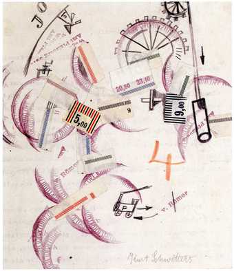
Fig.4
Kurt Schwitters
Untitled (With Red 4)
Collage, pen, pencil, ink and paper on paper
176 x 152 mm
Courtesy Sprengel Museum, Hannover, loan from Kurt und Ernst Schwitters Stiftung, Hannover
© DACS 2010 Photo: Michael Herling/Aline Gwose
The principal stamp used on this occasion was a small circular one from an ‘Association for the Support of the Deaf and Dumb’, although it was applied in such a way as to be barely legible; no circle is in fact stamped in a complete fashion. Either Schwitters inked the stamp only partially or it was an old, worn object that no longer functioned properly. The same is true of the other stamp used in the drawing which includes the name v. Römer and an address in Berlin. The stamps are applied using red ink and combined with what appear to be gummed paper stamps (or their edges) and drawings made by hand of a train, cog, windmill and coffee grinder, along with one or two more indeterminate items. The number four is drawn on in red and in the top left the two letters J and O in black. One could almost imagine this to be, in response to Kahnweiler, a knowing reference to Braque and Picasso’s frequent inclusion of the first letters of the word Journal (newspaper) in their papiers collés and other cubist works. The round stamp thematises the circular activity of reading the collage around and around, in both directions, as the arrows point and the windmill and grinder turn. The mail never reaches its destination but continues to circulate.
To this point much of our discussion has focused on the way that the emergence of collage in Schwitters’s Merz practice, an as yet unnamed typological category of art production, muddied traditional distinctions between painting and drawing. What is interesting to consider now in connection to the Stampdrawings is how Schwitters introduced a third term to the origination of collage, that of printing. The triangulation of painting and drawing with printing highlights a number of important formal aspects of Merz production. For example, it reminds us of the significance of pressure in the act of drawing, manifested in the relationship between hard and soft lines, the point of the pencil that carves into the paper and the side that rubs over it. In the Stampdrawing, the wearing of the stamp is like the loss of the pencil’s sharpness; the loss of definition of the rubber is closer to the physical act of drawing as abrasion common to graphite, charcoal and chalk implements rather than to the spreading of pigment. Further analogies are to be found in the incompletion of the circles which draw attention to the creation of outline and in the use of limited number of colours, applied separately rather than blended together.
From June 1917 to November 1918, Schwitters saw out his military service as a technical draughtsman at the Wülfel Ironworks, a factory that specialised in the manufacture of gearboxes, couplings and cogs. Not only are there plenty of iconographical resonances between the Stampdrawing and the kind of drawings he would have made day in day out of sprockets and hubs but we should also think about the continual translation of drawings into prints he would have experienced in that context, as his designs were made into blueprints for manufacture. Unlike a blueprint, the Stampdrawing exploits degrees of illegibility rather than absolute clarity. Furthermore, the priority of drawing to printing appears to be reversed, with the former often coming after and laying on top of the latter. Thus, in Merz, not only is the hierarchy of drawing, painting and printmaking disturbed, the order in which they are supposed to follow (preparatory drawing, worked up painting and, finally, reproduction print) is thrown into disarray.
Moreover, the introduction of printing techniques and printed matter introduces a fourth term into our equation, that of writing. In an introduction to the Stampdrawings in the Sturmbilderbuch written by the poet and painter Otto Nebel, he described how ‘numbers and letters remain purely pictorial. Their sense is artistically irrelevant. In itself writing is the graphic outline of a word. In the Merz-picture, writing becomes the wordless sound of a pure line.’23
This might be a subtle reference to Schwitters’s attraction to the stamp from the deaf and dumb association and possible punning references to difficulties in communication. In his own commentary on the Stampdrawings, Schwitters stated that, ‘At the end of 1918 I realised that all values only exist in relationship to each other and that restriction to a single material is one-sided and small-minded. From this insight I formed Merz, above all as the sum of individual art forms, Merz-painting, Merz poetry.’24
The art historian and curator John Elderfield noted many years ago the possibility that Schwitters’s concrete poems could well have been prompted by the repetition and visual arrangement experimented with in the Stampdrawings.25
A couple of those illustrated in the Sturmbilderbuch contain references to Schwitters’s most famous poem, ‘An Anna Blume’ (To Anna Blume), first published in 1919, a poem notable for its absurdity; the difficulty of making sense of it is exacerbated by Schwitters’s use of repeating pattern, inexplicable numbers and a multiple-choice prize question half-way through. Even more than word structure and composition, Nebel’s comments alert us to the very nature of line and its role in letter formation. In German the verb zeichnen (to draw) is very closely related to the noun Zeichen (sign) and has related meanings of to mark and even to sign in the sense of leaving one’s signature.
Drawing and writing have a close affinity through shared tools and similar use of the hand but more than that, as art historian Georges Roque has put it in a different context, ‘artists’ and critics’ frequent analogies between drawing and writing can be seen to derive from a desire to emphasize drawing’s instrumental function: drawing as an instrument of the hand whose tracings are governed by the dictates of the idea, drawing as a faithful and trustworthy intermediary. It is as if drawing, like writing, has to be as discreet as possible, in order to convey meaning effectively.’26
It is precisely this instrumental function that we see breaking down in Merzdrawing, just as the cogs and wheels in Schwitters’s odd constructions appear to have no function.
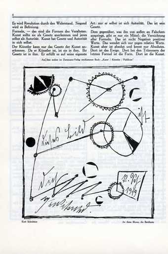
Fig.5
Kurt Schwitters
An Anna Blume, die Berühmte published 1919
(To Anna Blume, The Famous)
Reproduced in Der Zweeman, vol.1, no.2, December 1919, p.4
Courtesy Sprengel Museum, Hannover
© DACS 2010
In 1919 Schwitters published a couple of drawings in Der Sturm and the Hanover journal, Der Zweeman, which refer prominently to the poem ‘An Anna Blume’ and contain distinctive sections of handwriting. To take one of them, An Anna Blume, die Berühmte (To Anna Blume, The Famous), what is immediately noticeable is Schwitters’s cursive script (fig.5). He writes using the curling and jagged shapes of traditional German handwriting, standardised in the early twentieth century by the artist Ludwig Sütterlin and thereafter known by his name. Although perhaps difficult for a modern eye to decipher, Schwitters’s writing is in fact highly regular and clearly formed. Using incorrect grammar which echoes the poem ‘An Anna Blume,’ the text reads, ‘this picture is dedicated to you’ and in the corner, in a separate frame are the initials F.M. and the date 1919, a reference to Franz Müller, another of Schwitters’s poetic creations. Three of the words – dieses, Bild and dich – sit on lines which appear to be part of a strange machine. The h of dich drops down below the line in schoolbook fashion. The other two words are rather squashed to the side and bottom, although what is particularly significant is the way that the word gewitmed (a comical misspelling of gewidmet on Schwitters’s part, which plays on the closeness of t and d sounds in German) mimics the zigzagging line above it, especially in the up and down of the m. There is a relishing of writing’s excesses here, its lack of meaningfulness and its visual pleasures. The zigzag reminds one of Schwitters’s choice of the letter i for the i-drawings based on the children’s rhyme ‘Rauf, runter rauf, Pünktchen drauf’ (up, down, up, point on top) which describes its Sütterlin form – something like a z on its side.27
The framing of the false signature and date pulls what should be outside of the picture directly into it. Is this the picture that the text refers to as dedicated to someone and is that someone the viewer? Or Anna Blume? Are we being invited quite explicitly to look at letters and numbers as image, as picture?
The transformation of writing into drawing and vice versa that Schwitters effects through Merz moves us away from the complicity between of drawing as manifestation of idea and writing as clothing for thought that Roque outlined above. Instead, we get openness to interpretation and the production of meaning. Schwitters is less present as author of the work than as a viewer or reader himself, as the i-drawings make quite explicit. The mediation of the Stampdrawings in the emergence of collage points to Schwitters’s interest in writing not merely as inscription but also as impression and, by continual analogy, drawing not as engraving but as a relief process, with accompanying possibilities for overlaying and obscuration. As much as Schwitters enjoyed the swoops and angles of German handwriting, he was also deeply fascinated by printed type. Throughout the 1920s he worked as a professional graphic designer. The sans serif typefaces that came into common use at that time, and which Schwitters used frequently in his commercial work, were supposed to offer clarity and to rid type of unnecessary ornament. However, Merzdrawings often draw on the potential of such type to be misread to create meaning and visual interest, such as in Maas of 1922 (fig.6).
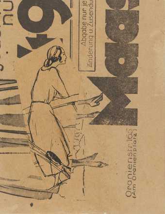
Kurt Schwitters
Measure
(1922)
Tate
Tate translates the title of this collage, derived from the word fragment ‘Maas’ it contains, as ‘measure’. This fragment is likely to have originally been either part of a name or a word derived from the Dutch word maas (stitch), given the references to clothing elsewhere in the collage, but in its abbreviated form it functions as a homonym for the German Maß (measure). The collage is comprised of only two elements, both taken from newspaper advertisements. Schwitters placed the figure of the woman on a boat on top of the advert for a Berlin fashion company rotated ninety degrees and in so doing quite literally cancelled some of its legibility and original meaning. Figure is used against figuration. Parts are cut adrift, such as the two pairs of feet now separated from the bodies they once belonged to. What size are they? What measure or standard is in use here? Is that a 9 hovering on its side at the top of the collage? It could be a 6 or even a g. Next to it are the letters n and u, which are the reverse of each other. The large M of Maas could be a W upside down or even a strange E. Looked at simply as a shape the Maa and partial s has almost the odd, totemic quality of an Arp woodcut.
Although Schwitters first identified and exhibited his collages in 1919 as Merzmalerei or Merzbilder, we have seen how crucial the Merzzeichnungen contemporary to them were in the development of the concept of Merz as ‘the combination of all materials for artistic purposes.’ Despite his later dismissal of it, drawing gained a privileged position among Schwitters’s Merz-categories not because of its scale, its connection to a type of studio practice or its ephemerality but because it was the nexus where painting met printing, where printing met writing, where the artist became a reader and the viewer a creative participant. Moreover, drawing is central to Schwitters’s conception of abstraction, which is based not on the extraction of something essential, the condensation of an idea into a particular form or the immediate expression of the artist’s feelings but the possibility of one thing becoming another, the translation of one medium into another. If any word in the collage Maas might be taken at face value it is one right in the middle, Änderung (alteration).
