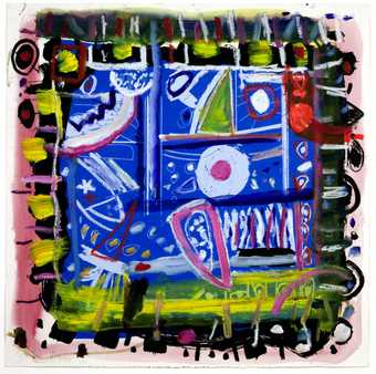
Gillian Ayres RA CBE, The Colour That Was There 1993. Tate. © Estate of Gillian Ayres RA CBE.
Ideas Depot
A dynamic display of artworks chosen with primary school children to be enjoyed by everyone
Ideas Depot is a regularly changing display that has been co-curated with primary schools across the city. Discover major works from the Tate collection by artists including Natalia Goncharova, Salvador Dalí and Chris Ofili. Central to this display is a belief that art plays a meaningful part in people’s day-to-day lives and intellectual curiosity. It encourages visitors to make their own connections between the works on display based on their own experiences and ideas.
The display has developed alongside a joint research project with Edge Hill University's Faculty of Education, focused on developing a 'schools in residence' programme.
Through art we can always learn something new about history, the world and our place in it. Our primary schools in residence are exploring our collection in relation to their whole curriculum and we are all learning new things together. Works will be swapped in and out as new schools pick and choose different ones from the art stores.
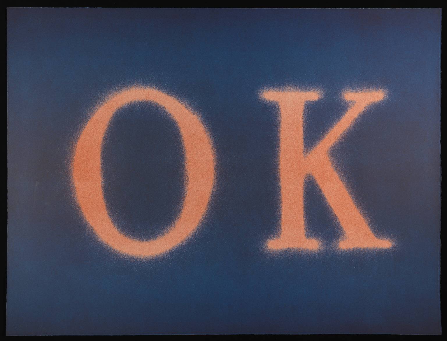
Edward Ruscha, OK (State I) 1990
OK (Slate I) is a lithograph with the word ‘OK’ at its centre. The letters are a peach-orange colour and the background is blue. The background takes a pure shade of blue in the region immediately above and below the letters, while the section behind the letters has a purple hue. There is also purple along the top and bottom edges of the piece. The letters, meanwhile, are a darker shade of peach at their centre than at their top and bottom. Small tendrils of the text’s peach-orange colour extend beyond the edge of the text and mingle with the blue of the background. This gives the letters a fuzzy-looking effect. The lithograph was made by Ruscha in 1990, but it is a technique he has used throughout his career. Lithography allows images and text to be printed quickly and can be used to produce dozens of identical images.
1/30
artworks in Ideas Depot
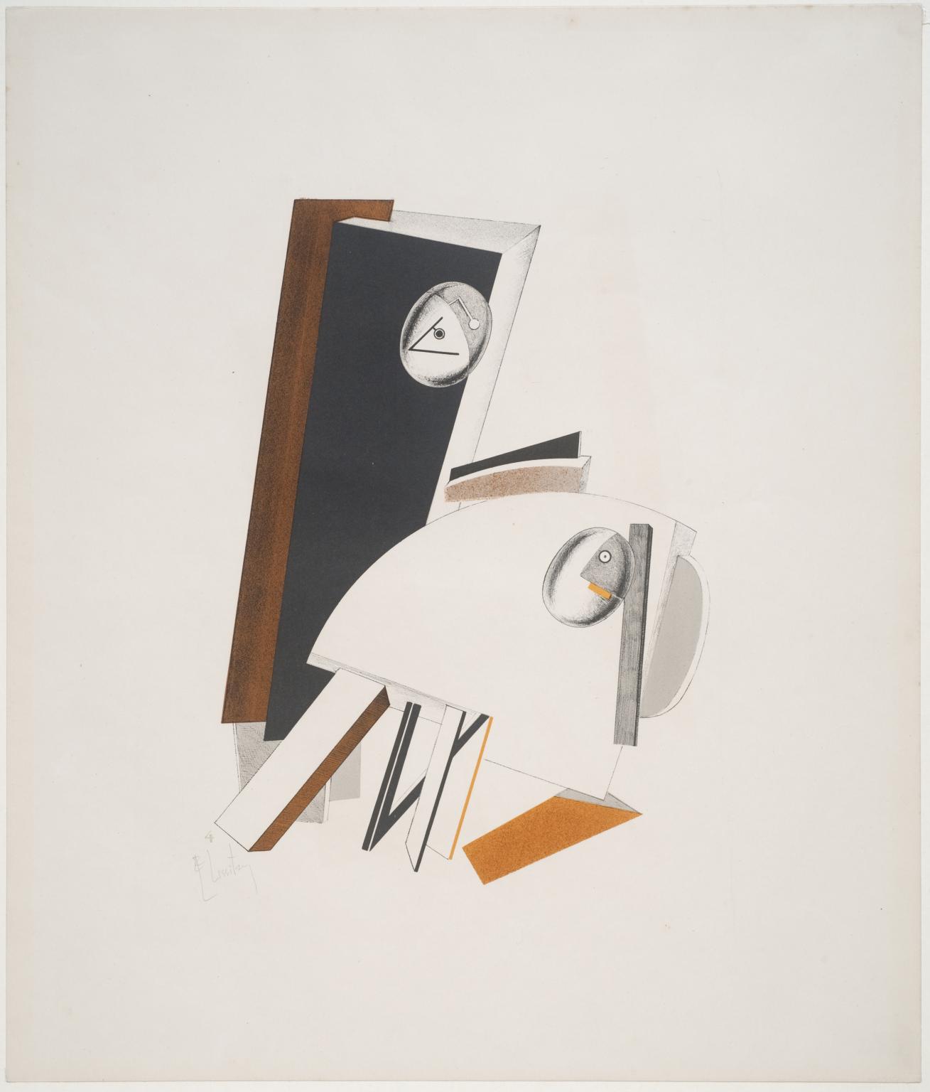
El Lissitzky, 4. Anxious People 1923
2/30
artworks in Ideas Depot
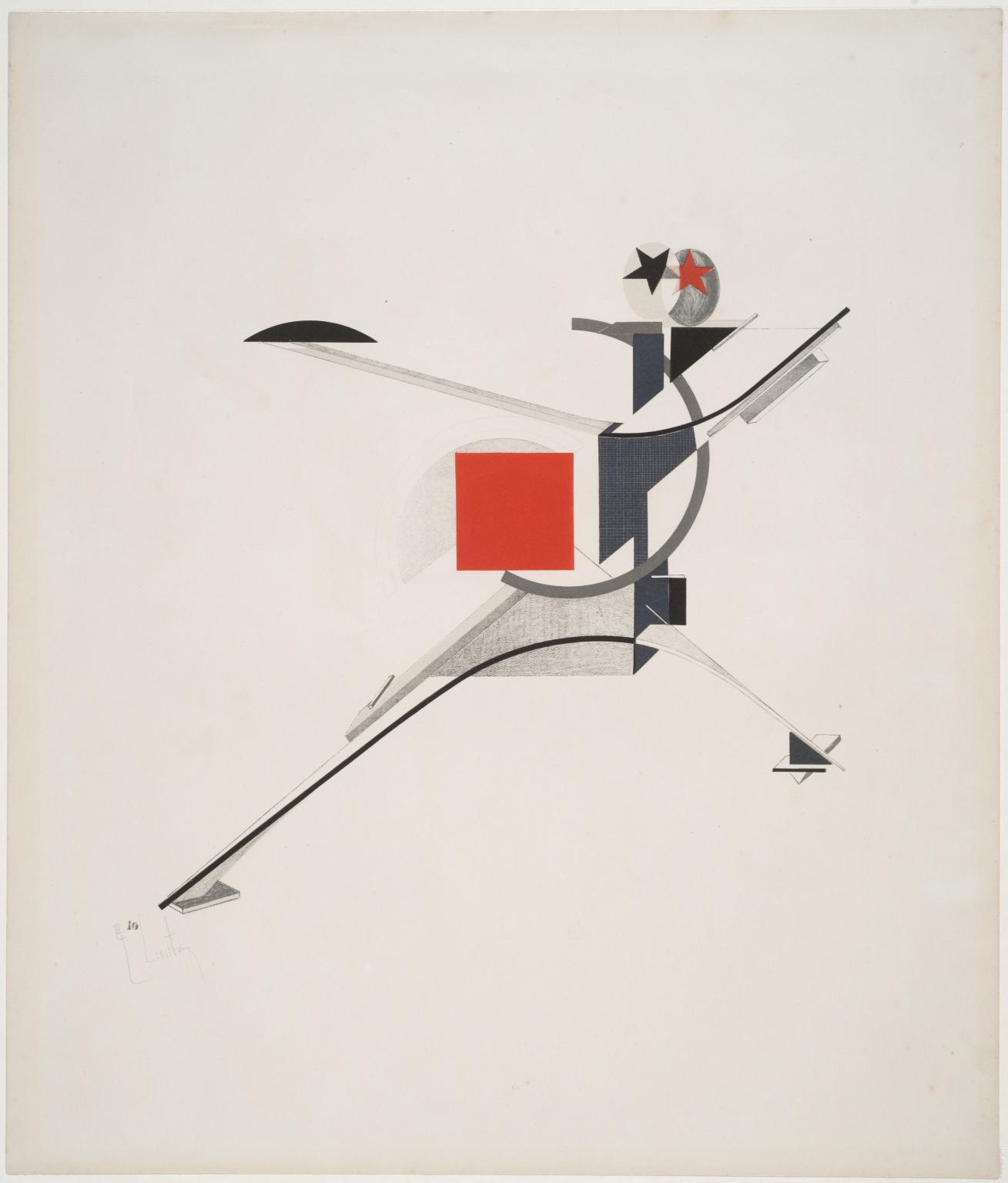
El Lissitzky, 10. New Man 1923
3/30
artworks in Ideas Depot
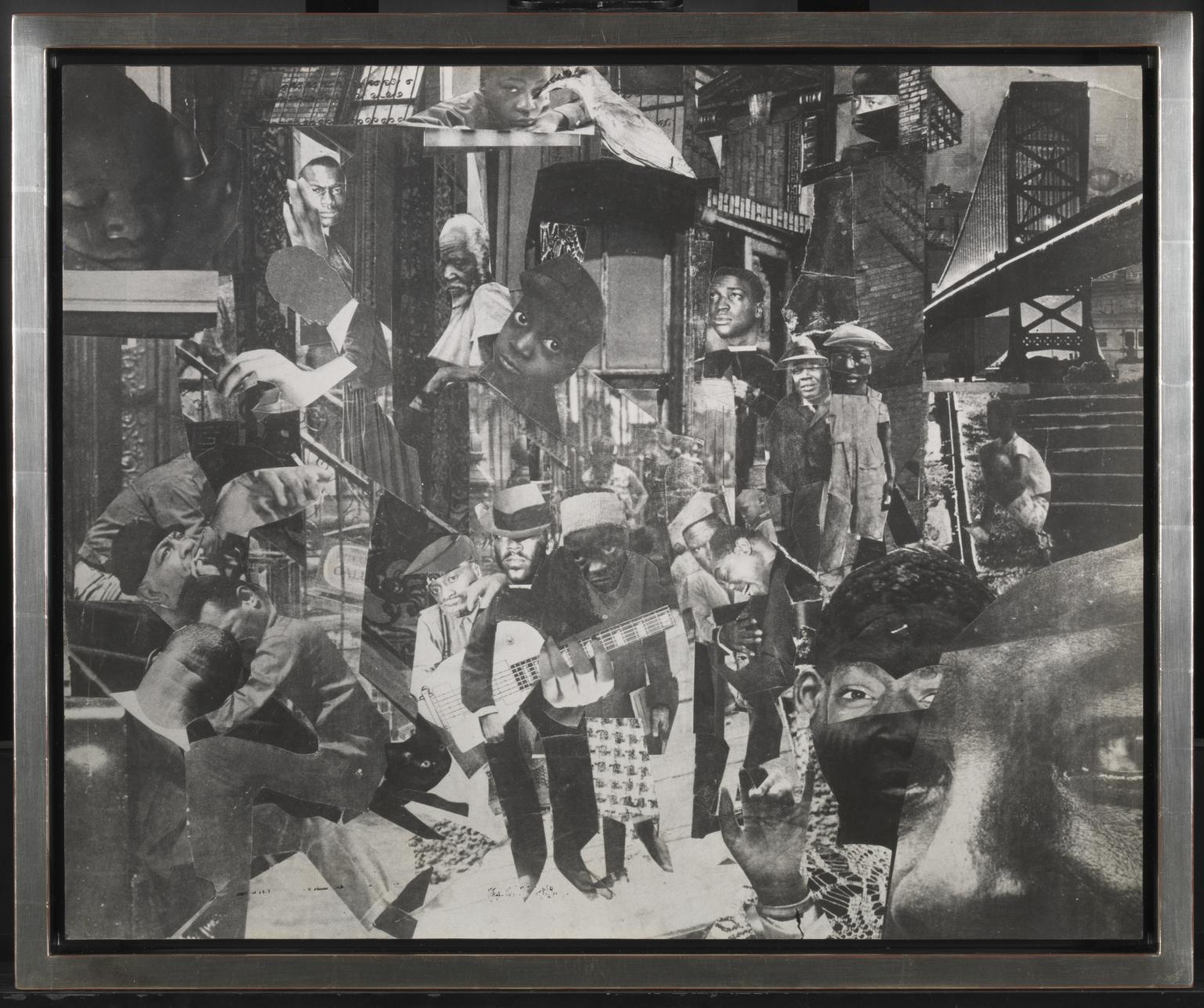
Romare Bearden, The Street 1964
4/30
artworks in Ideas Depot

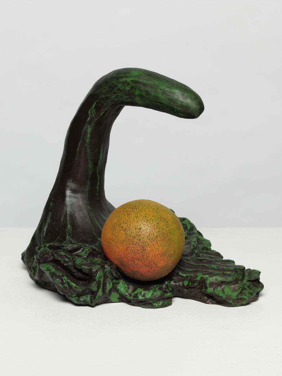
Erika Verzutti, Tarsila with Orange 2011
Tarsila with Orange 2011 is a painted bronze sculpture by the Brazilian artist Erika Verzutti. While Verzutti often works with the tradition of bronze casting, her emphasis is consistently placed on tactility and the handmade, and this sculpture is a key work in this regard, both in its form and conceptualisation. Verzutti produced the composition in clay, vertically pulling up a narrow, arching form that she then cast, such that it appears to both cradle and overlook an orange sphere. The ‘orange’ relates to her practice – begun around 2007 and continued for approximately seven years – of casting fruits and vegetables and using the shapes as recurring elements of her ambiguous sculptures (see also Brasília Tile 2011, Tate T15433, and Pencil 2014, Tate L04290). The odd, snake-like form of Tarsila with Orange has been a recurring motif in the artist’s work since 2003, and she has adapted it and described it in relation to the forms of a swan, a dinosaur, a phallus or a vegetable. Most often, and in this case of this work and its title, she draws direct reference between this shape and the work of Brazilian modernist painter Tarsila do Amaral (1886–1973), whose painting Setting Sun 1929 (private collection) features a similarly ambiguous animal at its centre.
5/30
artworks in Ideas Depot

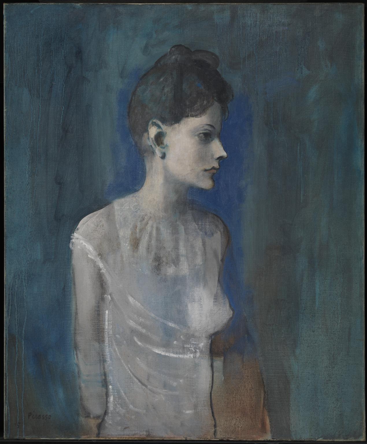
Pablo Picasso, Girl in a Chemise c.1905
This is one of the first paintings Picasso made after moving from Barcelona to Paris in 1904. The painting relates stylistically to works of his so-called ‘rose period’. Even though this painting is predominantly blue, the warm pinkish-brown undertones in the background represent a transition towards a more colourful palette and lighter subject matter. The young woman portrayed here is likely Madeleine, Picasso’s regular model at the time. Her depiction bears similarities to his paintings of harlequins and travelling entertainers which featured heavily in Picasso’s rose period.
Gallery label, November 2019
6/30
artworks in Ideas Depot

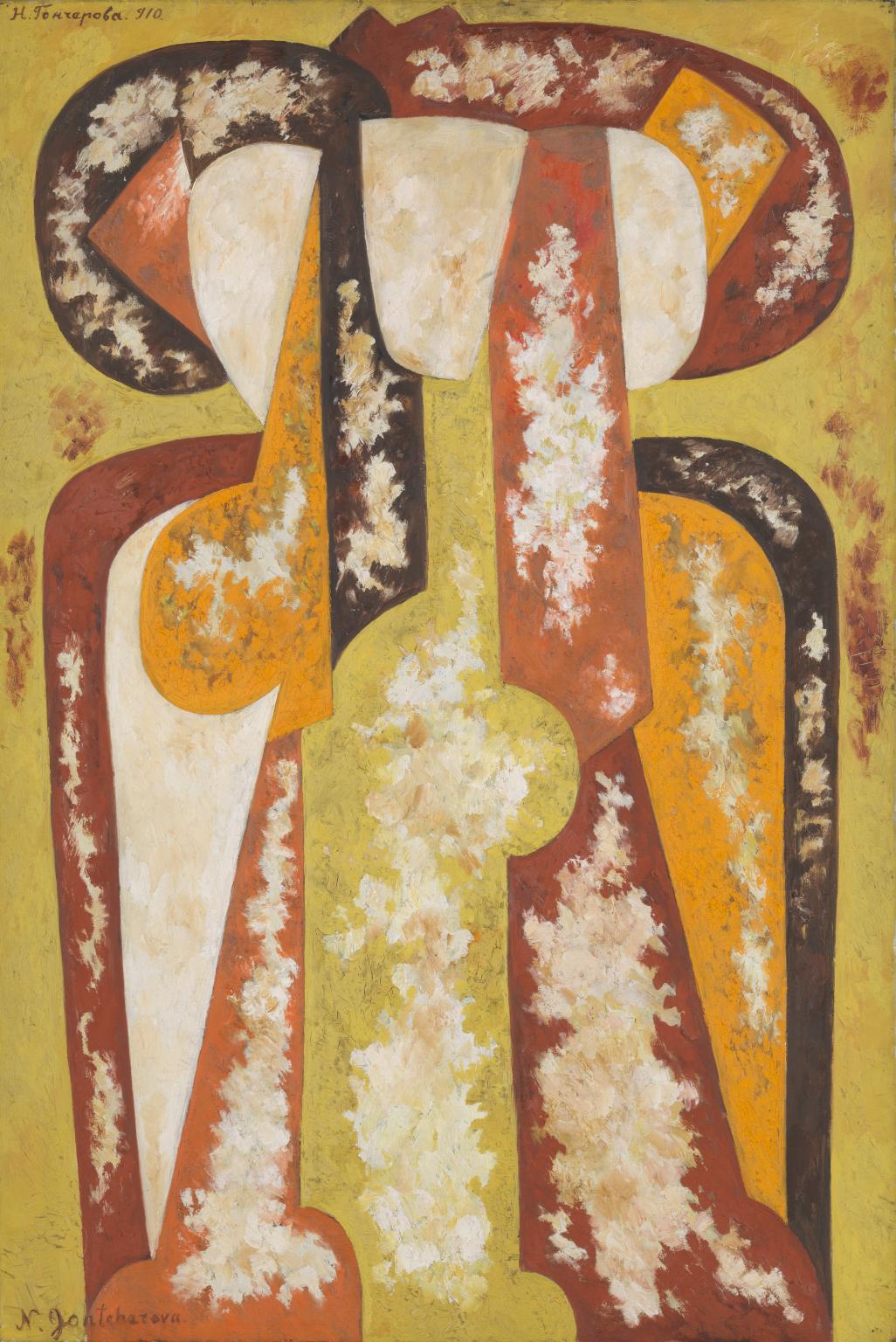
Natalia Goncharova, Three Young Women 1920
The apparent abstraction of this composition derives from the radically restructured forms of the three women identified in the title. Many years after its completion, the artist described it as: ‘Three half-length female figures, the play of sunlight and reflections of a sandy path (yellowish orange) and orange red etc.’ The fragmented forms that Goncharova favoured in earlier works were here resolved in a more stable synthesis that reflect her contribution to developments in post-First World War Paris.
Gallery label, November 2007
7/30
artworks in Ideas Depot
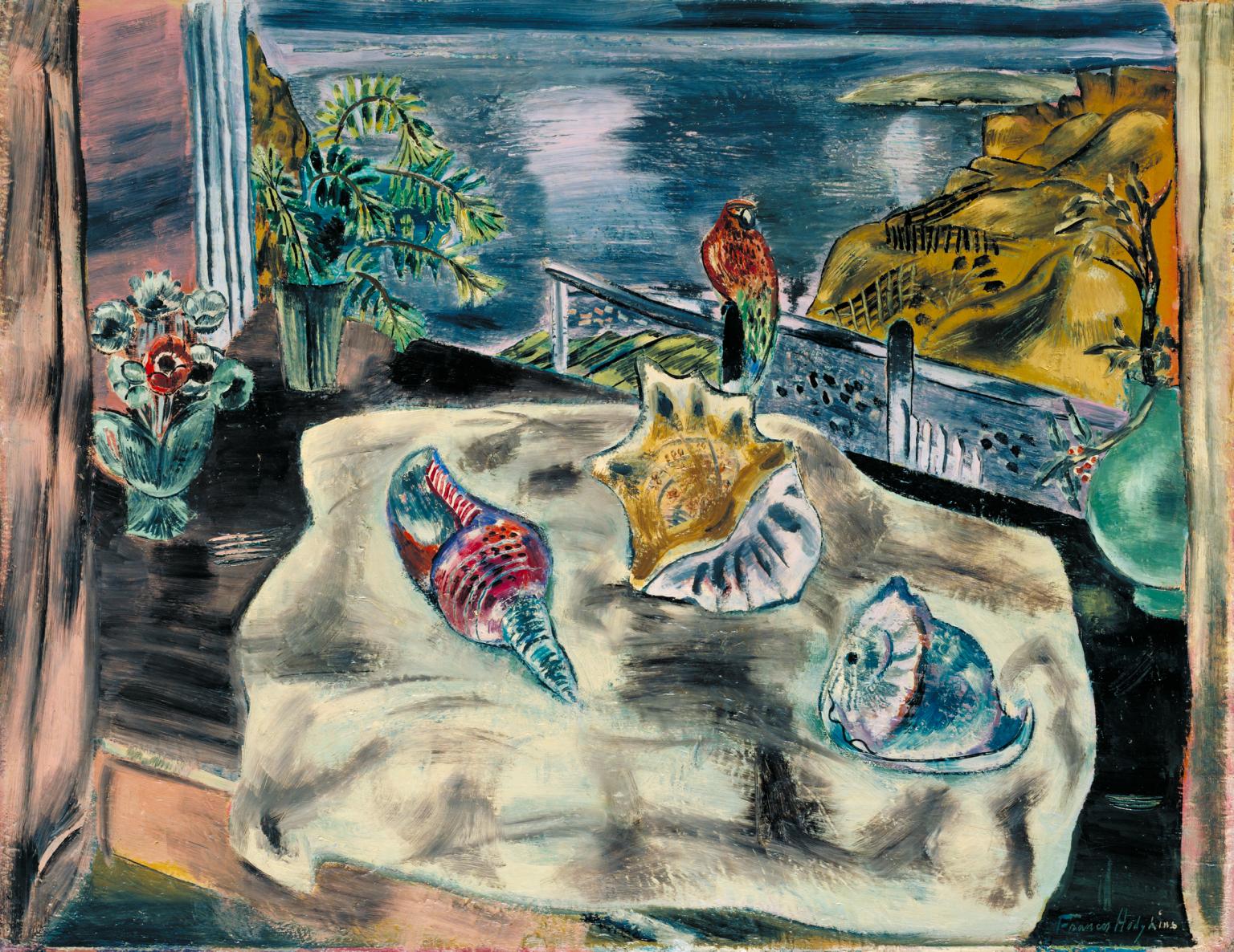
Frances Hodgkins, Wings over Water 1930
Frances Hodgkins was born in New Zealand and first came to Europe in 1901. She taught in Paris between 1910 and 1912 and settled in England in 1914. She was a close friend of Cedric Morris and Lett Haines, the former proposing her membership of the Seven and Five in 1929. 'Wings over Water' is typical of Seven and Five artists in its depiction of a table-top still life set before a window. It was painted in the artist's studio in Hampstead, an area of North London much favoured by avant-garde British artists at the time, and evokes memories of Cornwall where she had settled in 1914.
Gallery label, August 2004
8/30
artworks in Ideas Depot
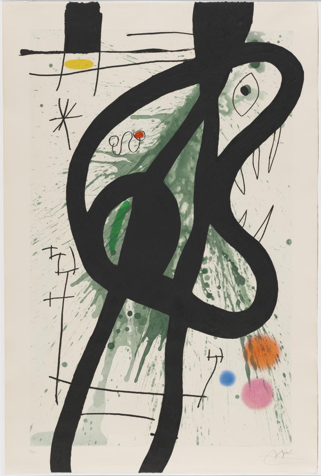
Joan Miró, The Great Carnivore 1969
9/30
artworks in Ideas Depot
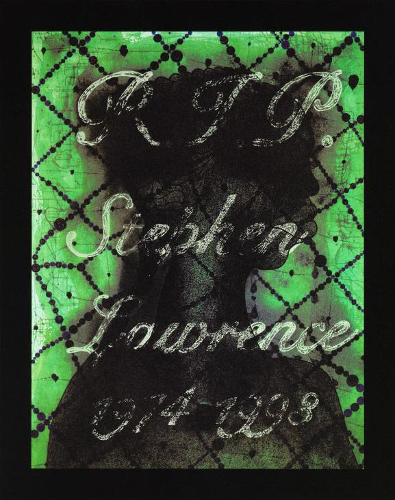
Chris Ofili, R.I.P. Stephen Lawrence 1974 - 1993 2013
10/30
artworks in Ideas Depot

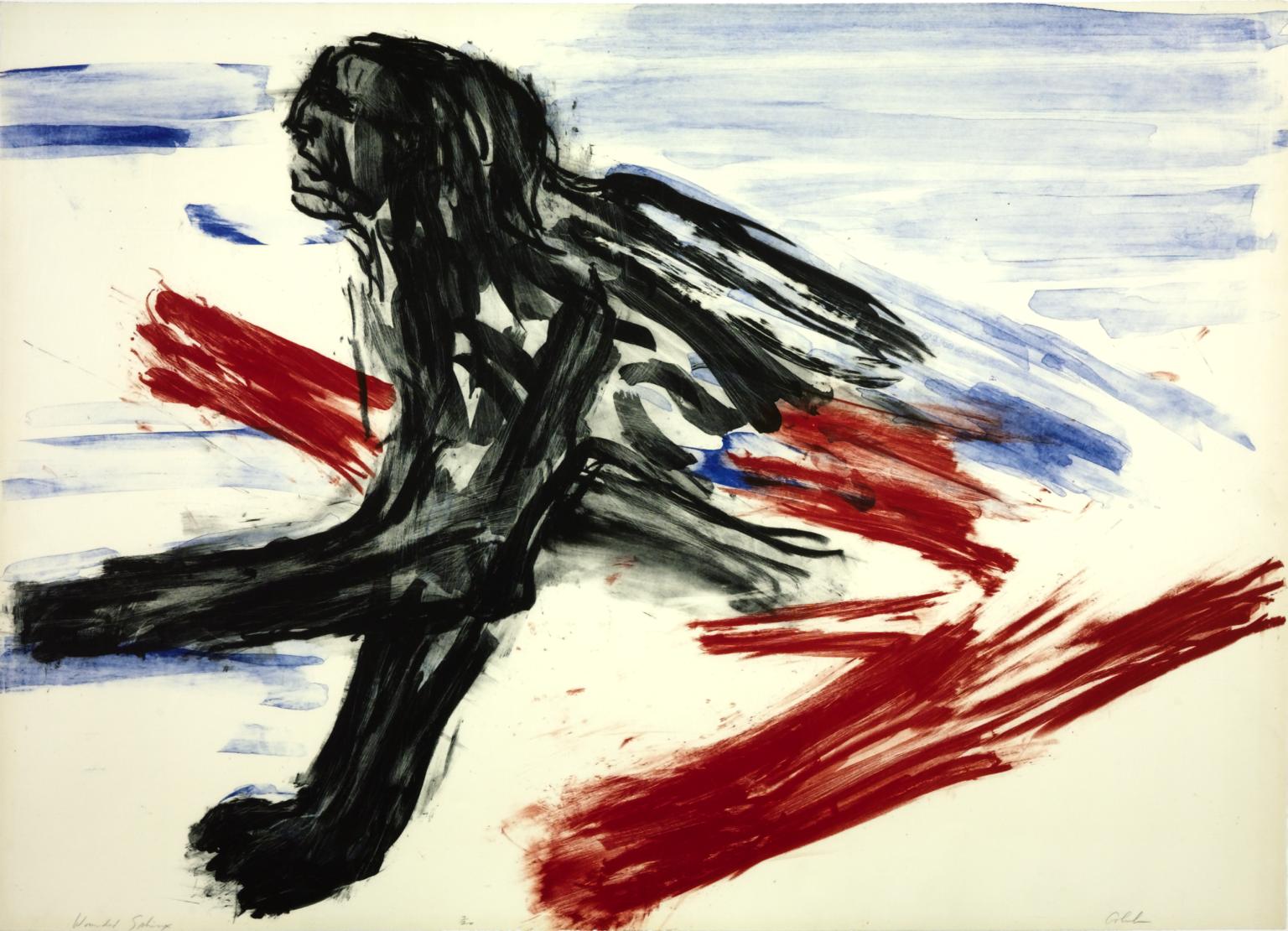
Leon Golub, Wounded Sphinx 1965
11/30
artworks in Ideas Depot

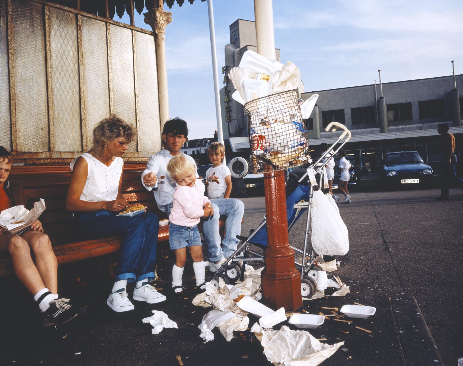
Martin Parr CBE, The Last Resort 25 1983–6, printed 2018
The Last Resort is a series of forty photographs taken in New Brighton, a beach suburb of Liverpool. Shot with a medium format camera and daylight flash, the photographs are an early example of Parr’s characteristic saturated colour, influenced by the American colour photography of William Eggleston (born 1939) and Garry Winogrand (1928-84). Parr printed eleven images from The Last Resort in a large-format edition of five for his 2002 retrospective at the Barbican Art Gallery, London. New Brighton, Merseyside (25) is one of four works from this special edition owned by Tate.
12/30
artworks in Ideas Depot
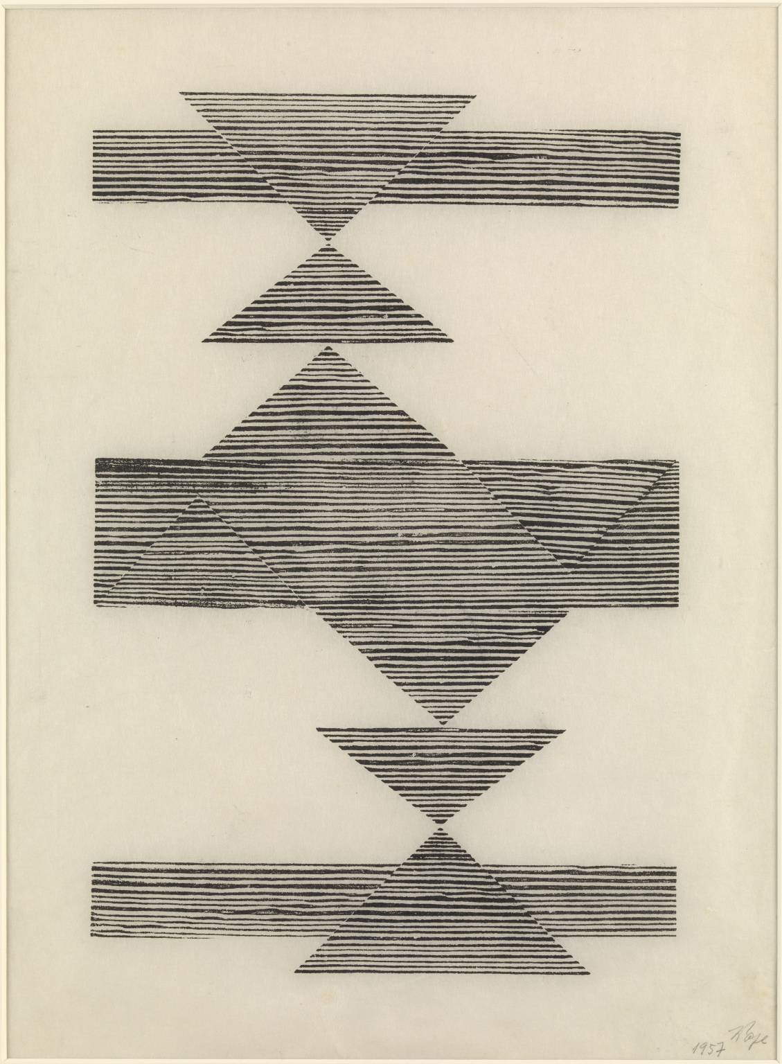
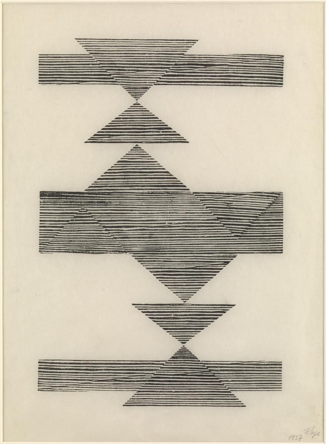
Lygia Pape, Weaving 1957
Here Lygia Pape creates a complex composition out of simple rectangles and triangles. The title refers to the act of weaving, and thus to textiles, a reference that implies the transparency of woven fabric, as well as its regularity and precision. Each shape is made with a woodcut printed onto thin paper, with the grooves of the natural woodgrain of the printing block visible. This organic element, along with the overlapping of the shapes, deliberately disturbs the pure geometry of the work.
Gallery label, November 2015
13/30
artworks in Ideas Depot
Sorry, no image available
Hansjörg Mayer, alphabet study: a 1962
14/30
artworks in Ideas Depot
Sorry, no image available
Hansjörg Mayer, alphabet study: b 1962
15/30
artworks in Ideas Depot
Sorry, no image available
Hansjörg Mayer, alphabet study: c 1962
16/30
artworks in Ideas Depot
Sorry, no image available
Nelson Stevens, Uhuru 1971
Uhuru 1971 is a screenprint on paper produced by Nelson Stevens, a member of the Chicago-based artists’ collective AfriCOBRA (African Commune of Bad Relevant Artists). Uhuru takes its title from the Swahili word for freedom. Adopted as a fundamental principle of the Pan-African movement, Stevens centres on the hopeful spiritualism associated with the word. Here it is emblazoned above a portrait of an African American woman who gazes upwards with a strong expression. Her face and Afro hairstyle are made up of fragmented and frenzied lines and forms, typical of Stevens’s painting aesthetic, evoking rhythm and movement inspired by African music.
17/30
artworks in Ideas Depot
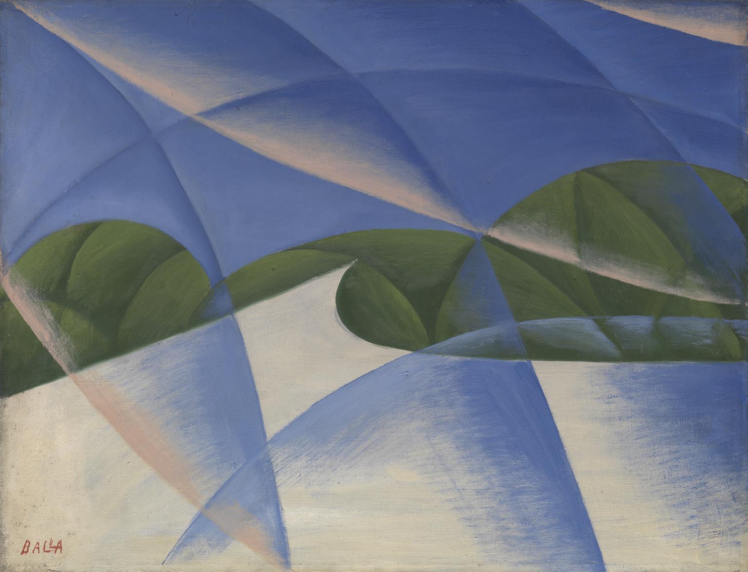
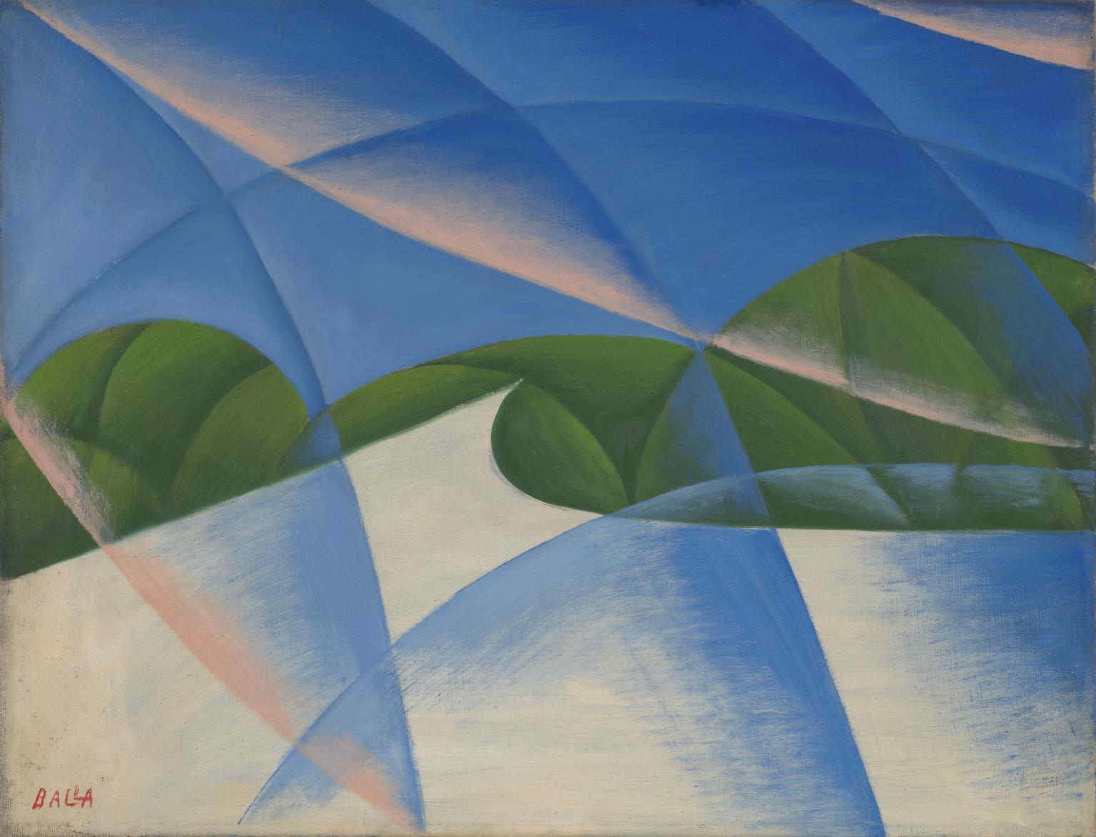
Giacomo Balla, Abstract Speed - The Car has Passed 1913
Ballà was a leading figure in the Italian Futurist group. He believed that the power and speed of machines such as cars were the salient characteristics of the modern age and aimed to express this idea in his work. This painting was originally the right-hand part part of a triptych. The left-hand part of the triptych was called 'Line of Force Landscape' and the central one 'Lines of Force Noise'. The theme of the triptych was the passage of a car along a white road, with green and blue forms, evoking earth and sky, in the background. The pinkish areas in this painting suggest the exhaust fumes left by the passing car.
Gallery label, September 2004
18/30
artworks in Ideas Depot
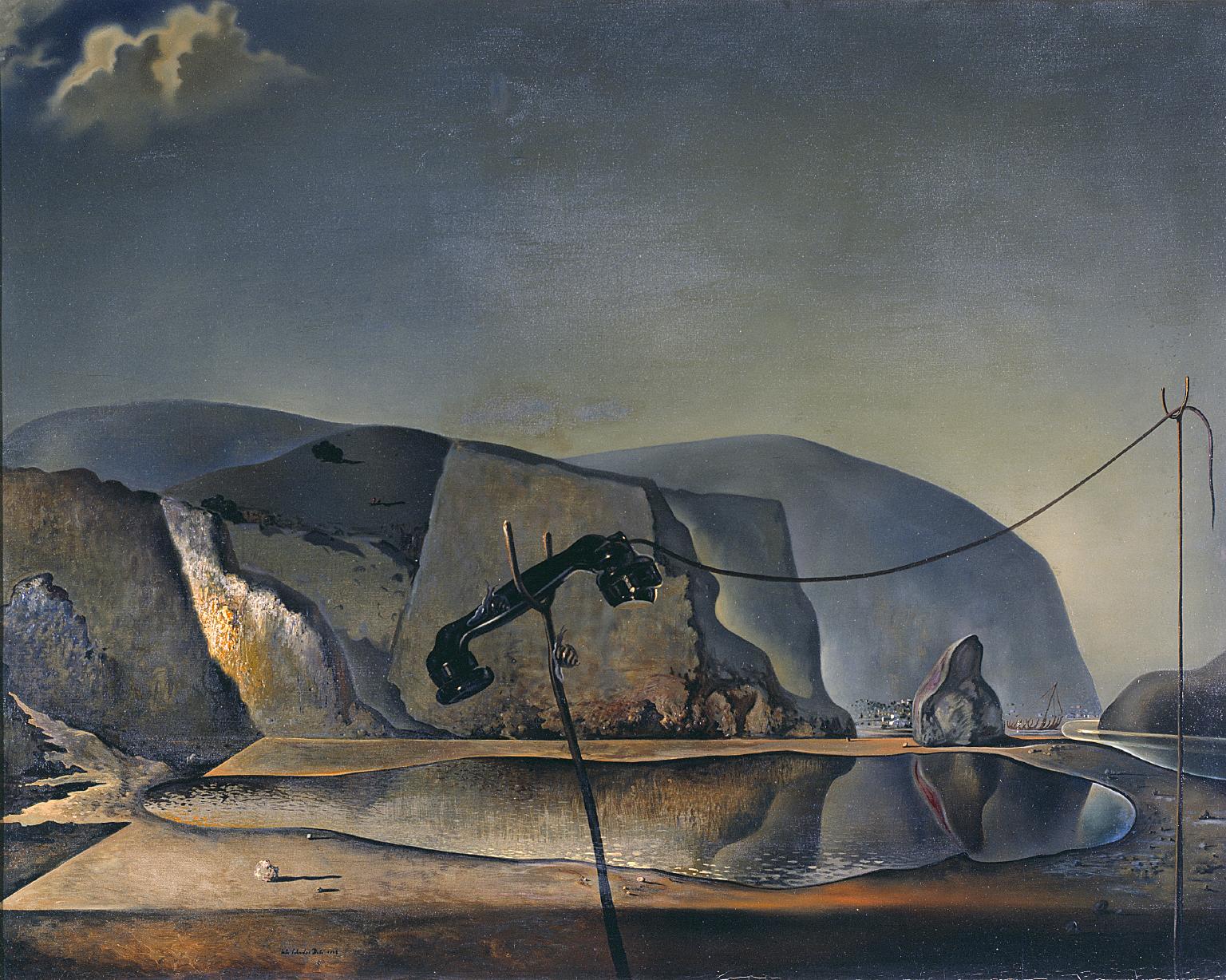
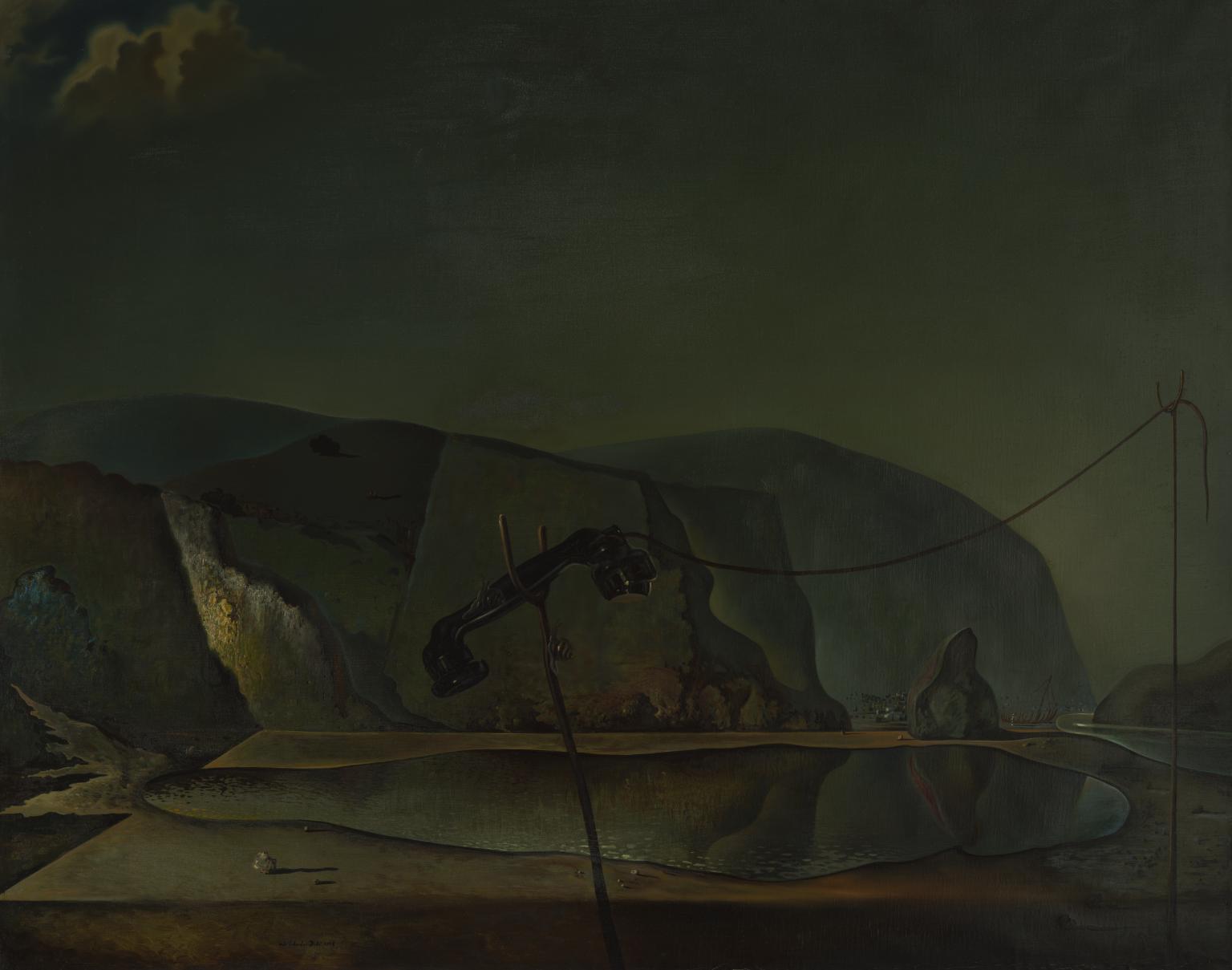
Salvador Dalí, Mountain Lake 1938
Mountain Lake demonstrates Dalí’s use of the multiple image: the lake can simultaneously be seen as a fish. By such doubling he sought to challenge rationality. The painting combines personal and public references. His parents visited this lake after the death of their first child, also called Salvador. Dalí seems to have been haunted by the death of his namesake brother whom he never knew. The disconnected telephone brings the image into the present by alluding to negotiations between Neville Chamberlain, the British Prime Minister, and Hitler over the German annexation of the Sudetenland in September 1938.
Gallery label, December 2005
19/30
artworks in Ideas Depot
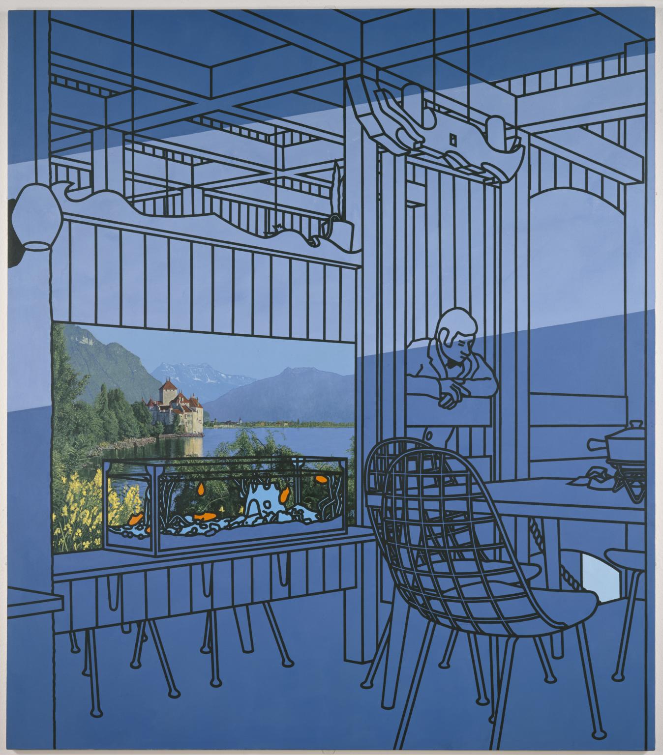
Patrick Caulfield, After Lunch 1975
Patrick Caulfield’s paintings explore alternative ways of picturing the world. After Lunch was one of his earliest works to combine different styles of representation. In this case, what appears to be a photomural of the Château de Chillon hanging in a restaurant is depicted with high-focus realism, contrasting with the cartoon-like black-outlined imagery and fields of saturated colour of its surroundings. Caulfield deliberately makes the relationship between these varying representational methods uneasy and ambiguous, so that the picture appears more real than the everyday world around it.
Gallery label, November 2016
20/30
artworks in Ideas Depot
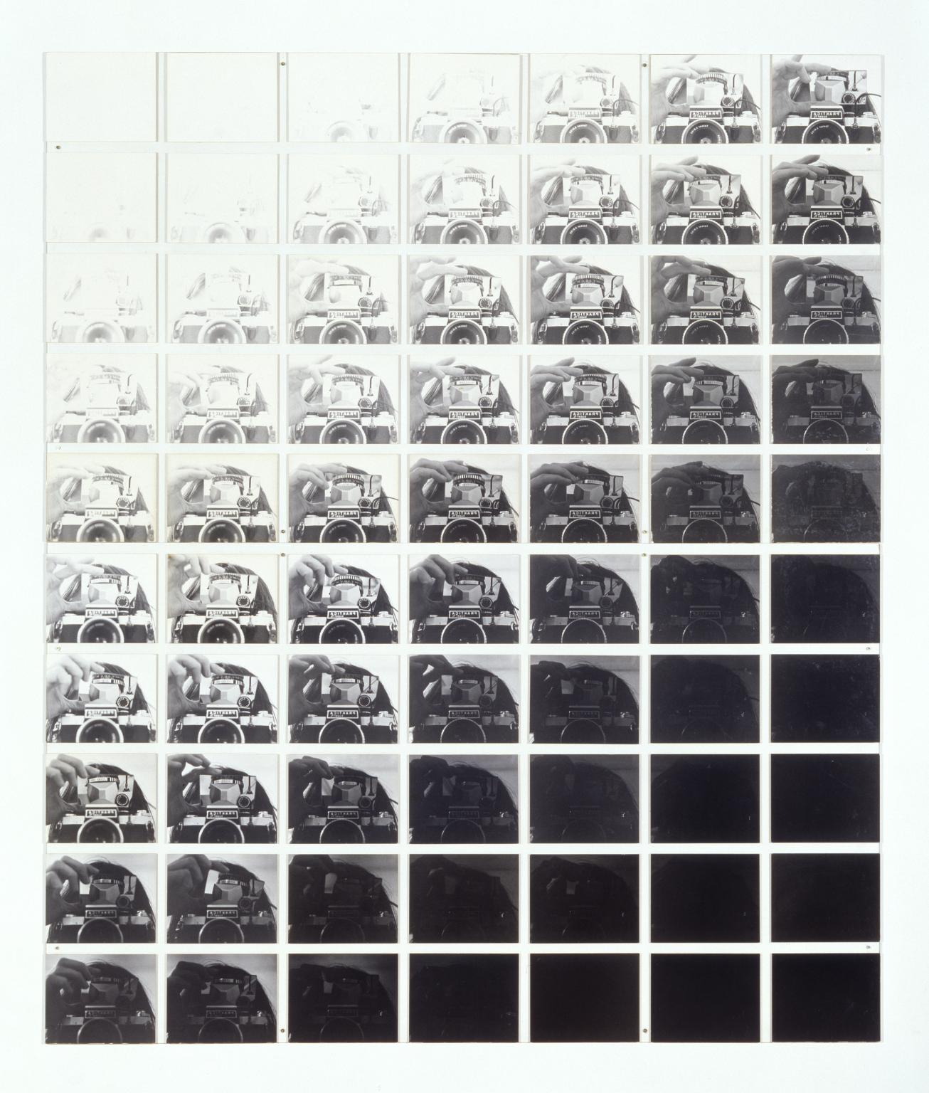
John Hilliard, Camera Recording its Own Condition (7 Apertures, 10 Speeds, 2 Mirrors) 1971
Conceptual art became a dominant movement in the 1970s as artists rejected traditional practices for an art that reflected upon the protocols of art itself. For many conceptual artists, the grid functions as rigorous scaffolding for the expressions of basic ideas, articulated with or without limited aesthetic intervention. The idea of a camera examining itself might be seen to epitomise such a practice. Here the camera serves as a device as well as the central image; 70 photographs were taken using mirrors and combinations of aperture and shutter speed.
Gallery label, September 2016
21/30
artworks in Ideas Depot
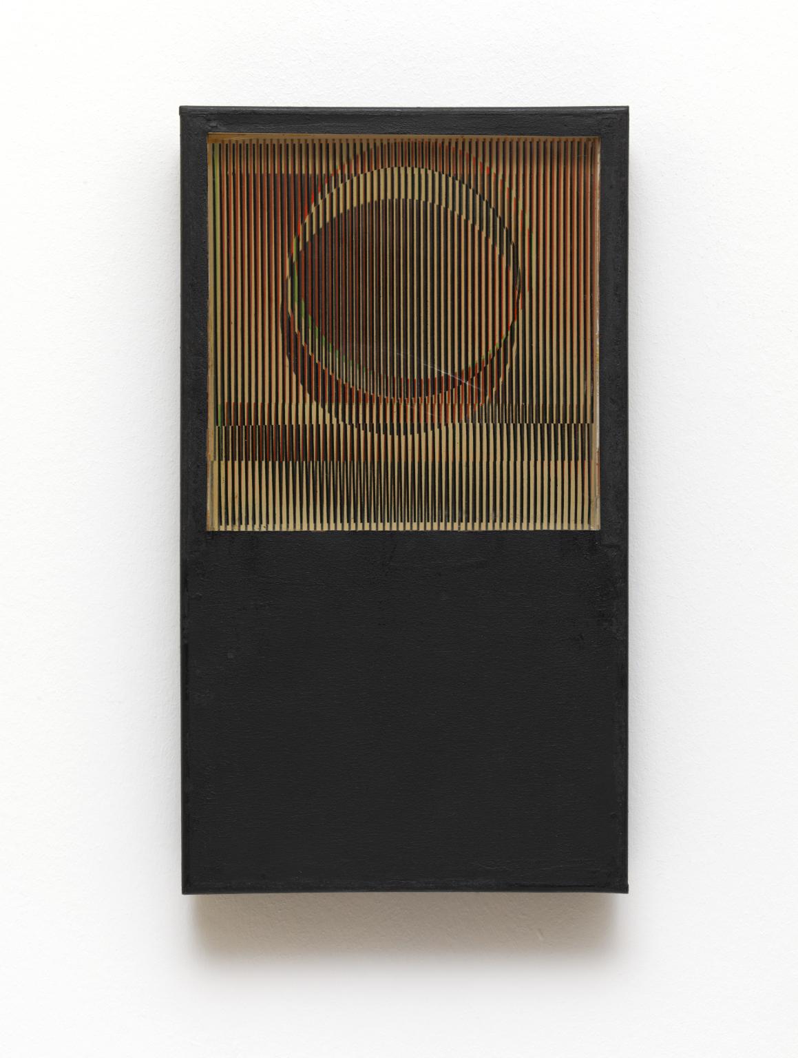
Carlos Cruz-Diez, Physichromie No. 123 1964
22/30
artworks in Ideas Depot
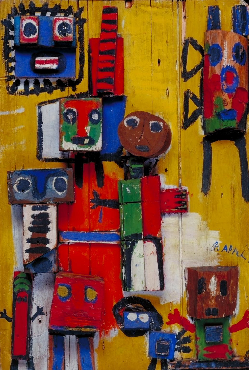
Karel Appel, Questioning Children 1949
Appel prepared the surface of Questioning Children by nailing discarded pieces of wood to an old window shutter. The vibrant colours and roughly-painted figures recall the spontaneity of children’s art. CoBrA artists believed that such unconventional sources could re-invigorate post-war culture. In the same year Appel also used the title Questioning Children for a controversial mural at the Town Hall in Amsterdam, which was condemned as incomprehensible, and covered over with wallpaper. There is a note of tragedy in these works as the Dutch title also means 'begging children' and evokes scenes of poverty that Appel had witnessed in post-war Germany.
Gallery label, August 2004
23/30
artworks in Ideas Depot
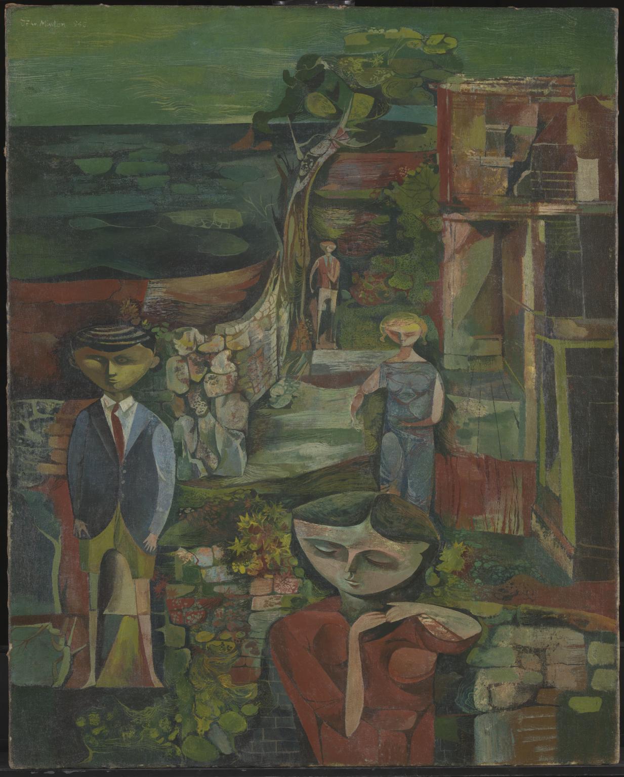
John Minton, Children by the Sea 1945
Minton was invalided out of the army in 1943, and from then until autumn 1946 he shared a London studio with two other painters, Robert Colquhoun and Robert MacBryde. The Polish painter Jankel Adler also lived in the same house and he shared with the younger painters his knowledge of the European avant-garde, especially Picasso. The landscape in this painting is inspired by disused buildings seen near the sea at Marazion in Cornwall, but the children are probably invented figures. The subject of the painting may suggest an interest in child psychology and awakening sexuality, themes found in other work by Minton in the mid-1940s.
Gallery label, September 2004
24/30
artworks in Ideas Depot
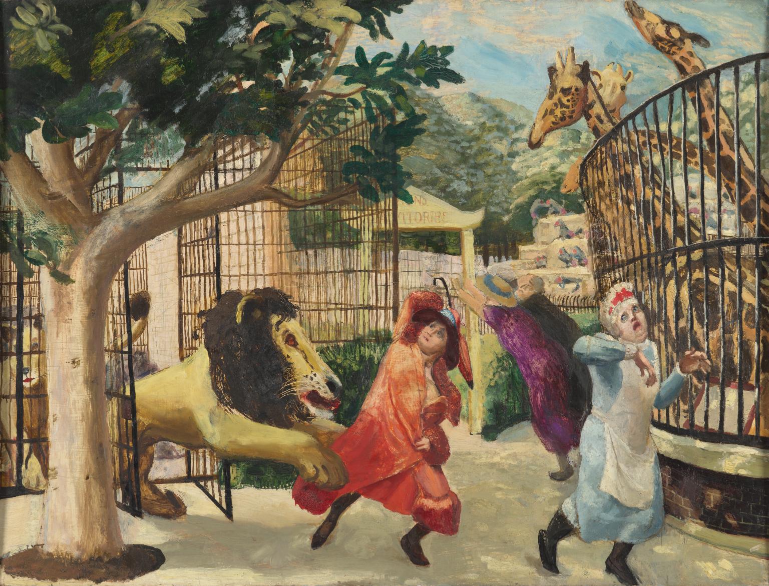
Carel Weight, Allegro Strepitoso 1932
During the 1930s Weight was interested in fairy stories and images which kindled the imagination. 'Allegro Strepitoso' was inspired by memories of childhood visits to London Zoo accompanied by his mother. A photograph of Weight's mother adopting a position of agitation provided the pose for the lady in red. Weight wanted to execute a comic painting and became fascinated with making the lion appear to spring out of the cage. The title of the painting was suggested by a musical friend of the artist after it had been completed. Allegro means 'merry' or 'lively', while strepitoso means 'noisily'. The theme of attack and escape is one that runs throughout Weight's work.
Gallery label, September 2004
25/30
artworks in Ideas Depot
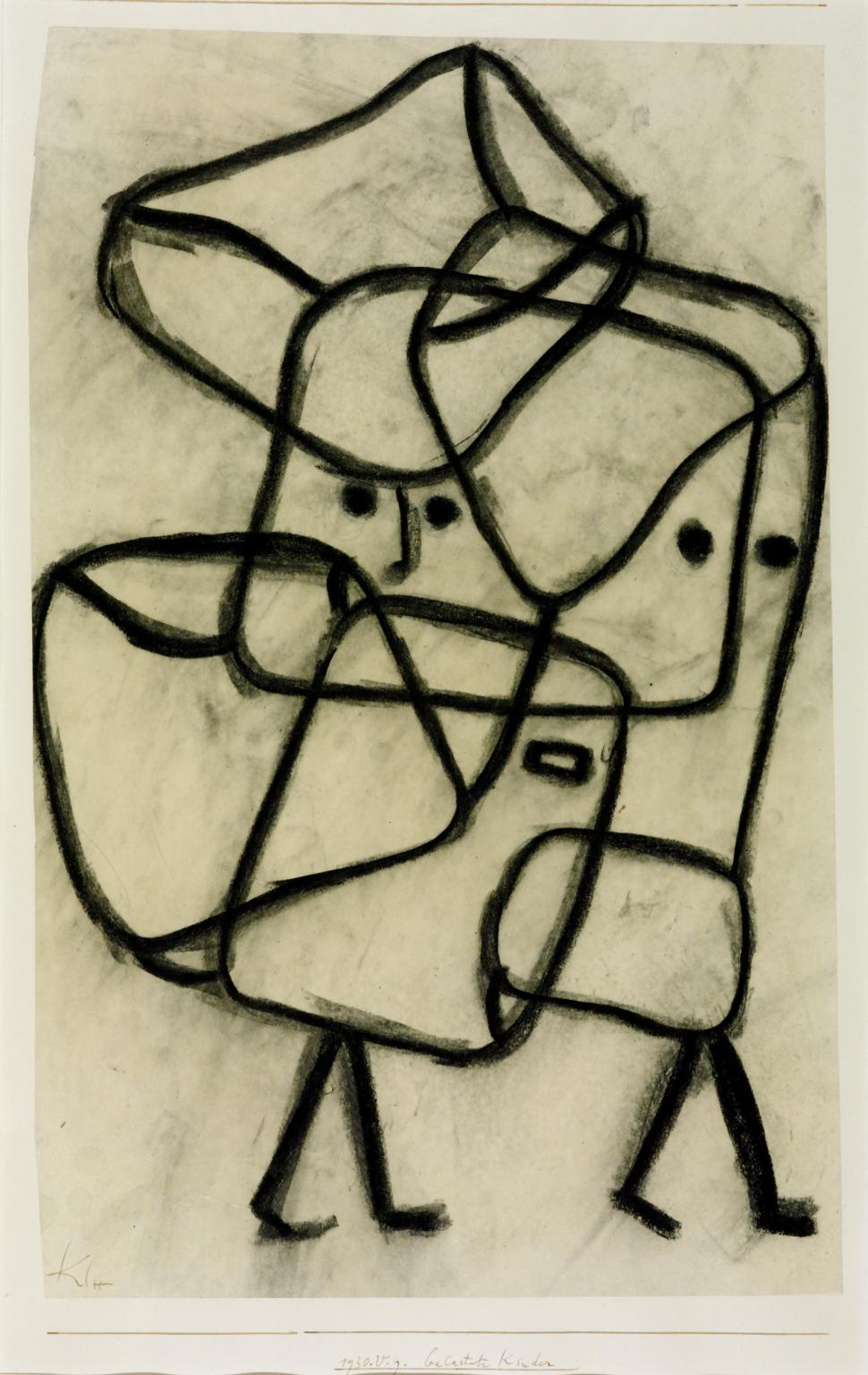
Paul Klee, Burdened Children 1930
These two works show Klee’s great imaginative and technical versatility. In The Castle of Mountain S, the mysterious castle seems to have emerged from the artist’s process of heavily working the paint. The freer process of ‘taking a line for a walk’ animates Burdened Children showing the spontaneity that Klee associated with childhood.
Gallery label, April 2008
26/30
artworks in Ideas Depot
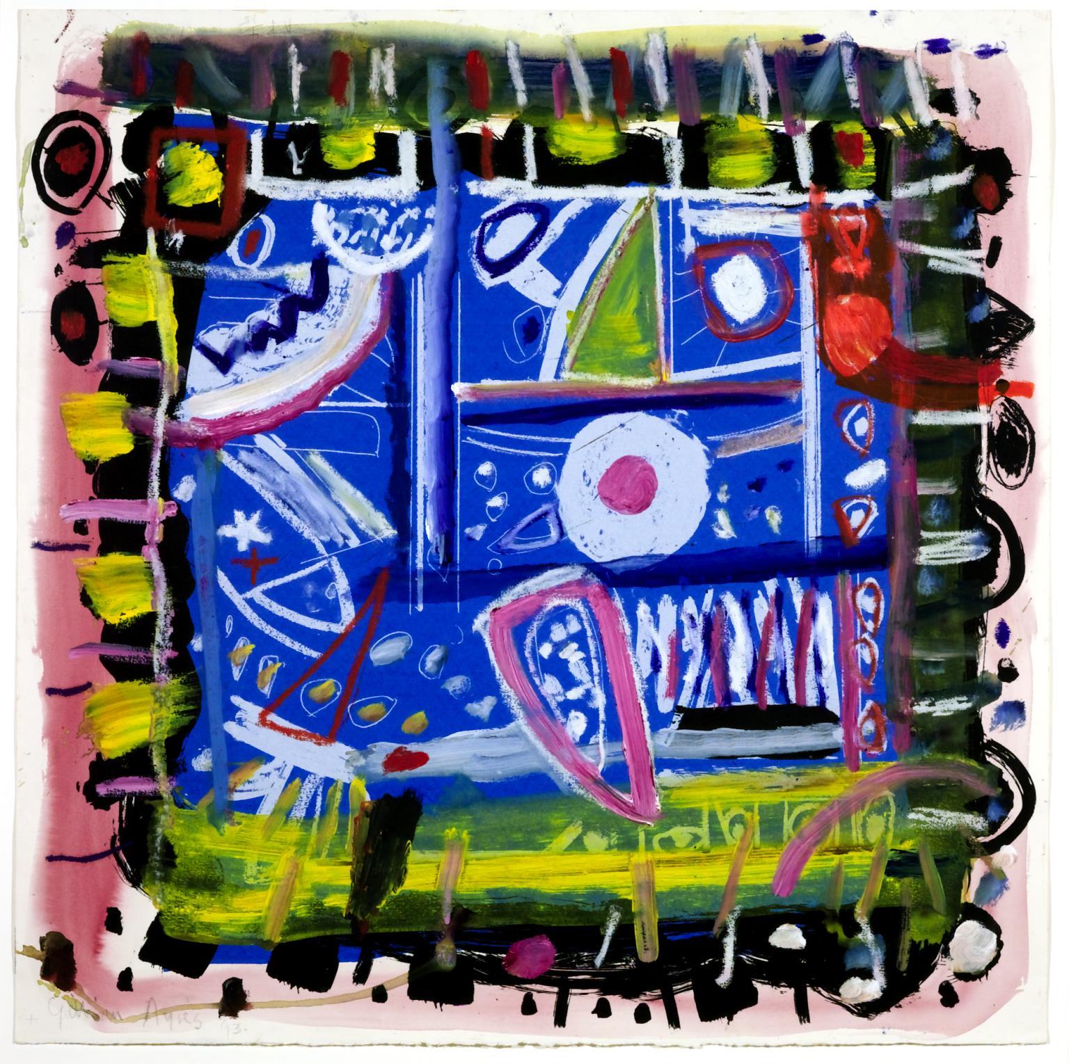
Gillian Ayres RA CBE, The Colour That Was There 1993
For The Colour That Was There, Ayres took a proof of a screenprint she had rejected, and painted over it using acrylic paint (a medium she had given up in favour of oil some years earlier). The shift in medium complicates the spatial dynamic of the composition, additionally defined by the decorative painted border around its four edges, emphasising the work’s self-contained nature. The title could refer to the original screenprint, which may have been differently coloured, or perhaps to a colour that was obscured when Ayres painted over the print.
Gallery label, October 2019
27/30
artworks in Ideas Depot
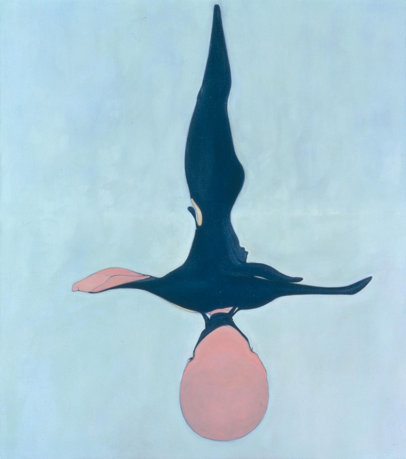
Nicola Tyson, Swimmer 1995
Nicola Tyson describes her work as ‘psycho-figuration’. Her figures tend to be oddly misshapen with puzzling proportions, usually set against a flat painted background. She uses them to examine issues of identity, gender and sexuality.
The submerged body of the Swimmer is particularly distorted by the refraction of light through water. The lower body tapers to a point like a tadpole, while the monstrously bulbous head has a pink-coloured void where a face should be. The bright colours conflict with the anxiety provoked by the distortion of Tyson’s figures.
Gallery label, August 2004
28/30
artworks in Ideas Depot
Sorry, no image available
Jorge Macchi, Musical Box 2004
29/30
artworks in Ideas Depot
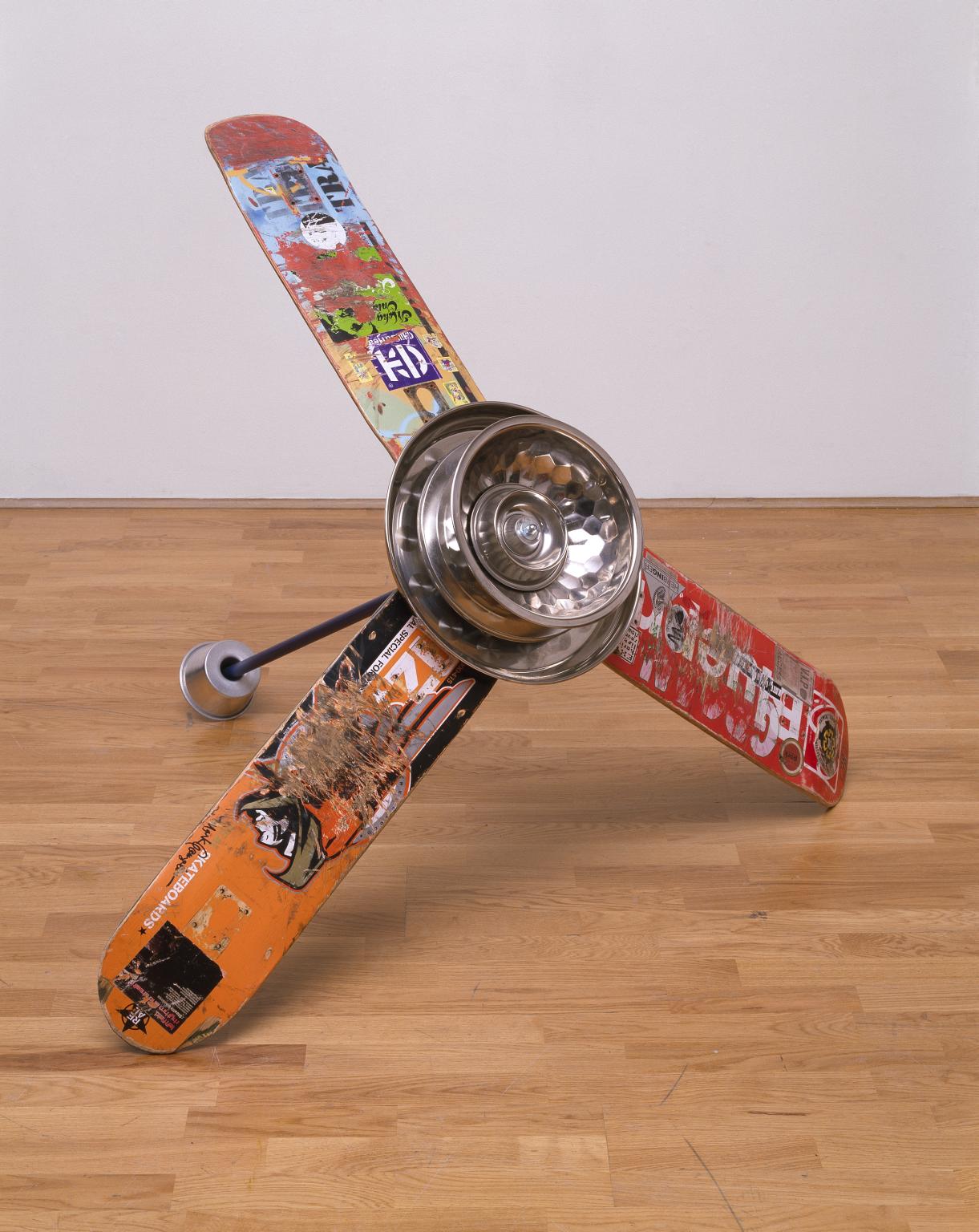
Alexandre da Cunha, Skateboarderistismatronics (fan) 2004
Skateboarderistismatronics (fan) 2004 is a floor-based sculpture by the British-Brazilian artist Alexandre da Cunha that comprises three skateboards with their wheels removed arranged in a three-armed configuration to resemble a domestic ceiling fan. At the centre of the work, four lightweight metal objects – a cake mould, a salad bowl, a circular baking tray and a film canister lid – are threaded onto a plastic-covered metal broom handle using a series of wing nuts and bolts. The work is balanced on the floor, with two of the skateboards touching the ground and a third support provided by the lower end of the broom handle, onto which is attached another, smaller metal ring mould.
30/30
artworks in Ideas Depot
Art in this room




Sorry, no image available
Sorry, no image available
Sorry, no image available
Sorry, no image available


Sorry, no image available

You've viewed 6/30 artworks
You've viewed 30/30 artworks
