In Tate Britain
- Artist
- Richard Hamilton 1922–2011
- Medium
- Oil paint, cellulose nitrate paint, paper and plastic on wood
- Dimensions
- Support: 1219 × 813 mm
frame: 1330 × 944 × 98 mm - Collection
- Tate
- Acquisition
- Purchased 1970
- Reference
- T01190
Display caption
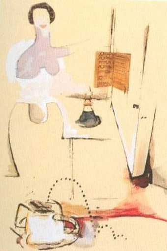
$he explores the imagery of consumerism and female identity, bringing together advertisements for household appliances alongside fragmentary images of a model taken from Esquire magazine. ‘Sex is everywhere, symbolised in the glamour of mass-produced luxury – the interplay of fleshy plastic and smooth, fleshier metal’, Hamilton wrote. ‘This relationship of woman and appliance is a fundamental theme of our culture; as obsessive and archetypal as the Western movie gun duel.’ The mechanisation of desire is alsoa key concern of the Large Glass, whose notes Hamilton was translating at this time.
Gallery label, August 2011
Does this text contain inaccurate information or language that you feel we should improve or change? We would like to hear from you.
Catalogue entry
T01190 $HE 1958–61
Not inscribed.
Oil, cellulose and collage on panel, 48×32 (122×81).
Purchased from William N Copley (Grant-in-Aid) 1970.
Coll: Given by the artist to William N Copley on completion of the painting, 1961.
Exh: Hanover Gallery, October–November, 1964 (8, repr.); Tate Gallery, March–April, 1970 (40, repr. in black and white p. 38 and in colour p. 9), and tour of Eindhoven and Berne.
Lit: Lawrence Alloway, ‘Artists as Consumers’ in Image, No.3, 1961, pp. 14–19, repr.; Richard Hamilton, ‘An exposition of She’, in Architectural Design, XXXII, No. 10, 1962, pp. 485–6, repr. (reprinted, in version corrected by the artist, in John Russell and Suzi Gablik, Pop Art Redefined 1969, pp. 73–76 repr.); Richard Morphet, catalogue of Tate Gallery retrospective, March–April, 1970, pp. 37–9.
Repr: Art International, X/8, 1966, p. 23; Lawrence Alloway, ‘The Development of British Pop’, in L. Lippard, ed, Pop Art, 1966, p. 43.
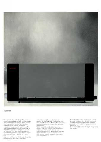
Following Hamilton's open espousal of pop subject matter in the collage ‘Just what is it that makes to-day's homes so different, so appealing?’ 1956, each of his next four paintings, of which T01190 was the third, was a variation on the theme of the relationship between a girl and machines or appliances, in which concept and treatment of both girls and artefacts reflect the method of presentation of these subjects in magazines of the period. A preoccupation with relief in both illusion and actuality, which runs through Hamilton's whole oeuvre, is represented in T01190 by juxtaposition of the passage of modelled painting of shoulder and breast with the skirt shape superimposed in plywood in shallow relief. In his two preceding pop paintings, Hamilton had fused into single entities shapes derived from different models of car. In T01190, as in Pin-up which immediately followed it, appliances with distinct functions are synthesised—here an automatic pop-up toaster (a subject reinterpreted by Hamilton in 1966–67) with a vacuum cleaner.
Hamilton painted T01190 as the outcome of an investigation into consumer goods for an independent Group lecture at the I.C.A. London, published as ‘Persuading Image’, in Design, 134, February 1960, pp. 28–32. In Image No. 3, 1961 (loc. cit.), Lawrence Alloway wrote of T01190: 'She extends the most elliptical sign language of the art world (minted by Marcel Duchamp) to consumer goods. The painting is characterised by the cool, clean hygienic surface of kitchen equipment and the detailing has the crisp, fine point of ads or explanatory booklets on the products that Hamilton is painting. Sources of imagery candidly exposed by the artist (in the proud spirit in which Constable could point to Suffolk and say ‘these scenes made me a painter’) are American ads... She, tall, pale and two-sided, is derived from an Esquire photograph of Vikky (the back) Dougan. Hamilton has made the cleavage of the dress resemble an apron, topped by an airbrush-smooth shoulder/breast. In this image the codes of fine and the messages of pop art are meshed. Toaster confronts refrigerator, sex-dress becomes apron and a nipple looms in the kitchen: hot or cold? The latest sociological and fantastic content of ads and girlie photographs are stressed by Hamilton in his ironic and polished treatment.
‘Hamilton's position is that of a knowing consumer, a role typical of other English painters, abstract and figurative. This is a drastic departure from both the bohemian tradition of distrusting possessions (being a bad consumer) and from the high spiritual aims declared by early modern artists.’
As published in Architectural Design and in Pop Art Redefined (loc. cit.), Hamilton's detailed account of the genesis of T01190 was illustrated by ten reproductions of source materials for the imagery. It is to these that the numbers in his text, which follows, refer: 'In an old Marx Bros film (and this is the only memory I have of it) Groucho utters the phrase “Women in the home” and the words have such power that he is overcome, he breaks the plot to deliver a long monologue directed straight at the camera. Sentiment is poured towards the audience and is puddled along with devastating leers and innuendos. This vague recollection of Groucho was revived when I began to consider the frequency with which advertising men are faced with the problem of projecting the w.i.t.h. image. “Women in the home” was a possible title for ‘She’, which is a sieved reflection of the ad man's paraphrase of the consumer's dream.
'Art's Woman in the fifties was anachronistic—as close to us as a smell in the drain; bloated, pink-crutched, pin-headed and lecherous; remote from the cool woman image outside fine art. There she is truly sensual but she acts her sexuality and the performance is full of wit. Although the most precious of adornments, she is often treated as just a styling accessory. The worst thing that can happen to a girl, according to the ads, is that she should fail to be exquisitely at ease in her appliance setting—the setting that now does much to establish our attitude to woman in the way that her clothes alone used to. Sex is everywhere, symbolized in the glamour of mass-produced luxury—the inter-play of fleshy plastic and smooth, fleshier metal.
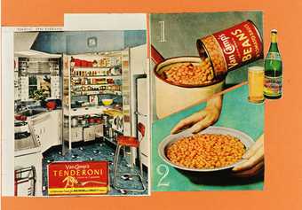
'This relationship of woman and appliance is a fundamental theme of our culture; as obsessive and archetypal as the Western movie gun duel. 1–6 reveal some basic features. 1 The caress. Characteristic posture; inclination towards the appliance in a gesture of affectionate genuflexion. Possessive but also bestowing. She offers the delights of the appliance along with her other considerable attributes. 2 A job, like Dad's. Mum too has a uniform, discreetly floral apron equals pin stripe or grey flannel. Bell provides the communications system to plug her into the home industry network. 3 Empire builder. Stock-piled cake mixes filed for easy reference; she commands the lot. 4 and 5 ls it me? The appliance is “designed with you in mind”—but are you the girl next door in a party hat or the svelte job that goes with the “Sheer Look”. Within a few years the Frigidaire image of itself can change quite a bit. 6 The source of the overall layout of “She” is this brilliant high shot of the cornucopic refrigerator—a view that uses a photographic convention from the auto ads. The cadillac pink colour of this particular model of RCA Whirlpool's fridge/freezer was adopted with enthusiasm for the painting. The woman is an interesting deviation from the norm—matronly if not downright motherly—she contributed little.
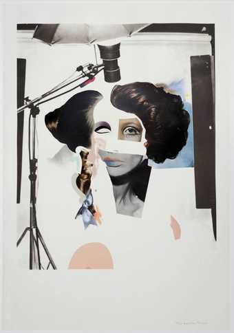
'In spite of their contrived sophistication, my paintings are, for me, curiously ingenuous (like Marilyn Monroe). At first sight it is easy to mistake their intention as satirical. It looks as though—and some of the references to the first six illustrations may seem to confirm the view—the painting is a sardonic comment on our society. But I would like to think of my purpose as a search for what is epic in everyday objects and everyday attitudes. Irony has no place in it except in so far as irony is part of the ad man's repertoire. My woman may seem exotic but, thanks to mass reproduction and wide distribution, she has become domesticated. She owes much to 7, an Esquire photograph of “starlet” (?) Vikky Dougan in a dress concocted by her publicist Milton Weiss. Miss Dougan specializes in modelling backless dresses and bathing costumes. The only pin-up I can remember making a greater impact in art circles was Brigitte Bardot spread piecemeal through Reveille (October 1957)—the gimmick of make-your-own-lifesize BB gave it an understandable edge. I first saw Miss Dougan decorating a wall in the Smithson's home. I gained my copy from a student's pinboard in the Interior Design Department of the Royal College. Lawrence Alloway gave me the data on her—the photograph had impressed him sufficiently to regard it as a fileworthy document. It turned up again recently as one of a group of pin-ups in a painting by Peter Phillips.
'Miss Dougan's back, although too good to miss, was not quite what was needed; a rotation of the figure gave the best of both worlds plus. The shoulders and breasts, lovingly air-brushed in cellulose paint, were done with one eye on 7 the other on the Petty girl. Her breasts can be seen in two ways, one reading provides a more sumptuous profusion of flesh than the other. The cleavage on the backside suggested an apron effect in negative; this was nice—an apron, however minute, is fundamental to the woman-in-the-home image. This area is in shallow relief, ⅛ in. ply sanded down at the lower edge to merge into the panel. The relief retains some subtleties of modelling which are not perceptible in the photograph—in fact, they can best be explored by sensitive fingers rather than the eye.
'A supplementary detail from the double-spread ad which also contained 6 was of the automatic defrosting system 8. This was photographed, blown up and pasted into the painting.
'Two other advertisements, 9 the Westinghouse vacuum cleaner and 10 General Electric small appliances, combined to make the remaining feature of “She”, the device in the foreground compounded from toaster and vacuum cleaner. The refrigerator stands for major appliance, the small mobile units were incorporated to extend the range to minor. They also provide the opportunity for a plastic elaboration which gratifies my own aesthetic needs. The ad for the Westinghouse vacuum cleaner 9 demonstrates an endearing characteristic of modern visual technique which I have been at pains to exploit—the overlapping of presentation styles and methods. Photograph becomes diagram, diagram flows into text. This casual adhesion of disparate conventions has always been a factor in my paintings. I want ideas to be explicit and separable so the plastic entities must retain their identity as tokens. The elements hold their integrity because they are voiced in different plastic dialects within the unified whole.
‘The picture was worked on, on and off, for about two and a half years. Towards the end Herbert Ohl from Ulm visited me in London bringing a little gift from Germany for the English pop artist, an advocate of what, at the Hochschule für Gestaltung, they strangely termed “the blau-jinx philosophy”. It was a winking plastic eye and within minutes of its arrival it was cellotaped into position on the painting, waiting to be inlaid and carefully sprayed to smear the rectangular block into the surrounding surface. The wink, unhappily, is impossible to reproduce.’
Hamilton made four studies for T01190. One is an initial visualisation of the whole composition. Two are individual studies of different types of woman, one robotic (like a further machine), the other soft and welcoming—the two types were merged in the final picture. The last study, of the combined toaster and vacuum cleaner, is appropriately entitled ‘Toastuum’.
Published in:
The Tate Gallery 1968-70, London 1970
Explore
- objects(23,571)
-
- electrical appliances(404)
-
- refrigerator(14)
- vacuum cleaner(8)
- kitchen(636)
-
- toaster(5)
- lifestyle and culture(10,247)
-
- advertising(536)
- eroticism(409)
- consumerism(102)
You might like
-
Sir Eduardo Paolozzi 11. Improved Beans
1972 -
Richard Hamilton Toaster
1967 -
Richard Hamilton Fashion-plate
1969–70 -
Richard Hamilton $he(1958)
1982 -
Richard Hamilton Pin-up (1961)
1982 -
Richard Smith Vista
1963 -
Richard Hamilton Interior II
1964 -
Richard Hamilton The Solomon R. Guggenheim (Neapolitan)
1965–6 -
Richard Smith Panatella
1961 -
Richard Hamilton Trainsition IIII
1954 -
Patrick Caulfield Greece Expiring on the Ruins of Missolonghi (after Delacroix)
1963 -
Allen Jones Wet Seal
1966 -
Richard Hamilton Hommage à Chrysler Corp.
1957 -
Richard Hamilton Chromatic spiral
1950

