For the artist Frank Bowling, painting is primarily about colour and materials. As he stated in 1971, ‘Colour plays an enormous part in my work, if not the most important part’.1 He applies paint and allows himself to be led by the nature of the material and to let the painting create itself. ‘It all happens in an extemporary way, I mean I don’t have any pre-planned idea of how I’m going to make a painting.’2
With this in mind, it is impossible to write about Bowling’s art without referring to his unique use and application of materials: staining, pouring, spraying, screenprinting, stitching, cropping, masking, applications of acrylic gel, sprinklings of metallic pigment, unstretched canvas. Bowling’s interest in the materiality of paintings – how paint can be applied, moved and manipulated, as well as the physical and chemical interactions of paint and the random process of creation – has been a driving force for him since early in his career. His work shows a constantly moving process of change and exploration, with the aim of finding new, engaging ways of making paintings. Yet Bowling often returns to previously used techniques, developing and improving them.
This technical art history paper chronicles Bowling’s rich choice of materials and aims to offer fresh perspectives on his paintings. It begins with a focus on works created by Bowling after his student days, taking his oil painting Mirror 1964–6 (Tate T13936) as a starting point. From the mid-1960s onwards Bowling stopped using traditional oil paint and began to experiment with a broader range of materials and techniques, and this paper charts the changes and continuities that his work has experienced ever since. Following the examination of Mirror, the discussion covers Bowling’s ‘map’ and ‘poured’ paintings of the 1960s and 1970s through to his subsequent experimentation with everyday materials, silkscreen techniques, pearlescent, metallic and fluorescent pigments, and innovative ways of pouring and mixing paints on the canvas. Through the detailing of specific materials, which contributes to the conservation knowledge of the artist’s work and techniques, this study serves as a reference for conservators tasked with preserving Bowling’s paintings in the future.
Bowling’s early career
Bowling was born in 1934 in British Guiana (now Guyana) and moved to Britain in May 1953, settling in London at the age of nineteen. He met Keith Critchlow that same year while undertaking national service in the Royal Air Force. Critchlow, who was about to begin studying at the Royal College of Art (RCA), saw that Bowling was interested in painting and introduced him to the museums and galleries of London, eventually giving him informal tuition in the basics of painting.3 In 1959 Bowling won a scholarship to the RCA, where he studied alongside David Hockney, R.B. Kitaj and Derek Boshier in a highly competitive and creative environment, graduating in 1961. His paintings during this period were mainly figurative and executed in oil paints, showing the impact of his relatively traditional training (see, for instance, Paddy’s Painting 1962, collection of the artist). Bowling was influenced by the painter Francis Bacon, with whom he was friends, and his work tended towards thickly applied paint layers, the majority in earth tones. However, Bowling also showed an instinctive feel for painterly passages in a composition, and the curator and art historian Mel Gooding has described his works from this time as exhibiting a ‘focused attention to paint as a natural chemical compound, a complex and subtle substance susceptible to variations of medium, pigment, glaze, density and viscosity, capable of a marvellous diversity of tactile and visual effects’.4
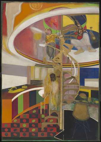
Fig.1
Frank Bowling
Mirror 1964–6
Oil paint on canvas
3100 x 2168 mm
Tate T13936
© Frank Bowling. All Rights Reserved, DACS 2019
In 1961 Bowling visited New York for the first time, where he befriended the American painter Larry Rivers. He was greatly influenced by what he saw in galleries, museums and fellow artists’ studios while he was there, especially regarding how painting was made.5 By 1964 Bowling’s art showed signs of his struggle to navigate the tensions between figurative painting and abstraction, as will be shown below in the case of Mirror (fig.1). He did not fully align himself with abstraction or figuration, being interested in both the material elements of colour and brushwork and in portraiture that showed emotional realism. He wanted to make figurative painting more geometrically complex, while at the same time complicating the geometric works by adding layers.6 Bowling grew disillusioned with the art scene in London and, through his friendship with the architect Jeremy Thomas and the colour chemist Paul Harrison, became more aware of and more interested in what, for him, makes a painting: geometry and colour.7
Mirror is an important painting in both Bowling’s personal life and his professional career. It was begun in 1964 and finished just before the artist moved to New York in 1966, and encapsulates the tension between figuration, geometry and colour that his work was experiencing at this time. The artist has described Mirror as an attempt to make a strong painting that would ‘marry up’ and ‘do a fandango with all these styles’; he has recalled that he was trying to ‘out-do’ Bacon, while also doing something new with colour painting.8
Mirror is painted on plain weave, medium weight cotton duck canvas, with several additional sections of canvas sewn and glued around the edges. Despite Bowling’s preference for cotton duck, several of these additions are linen; it is possible that they were left over from when Bowling worked on his three large Shakespeare Quatro Centenary paintings in 1963, which were painted on Belgian linen.9 Mirror has no priming layer, showing that Bowling had already begun to reject the traditional methods of easel painting. Instead, dilute washes of paint were applied to the raw canvas, the colour and medium often seeping through the weave to the canvas’s reverse. Outlines of the architectural elements and shapes, such as the staircase, chairs and kitchen cabinets, were masked off with tape prior to painting. This resulted in sharply defined edges for the parts where the tape was removed next to wet paint. Most of the flat areas of colour in Mirror were built up in a few thin layers of acrylic paint, most likely water-soluble Cryla Artists’ Acrylic, developed by the paint manufacturers Rowney and Co in 1963. Samples of this new paint were given to Bowling for testing during the early years of its development: as Bowling recalls, ‘Rowney used us as guinea pigs … they had just started up using water-based acrylics and so we got a lot of paints from them’.10 Thickly applied oil paint has been used for the portraits in Mirror, possibly with the addition of sand or beeswax heated with linseed oil to create texture.11 Finally, the artist applied a glossy coating in localised areas; given the date of the painting this is likely to be a commercially produced artist varnish, such as Vernis Satine from LeFranc and Bourgeois.
To make Mirror, Bowling collaborated with two other artists, possibly for the first time in his career. As will be demonstrated later in this paper, collaboration is a practice he has returned to more and more over the years. Margaret Hogg, a fellow RCA student, told Bowling that he could not paint the floor of Mirror in the style of pop artist Victor Vasarely as well as she could, so he let her paint it.12 Examination with a microscope shows the painted outlines of the rectangles and ellipses extending under the gold staircase, indicating that Hogg painted the floor first and Bowling came back to finish the painting. The staircase, Eames chairs and kitchen table were originally rendered in gold paint. However, the gold gradually turned green upon mixing with the acrylic medium and Bowling therefore reworked the staircase in 1967–8. His revisions were inspired by the 1968 exhibition The Obsessive Image 1960–1968 at the Institute of Contemporary Arts, London, which featured many works that used metallic leaf. Upon seeing this show Bowling decided he wanted something more reflective that caught the viewer’s eye and he reworked Mirror with a student at Byam Shaw School of Art, who applied the gold leaf.13
New York and the ‘map paintings’
Bowling’s move to New York in 1966 marked a dramatic change in his art, when he dropped almost all figurative elements and his work became explicitly abstract. Subject matter lost its importance and became a pretext for the process of painting.14 Colour and composition became Bowling’s focus and his early palette of earth pigments gave way to bright, high-key colours in his preferred medium of acrylic.
Bowling arrived in New York at a time of great artistic experimentation in the city and an explosion in new artistic materials. He thrived in this creative community where arguments regularly broke out over the limitations of secondary colours, tints and hard colours. Colour field painting was a legitimate way of working by this time, as seen in the work of artists such as Mark Rothko and Barnett Newman, but Bowling felt these works lacked structure. He wanted the meaning of a colour and the perfection of a shape to be challenged, pushed and heightened.15 The intellectual stimulation he experienced in New York allowed him to deepen his understanding of geometrical forms and their existence alongside colour and materials. Like many of the artists with whom he was associated, Bowling developed a close professional relationship with Leonard Bocour of Bocour Artists Colors Co., one of the great pioneers in paint manufacturing, after they met at Bowling’s first exhibition at Noah Goldowsky Gallery in 1973; according to the artist, Bocour said he would like to swap paint for works.16 The late 1950s through to the mid-1970s was a period of significant development in technology for the artists’ paint market and Bowling experimented with the new paints being produced by Bocour, including Magna and the later acrylic emulsion paints. Magna was the first acrylic solution paint to be produced for use by artists, and by 1953 it was being widely distributed. Its favourable qualities were that it was fast drying and could be thinned in the same solvents used with traditional oil paints. However, it was later found to be carcinogenic and stopped being produced in the mid-1970s.17
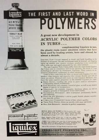
Fig.2
Advertisement for Liquitex Acrylic Polymer Tube Paints, 1964
In 1963 Bocour Artists Colors introduced its new Aquatec range, a water-soluble acrylic co-polymer emulsion paint (ethyl acrylate and methyl methacrylate polymers (pEA/MMA)). This was created by Bocour’s nephew Sam Golden, who had joined the company in 1936 as a specialist in paint formulation. The introduction of Aquatec paints coincided with the reformulation and popularisation of Liquitex, another water-soluble acrylic emulsion paint initially introduced in 1954 by the company Permanent Pigments (fig.2). As well as enabling artists to avoid the use of carcinogenic solvents, one of the biggest appeals of these acrylic emulsion paints was their fast-drying nature, which allowed artists to apply a second layer almost immediately without having to use complex isolating techniques to prevent the underlying layer being re-dissolved, as was the case with acrylic solution paints or oil paints.18
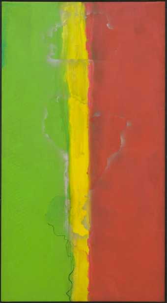
Fig.3
Frank Bowling
Who’s Afraid of Barney Newman 1968
Acrylic paint on canvas
2364 x 1295 x 27 mm
Tate T12244
© Frank Bowling. All Rights Reserved, DACS 2019
Furthermore, acrylic paint allowed for more flexibility of technique, since the paints could be significantly diluted and thinned without compromising intensity of colour. As Bowling’s work became more abstract, he exploited this feature in his practice of staining and applying dilute washes of paint like thin veils to create a sense of diffusion between different tones. From 1968 to 1971 Bowling bought both Aquatec and Liquitex from Pearl Paint, a large art supply store in New York.19 This was during the four-year period, between 1967 and 1971, that Bowling was making his ‘map’ paintings: abstract works that featured the outlines of landmasses, such as Who’s Afraid of Barney Newman 1968 (fig.3) and Texas Louise 1971 (Rennie Collection, Vancouver). These were a springboard for Bowling to explore his concerns about paint and painting; as Gooding observes, the ready-made geographical shapes acted as ‘formal devices whose purpose was to locate colour on the surface’.20 Bowling began by drawing freehand the shapes of the maps of South America, Guyana and Africa, until Larry Rivers suggested that he use an overhead projector to get an accurate rendition of the maps; the drawn outlines were then silkscreened onto the canvas.21 From 1967, when Bowling moved out of his small studio in Beekman Street and into a much larger loft space on Broadway, he began using thick brown paper cut-outs of maps, which he then stencilled onto the canvas.

Fig.4a
Frank Bowling
Who’s Afraid of Barney Newman, detail of the blue underlayer
© Frank Bowling. All Rights Reserved, DACS 2019
Photo: Laura Homer
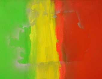
Fig.4b
Frank Bowling
Who’s Afraid of Barney Newman, detail of the silver stencilled shape of Bowling’s mother’s convenience store
© Frank Bowling. All Rights Reserved, DACS 2019
Photo: Laura Homer
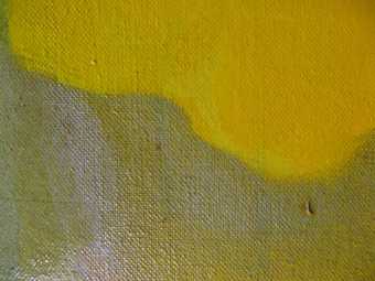
Fig.4c
Frank Bowling
Who’s Afraid of Barney Newman, detail of the two different yellow pigments and the silver stencilling paint
© Frank Bowling. All Rights Reserved, DACS 2019
Photo: Laura Homer
As with nearly all of his paintings, Bowling began the map paintings by applying a thin stain or wash of colour over the whole canvas; as Bowling’s partner Rachel Scott describes it in a 1989 letter written on behalf of the artist, ‘A colour ground is flooded into the canvas’.22 The colour of this layer does not necessarily correspond to the colours of the final image, as is the case in Who’s Afraid of Barney Newman, for which the canvas was flooded with a thin blue wash (fig.4a ).23 Thicker, glossier layers of green, red and yellow paint were then brushed or rolled over the stained canvas before the outlines of the convenience store owned by Bowling’s mother and a map of Africa were stencilled in silver metallic paint on top (figs.4b–c).24 Further paint layers were then added, followed by a final layer of acrylic gel, applied locally as a coating. The green paint was added in two layers: a matte imprimatura layer and a brighter, thicker, glossier upper layer applied in a diagonal pattern. The thin central yellow strip, a nod to the titular artist’s compositional ‘zip’ device (see Barnett Newman, Adam 1951, 1952, Tate T01091), was painted using two different yellow pigments; one is deep and warm, the other lighter and greener. By layering several colours, and using different pigments of the same hue, Bowling creates a heightened structure and richness in the body of the work, a method he was taught at the RCA.25
One of the yellow pigments used for Who’s Afraid of Barney Newman has been identified using scientific analysis as PY3, a synthetic organic pigment that is also known as Hansa Yellow Light.26 Further analysis on Who’s Afraid of Barney Newman, carried out by Tate conservators in 2009, shows the presence of either a PVA paint or a vinyl-modified acrylic paint medium, rather than a pure acrylic emulsion paint. It is known that some paints labelled as acrylic emulsions could in fact be co-polymers with other monomers, such as vinyl acetate to create vinyl-acrylics.27 The clear coating on the painting has been confirmed with analysis as being an EA-MMA acrylic latex co-polymer.
London and the ‘poured paintings’
Always looking for new ways of painting, both in terms of representation and the application of materials, Bowling stopped creating map paintings around 1973. He wanted to remove all signs of direct touch and directed application of paint, to move away from expressionist gesture and ‘invent [new] ways of using the traditional ways of applying paint’.28 Thus began a new phase of painting for Bowling when he produced what are now referred to as the ‘poured paintings’.
Bowling created these poured paintings using a self-made wooden contraption that allowed him to tip, tilt and twist the canvas while the paint was poured directly onto it from heights of up to two metres.29 In this way he could exert a certain level of control over the direction and speed at which the paint travelled down the canvas, while also allowing it to find its own paths. Bowling first experimented with this method in France in 1973 while visiting artist Elizabeth Frink.30 He then developed the process further when he returned to New York, where the large loft space he rented lent itself to such a physical and expansive technique.
The tilting platform was 6 ft 6 in (198 cm) in length and had pins in the legs at one end that allowed Bowling to adjust the angle of the board and thereby the speed at which the paint travelled.31 Bowling tacked raw cotton duck canvas onto this board, then soaked the canvas in soapy water until it was dripping wet in order to release the surface tension of the fibres so that the ‘surface becomes taut and allows the paint to move more smoothly and easily down the surface’.32 Bowling has followed this practice since his time in New York, where several artists were experimenting with soap flakes or washing up liquid in the preparation of their canvases. As Bowling recalled in 2009: ‘in the beginning what we used to use to dilute the paint was a kind of soap powder in the water … and so you got this whole greying out process … all the artists were using soaps, soapy water to mix their paints with and get these veils.’33 After this, the paint was applied at the upper edge of the canvas, and the board was lifted and the paint allowed to run and spill down to the bottom, resulting in richly layered shifts of colour. Agility was key; Bowling made these paintings completely alone and ran between the two ends of the mechanism, tilting and then catching it again before the paint reached the bottom so that the colours swirled back on themselves. As Bowling described it: ‘I gradually take the pegs out of the table legs so the paint just gradually moved from high to low. And of course, you have to watch it like a hawk because it could run too fast and then you’d have to settle it down. And then sometimes I would let it just go whoosh.’34
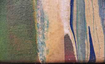
Fig.5
Frank Bowling
Bessboro’ Knights 1976, detail of a vertical strip of masking tape still present in the painting
© Frank Bowling. All Rights Reserved, DACS 2019
Photo: Laura Homer
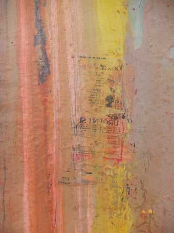
Fig.6
Frank Bowling
Crevice Reflecting Morning Light 1977, detail of newspaper text imprinted on the paint surface
© Frank Bowling. All Rights Reserved, DACS 2019
Photo: Laura Homer
In London, where Bowling returned to in 1975 and where the majority of the poured paintings were made, the artist’s creative space was limited. He worked on his kitchen table and on a board, and dried the paintings in his spare room, canvases lying all over the floor.35 The small space put constraints on his working method and he tried to turn this to his benefit. He worked on smaller sections of canvas, joining them together later, as in Rosebushtoo 1975. He found ways to control the paint and edited his ways of working, complicating the mechanical process by adapting his materials. He poured paint over paint in several layers, made use of washes and wet-in-wet technique, and applied thin, localised layers of acrylic gel across the surface. He used paper strips or masking tape to section off areas and control the direction of the paint and the level of dripping, such as in Runs Through 1975 and Bessboro’ Knights 1976 (fig.5), and he blotted the surface with newspaper to reduce the amount of paint.36 This often resulted in sections of newspaper and imprints of text remaining in the final, dried paint layer, for example in Crevice Reflecting Morning Light 1977 (fig.6).
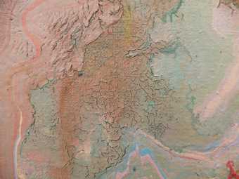
Fig.7
Frank Bowling
Crevice Reflecting Morning Light, detail of cracking in the paint layers
© Frank Bowling. All Rights Reserved, DACS 2019
Photo: Laura Homer
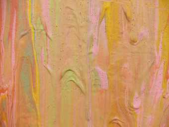
Fig.8
Frank Bowling
Rosebushtoo 1975, detail of air bubbles in the paint
© Frank Bowling. All Rights Reserved, DACS 2019
Photo: Laura Homer
Bowling left his canvases to dry before he stretched them up. In London, the drying process was assisted by direct sunlight shining in through the window, as well as a paraffin stove.37 Several of the works displayed in the 2012 Tate Britain Focus display Drop, Roll, Slide, Drip… Frank Bowling’s Poured Paintings 1973–8 were made in London and show significant drying characteristics. These include severe open drying cracks (as in Crevice Reflecting Morning Light; fig.7), delamination and lifting of the acrylic gel layer, bubbling and crazing of both the gel and paint layers (seen in Rosebushtoo; fig.8), and general distortions in the canvas along the edges. These are no doubt the result of the materials drying extremely quickly or being heated unevenly by the sunlight or through proximity to the paraffin heater. The presence of the gel and the increased texture in these areas would cause the canvas to contract when not under tension on a stretcher. As with so many unexpected features that occur in his work, Bowling likes the resulting alligator-skin effect and nowadays places a small fan heater next to or on his canvases to speed up the drying process and ensure cracking occurs.38 Other surface phenomena visible on paintings such as Early Pour 1975 include a grey-white haze, which is possibly the result of soap flakes in the diluted paint that Bowling applied to the raw canvas.
Bowling has stated that the poured paintings were purely mechanical, with colours chosen without reference to anything.39 It was just about the paint. He sometimes used a tonal application of colour, such as three different yellow pigments, unbleached titanium dioxide and flake white.40 The different paints would begin as separate lines at the top of the canvas, then would meet and merge in the middle and end as a swirl at the bottom; the tonal drift was tight. Bowling loved the ‘thrilling unpredictability’ of the paintings and how he could achieve such variations through chromatic mixtures, density of colour, and texture.41
However, Bowling stopped making the poured paintings when the art critic Clement Greenberg said he was ‘on to something’;42 Bowling wanted to avoid his art becoming a ‘package’ or brand.43 He wanted to keep developing, changing and exploring new ways of making art rather than getting stuck in a groove. This attitude sums up Bowling’s career; he never stops developing his techniques, looking at ways to introduce more complex interventions into the painting process, to complicate mechanical automatism and achieve new aesthetic results.44
Foams, gels and acrylics: Experimentation in the 1980s and 1990s
Around the early 1980s, Bowling wanted to complicate the surfaces of his paintings and reintroduce geometrical figures to his compositions. He began incorporating strips of acrylic foam and plastic found objects into his works. The foam was adhered directly to the raw canvas using Copydex, a latex-based rubber cement glue. A colour ground of dilute acrylic paint was then flooded into the canvas and the foam pieces were covered in thick acrylic gel and paint. The foam strips would often buckle and fold under the weight of the natural downward flow of the gel, but Bowling welcomed this unplanned effect as part of the process of creating.45
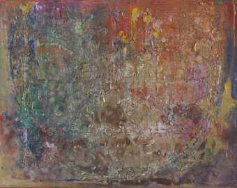
Fig.9
Frank Bowling
Spreadout Ron Kitaj 1984–6
Acrylic paint, oil paint, acrylic gel, damar, beeswax, chalk, metallic pigments, acrylic foam, shells and plastic toys on canvas
2285 x 2860 mm
Tate T04889
© Frank Bowling. All Rights Reserved, DACS 2019
Spreadout Ron Kitaj 1984–6 (fig.9), with its rich and complex surface, is a good example of a painting from this period of Bowling’s work. It was begun in 1984 during a summer residency in Maine and is the left half of a larger piece of canvas, which was cut while still unfinished to facilitate transportation back to London. Spreadout Ron Kitaj was completed in the autumn of 1986; the other half was finished in 1987 and is titled Sacha Jason’s Quail’s Nest.46
The methods for paintings from the 1980s are vividly described by Bowling, with specific reference to Spreadout Ron Kitaj, in the letter to Tate Conservation written by Scott on his behalf:
The cotton duck canvas is tacked to the wall. The polyether type foam is cut into strips and glued to the canvas. A colour ground is flooded into the canvas. Acrylic Gel is applied with spatula and palette knife. The canvas is transferred to the floor. Paint, water and acrylic gel are mixed in containers and then applied. Ammonia is added, with sometimes pearlessence and sometimes with metallic pigments. The paint is applied, shells and plastic toys are embedded. The painting is left to dry a little for a day or two, depending on room temperature and weather conditions influenced by the time of year. The canvas is pulled up to the wall and stapled there. More gel, paint, fluorescent chalk, metallic dust are applied. When completely dry, oil paint is applied. The painting is stretched, thinned damar varnish and distilled turps-thinned beeswax are applied.47
Prior to the summer of 1986 Bowling used polyether type foams. However, a letter from Tate conservator Stephen Hackney to Bowling dated 1 July 1986 details the conservation concerns regarding Bowling’s choice of materials. Hackney recommends Bowling start using a polyester foam that is ‘more stable [than] and almost as flexible’ as polyether foams and ‘can be painted reasonably well with acrylics’.48 He further suggests that Bowling change the type of glue he is using, since Copydex is unstable, and that he only uses foams that have not been exposed to light, since deterioration occurs through photo-degradation at the surface; he also recommends a supplier of polyester foams, K. Metzeler. A letter from Bowling in reply to Hackney, dated 13 August 1986, shows that Bowling took the conservation concerns seriously, spoke with a member of staff at K. Metzeler and began using a polyester foam and polymer, solvent-based adhesive as recommended by the suppliers. According to Bowling’s letter, the glue ‘proves to adhere the foam to the canvas much more firmly’.49
By the late 1980s, foam had almost completely vanished from Bowling’s practice. The paintings from the 1990s and early years of the twenty-first century make more use of the acrylic gel to delineate forms and dimensionality; Bowling created impasto by applying the gel with a palette knife and making scalloped ridges and grooves in the gel using a serrated plasterer’s spatula. The thick layers of gel settled and hardened and the dips and hollows, protrusions and raised edges refract and reflect, altering the appearance and effect of colour, adding layers and veils or hiding colour beneath their translucent forms.
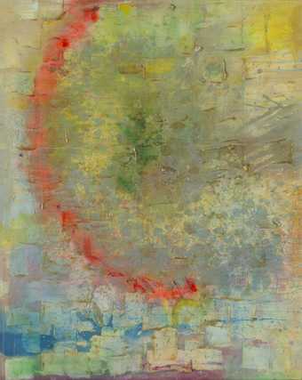
Fig.10
Frank Bowling
Sacha Jason Guyana Dreams 1989
Acrylic paint and resin on canvas
1780 x 1360 mm
Tate T12134
© Frank Bowling. All Rights Reserved, DACS 2019

Figs.11a–c
Frank Bowling
Sacha Jason Guyana Dreams, details of gel application with small touches of oil paint
© Frank Bowling. All Rights Reserved, DACS 2019
Photos: Laura Homer
Sacha Jason Guyana Dreams 1989 (figs.10 and 11a–c) is an early example of this slight change in technique. Much of the process remained the same: the unstretched cotton duck canvas was flooded with a dilute wash of acrylic paint. A thick, textured, impasto layer of acrylic gel followed, with several further applications of both acrylic gel and acrylic paint; occasionally the two materials were mixed together prior to application. Metallic pigments and dry pigments were generously sprinkled over the final layer of gel, and small touches of oil paint have been brushed on as a final paint layer.50
Reshaping the canvas
Bowling paints mostly on unprimed, unstretched canvas, which comes in a standard size of 6 ft (183 cm) wide.51 Board is too resistant for Bowling’s chosen painting methods and desired aesthetic outcomes; the stain and bleed of the dilute acrylic paint would not be accommodated.52 By working on unstretched canvas, the edges and dimensions of the finished painting are undetermined at the time of painting, allowing for substantial flexibility in creating the final work. For instance, the unstretched canvas may be rolled up and reworked at a later date or cut and reassembled in a new configuration.
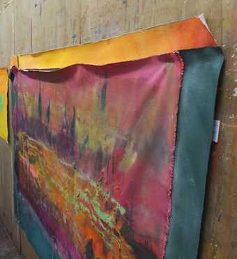
Fig.12a
Unstretched sections of canvas arranged on the wall as Bowling decided on the final shape for Suddenly 2014
© Frank Bowling. All Rights Reserved, DACS 2019
Photo: Laura Homer
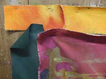
Fig.12b
Detail of sections of canvas used for Suddenly 2014
© Frank Bowling. All Rights Reserved, DACS 2019
Photo: Laura Homer
Since early on in his career Bowling has cut, extended and added colour sections to his canvases; these began as a way of controlling and delineating the painterly field, as a kind of internal framing system, but they often subsequently became part of the painterly field.53 Bowling likes to cut the material with pinking shears to give each piece a zigzag edge. The individual sections are then usually joined together once the canvas is completely covered and saturated with colour and material, and there is no more adjusting or tightening up of the tonalities. It is at this point that Bowling decides on the final ‘shape’ of the canvas (see, for instance, figs.12a–b, which document this process for Suddenly 2014, private collection).54 The extra pieces of canvas are stapled, glued or sewn onto the main section of canvas before the surface is rubbed with blocks of solid beeswax to seal the edges of the cut pieces.55
The glue that Bowling uses for this process is Jade 403, a conservation-grade polyvinyl acetate (PVAc) adhesive. It is flexible, fast-setting, transparent when dry and neutral in pH, which means that it is neither acidic nor alkaline and will therefore not cause degradation of the canvas over time. Bowling began using Jade 403 in 1989 after Mary Whitten, a paper conservator and the wife of Bowling’s artist friend Jack Whitten, said it was the best glue.56 Before this he had been joining his canvases using Copydex, the glue he had used earlier to stick on the foam strips, which turns brittle and yellow with age. Bowling had previously tried using acrylic gel as the glue but found this was not strong enough to hold the sections of fabric. The attachment of these canvas pieces often results in wrinkling around the edges, due to differing strains and tensions the canvases are under because of the presence of the glue. As with other unexpected phenomena, Bowling allows this change and embraces it as part of the painting; he says it addresses his sculptural interests.57
Colour and surface
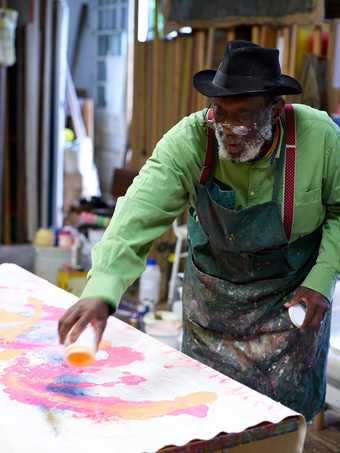
Fig.13
Frank Bowling pouring acrylic paint onto the canvas, having mixed it with ammonia in an old paint pot prior to application
Photo: Jäger Arén
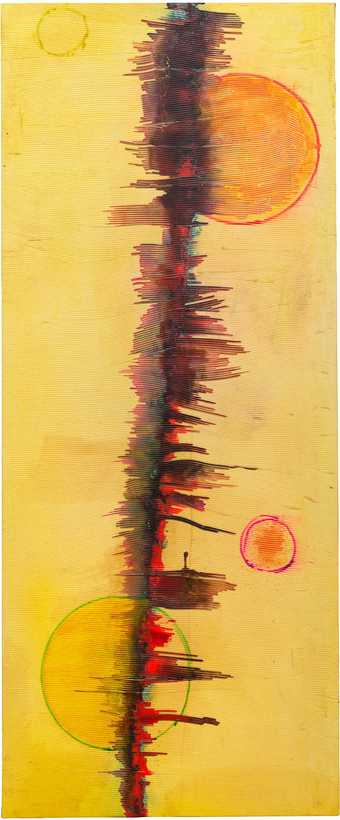
Fig.14
Frank Bowling
Abary 2009
Acrylic paint, acrylic gel and pearlessence on canvas
1729 x 7120 mm
Collection of the artist
© Frank Bowling. All Rights Reserved, DACS 2019
When making a painting Bowling always begins with a piece of unprimed 15 oz cotton duck canvas which, as mentioned above, is unstretched. In the past he would lay this on the floor, rejecting the traditions of easel painting; however, in recent years he has started painting on top of a trestle table. First he saturates the fabric with water, often mixed with a soap or washing up liquid to break the surface tension of the canvas fibres, as seen earlier in the process he used for the poured paintings. The canvas is then soaked with thin washes of extremely diluted acrylic paint, after which Bowling applies thicker passages of acrylic paint and acrylic gel by brushing, rolling and pouring or pasting it on with a spatula or palette knife (fig.13). As discussed above, Bowling has been using acrylic gel since 1973–4, when Bocour Artists Colors had begun to manufacture it and it was being used by artists such as Jules Olitski and Larry Poons.58 Nowadays Bowling also purchases Daler Rowney System 3 Acrylic Paints and gets large drums of Acrylic Gel Medium from Spectrum Oil Colours, who provide gel in three viscosities – soft, regular and thick – and varying levels of gloss.59 Bowling uses the gel for impasto and texture, often applying it with a serrated plasterer’s spatula, and favours the matte finish in regular viscosity for its malleability.60
Both the paint and the gel are mixed in an old paint pot or jar in equal proportions with pre-diluted, liquid ammonia (in water) before application.61 Bowling began using ammonia in his paintings in the 1970s after a chance remark from Leonard Bocour, who told Bowling that ammonia was used in the manufacture of acrylic paints; it helps make them water-soluble by breaking down the crude oil.62 Ammonia keeps the body of the actual colour but thins the medium and Bowling has commented that he likes the way it draws out the surface, creating a grey veil.63 Additionally, it made the acrylic gel much smoother than the homemade Rhoplex that his friend, the artist Edvins Strautmanis, was painting with at the time, which was rough and lumpy and had to be put in a blender before use. The ammonia allowed the material to spread and bleed and be applied both thickly and thinly. As Bowling describes it, ammonia suspends the mixture for longer and gives the consistency of flowing mud rather than water.64
Bowling initially bought the ammonia in New York supermarkets, where it was available already diluted. Since chemists in the UK stopped stocking ammonia in the 1990s, Bowling has subsequently used industrial ammonia from Mylands of London.65 The addition of ammonia to the acrylic gel affects the drying mechanism of the material; the gel dries out faster than it might do otherwise due to ammonia’s volatile nature, and creates a marbled state with ‘volcanic pustules’ and open drying cracks (see, for example, Mazarunitankfeat 1979, private collection). Again, Bowling liked these accidents and ‘would try and accommodate these things’.66
Figs.15a–b
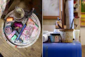
Some of Bowling’s materials: fluorescent chalk, metallic paint, acrylic gel, Pearl Lustre-Silver Pearl
Photo: Jäger Arén
In contrast to the map paintings, where individual colours were applied separately, Bowling now often puts all the colours down on the surface together and lets them bleed out from the centre.67 The mixing and blending occurs on the canvas rather than the paints being pre-mixed on the palette. This is particularly apparent in Bowling’s ‘zip’ paintings from 2009, such as Abary (fig.14). Sometimes pearlessence powders, metallic or fluorescent pigments, or a combination of all three, are mixed in with the paints; dry pigment powder might be sprinkled on top to retain the intensity of colour, or fluorescent chalk may be grated onto the surface (figs.15a–b). Bowling uses pearlessence powders from Cornelissen and Son (for example Pearl Lustre-Silver Pearl) or Brodie and Middleton (Pearl and Metallic Lustre Pigments), which according to the manufacturer’s website are made from mica flakes coated with titanium and iron oxides.68 These can be mixed with any medium and are promoted as being totally lightfast – not prone to discolouration due to exposure to light. Bowling has recently started trying out a new way of applying the pearlessence powder: he simply releases a handful of it into the air and, with the help of hot air from a heater, allows the powder, which is attracted to the acrylic paint, to fall and settle by itself.69
The fluorescent paints Bowling uses are acrylic paints manufactured by Sargent Art, Brooklyn, New York, while the chalks are Lecturers’ Chalks produced by the American Crayon Company, Ohio. The chemical composition of the fluorescent pigments (based on p-toluene sulphonamide) has been confirmed by material analysis on samples from both Who’s Afraid of Barney Newman and Sacha Jason Guyana Dreams.70 According to a 1986 memorandum sent by Stephen Hackney to Richard Morphet, then Keeper of the Modern Collection at Tate, the metallic powder colours will darken and the fluorescent pigments will fade slowly.71 Hackney had also made the artist aware of these limitations and expected changes, but Bowling chose to continue using these materials and has never noticed fading of the fluorescent colours; to him they seem lightfast.72 Bowling has used a variety of metallic pigment powders in the past, including nickel, silver and gold, and now uses Rich Pale Gold metallic powder made by Mylands of London. He accidentally discovered that this material reacts with ammonia and turns a beautiful, bright turquoise.73 This phenomenon utterly transformed the composition and is now an effect that Bowling purposefully aims for in many of his paintings (see, for instance, Pouring over 2 Morrison Boys and 2 Maps II 2016).
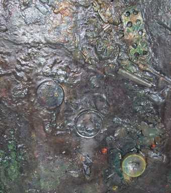
Fig.16
Frank Bowling
Knightryder 2005, detail of a pill packet and plastic bottle lid embedded in the surface
© Frank Bowling. All Rights Reserved, DACS 2019
Photo: Laura Homer
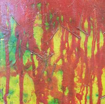
Fig.17
Frank Bowling
Remembrance Saturday with Marcia Scott 2013, detail of acupuncture needles embedded in the acrylic gel
© Frank Bowling. All Rights Reserved, DACS 2019
Photo: Laura Homer
Since he was a student, Bowling has incorporated and embedded miscellaneous, extraneous items found around his house or studio into the thick acrylic gel of his paintings. These items might include shells, children’s plastic toys, acrylic-based Christmas glitter, plastic costume jewellery and plastic seals from pill bottles, as seen in Knightryder 2005 (fig.16). This was prompted by visitors leaving items behind when they came to his studio, and by Bowling’s attempt to cope with these distractions. He was bothered by the detritus around him and tried to get rid of everything that was clogging up his life; his solution was to put it in his paintings, challenging his art to see if he – and it – could survive the intrusion.74 Bowling liked the result and still enjoys recycling bits and pieces, adding things that might surprise the viewer.75 The inclusion of these personal objects adds an autobiographical dimension to his work, alluding to specific events, people, places and even, in the case of the pill bottles, the state of his health at the time. Although he stopped this practice during his formalist, abstract years when he made the map and poured paintings, Bowling resumed it in the 1980s and continues it today. For example, acupuncture needles can be found in Remembrance Saturday with Marcia Scott 2013 (fig.17).76
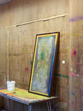
Fig.18
An unstretched, painted canvas spread out on a table in Bowling’s studio, with a paint pot and finished painting resting on its surface
© Frank Bowling. All Rights Reserved, DACS 2019
Photo: Jäger Arén
Not only do physical objects provide signs of life in Bowling’s paintings: one also sees shapes and halos that hint at the creation process. These are the result of the limitations on space and the amount of clutter in the studio, which mean that the paintings migrate around the room, moving from floor, to wall, to table, even to the ceiling, and accruing elements and impressions of studio life on their surfaces (fig.18).77 For instance, paintings might be made in, or contain, a certain rectangular format, traceable to the size of the trestle table Bowling was working on at a given time. In some cases, circular impressions emanate from within a painting (see, for instance, Odysseus’s Footfalls 1982 and Elder Sun Benjamin 2018), the result of paint pots being used to shape and hold the canvas as the wet paint moves and dries.
Drying and finishing
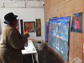
Fig.19
Bowling spraying water over a painting on the wall
© Frank Bowling. All Rights Reserved, DACS 2019
Photo: Laura Homer
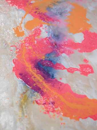
Fig.20
Detail of the surface of a painting as it ‘cooks’
© Frank Bowling. All Rights Reserved, DACS 2019
Photo: Jäger Arén
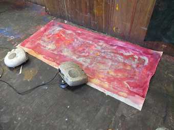
Fig.21
A painting, mid-process, drying on the floor with the assistance of fan heaters
© Frank Bowling. All Rights Reserved, DACS 2019
Photo: Laura Homer
The rich, textured surfaces of Bowling’s paintings require a slow and complex way of working, and after the initial layers of acrylic gel and paint have been applied, and the various objects embedded, Bowling continues to work the surface of the painting. The canvas either remains on the floor or is tacked to the wall and more gel, paint, fluorescent chalk, metallic pigments and pearlessence dust are applied as the final image develops. If the painting is on the wall, Bowling tends to spray large amounts of water over the front of the painted canvas, which runs down the surface, dripping, dribbling and picking up underlying material and redistributing it elsewhere in the painting (fig.19).78 The materials move, drip, cascade and slither in a downward flow. Dry pigment powder is picked up and colours move across the surface, creating a halo or veil of tonality. Alternatively, and increasingly, Bowling leaves the canvas lying on the uneven wooden floorboards, which tend to rise and fall due to the amount of liquid on the canvases and the humidity of the room, and these movements in turn help to dictate what the composition looks like.79 The artist might empty a kettle of steaming water over the canvas’s dried-out surface, revitalising the materials, or pour more ammonia over it, making it ‘cook’ (fig.20). These pools of liquid are allowed to sit on the surface for several days as they dry, helped along by fan heaters, and interact with the paint layers, altering their appearance (fig.21).
When all the paint and gel is completely dry, oil paint might be locally applied, providing subtle punctuation of colour and structure. Either before or after this, Bowling sometimes applies a coating or varnish to cover the area that has been worked on with the water-based materials.80 Since the 1990s this has been the oil-based gel coating Elvacite® 2044, a thermoplastic high molecular weight n-butyl methacrylate polymer supplied by Talas and similar to Magna acrylic solution paints in its chemical and physical properties. It comes as a solid resin block and needs to be diluted with turpentine. Bowling has said that he wants to control Elvacite®, to be able to use it like the old masters used and layered natural resin varnishes and glazes to create effects of light and radiance.81 Elvacite®, previously called Lucite® resin, was originally tried out as a picture varnish in the 1930s and 1940s because it was thought to be resistant to yellowing.82 However, the resin cross-links when exposed to light and therefore yellows extremely quickly; Bowling does not mind this, possibly because it becomes closer in appearance to an aged old master varnish.83 Occasionally Bowling mixes Elvacite® with beeswax or pours pure liquid beeswax onto the surface of acrylic gel and paint; he uses a commercial beeswax pre-diluted in turpentine, which is produced by Liberon and designed for interior timber surfaces.84
The final stage of Bowling’s process is the stretching of the paintings. Until recently Bowling stretched up his own canvases, sometimes with the help of a friend or assistant. He measures up precisely what size he wants based on the final appearance of the worked and collaged canvases, and orders custom-made stretchers from Russell and Chapple, whom he has been using as a supplier for canvas, stretchers and other materials since the early 2000s. Prior to this Bowling got his stretchers from Bird and Davis Ltd.85 The stretchers he uses are robust and of good quality, ensuring the paintings remain structurally sound.
Frames are also important to Bowling, as they lock in the shape of the canvas, and ideally he would like all of his works to be framed.86 Bowling prefers a two-part L-section frame in either plain or painted wood, nailed directly to the stretcher. The first section is placed against the canvas; this is generally painted in a dark colour and sits further back than the front surface of the painting, such that from a distance it is almost invisible. The other section is the thin wooden frame around the outside of the painting; this sits level with the front surface of the painting and is generally left as plain wood or painted in a lighter tone. The overall effect is one of the painting floating in the frame. Bowling chooses the wood, usually White American Oak, and a friend in London does the joinery and framing for him. His partner, Rachel Scott, spray paints the frame sections before they are delivered to the framer. In New York, where Bowling also keeps a studio, he uses another friend and his son to do the framing and stretching.
Innovation and collaboration
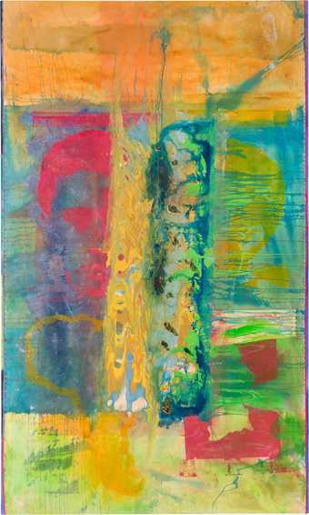
Fig.22
Frank Bowling
Pouring over 2 Morrison Boys and 2 Maps II 2016
Acrylic paint, acrylic gel and collaged paper on canvas
3060 x 1840 mm
Collection unknown
© Frank Bowling. All Rights Reserved, DACS 2019
Bowling’s enduring engagement with the medium of paint means that he continues to push its limitations; in recent years, he has revisited earlier techniques, challenging the materials and techniques to do something new. He still delivers paint onto the canvas through spilling, dripping, pouring, and by using spatulas, brushes and palette knives, but in addition he uses hog’s hair brushes, like the French impressionists.87 Since around 2010 Bowling has incorporated silkscreen printing into his paintings once again, saying that it helps animate the canvas.88 For instance, in Wadi√one 2011, patterns of leaves have been stencilled over dilute washes of yellow pigment. These delicate shapes are more restrained than the stencilling in the map paintings from 1967–71 and contrast with the heavily worked, gelled surface of the central piece of collaged canvas in Wadi√one itself. For the aforementioned Pouring over 2 Morrison Boys and 2 Maps II 2016 (fig.22), Bowling reworked an old canvas onto which he had previously screenprinted two portraits and two maps. These screenprinted silhouettes add depth and animation to the newly added layers of paint and are, in turn, animated themselves by the reworking as they emerge from beneath cascades of poured paint.89
Bowling has said that he ‘needs’ the poured-painting technique, returning to it several times in the last decade, albeit with an increased control over the paint and its movements: ‘I keep going back to spilling, dripping, pouring. Often enough, nowadays, when I dump the material down on a surface and it is not going the way I thought it would, I get a brush out and push it. I wouldn’t let it do its own alchemy. I would help it along.’90 Bowling enjoys the interplay of the words ‘pour’ and ‘pore’ and has said that by pouring/poring over techniques and materials from his past, he has been able to process past events and move forward in his life and work.91 Bowling pores over paintings by or of old friends or girlfriends, as well as abandoned paintings of his own. He often removes the old paintings from their stretchers, cutting them and re-using them in new works, such as in Pondlife 2010 (private collection). This was a painting that Bowling abandoned in 1972, leaving the canvas with only dilute washes of colour flooded into it. In 2010 Bowling attached a horizontal section of highly textured, heavily worked, painted and gelled canvas across the middle of this recycled canvas. The result of the reworking is a rich surface on which the background of gentle, matte colour washes is juxtaposed with the vibrant, glimmering surface of the collaged canvas.92
Bowling has also admitted to pouring a mixture of hot water, soap suds and vinegar over paintings by old acquaintances, in an attempt to ‘cleanse’ both the surface and himself. The original paint becomes ‘alive’, at which point Bowling stomps all over the surface and then applies his own paint, covering up the canvas’s previous history.93
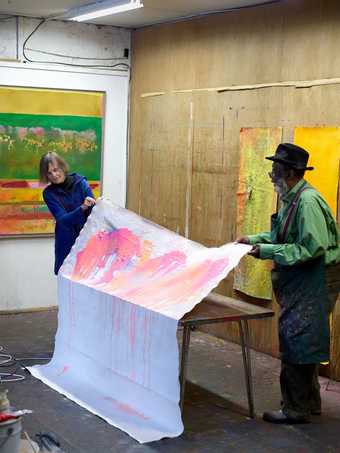
Fig.23
Frank Bowling working with his partner, Rachel Scott
© Frank Bowling. All Rights Reserved, DACS 2019
Photo: Jäger Arén
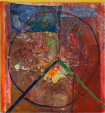
Fig.24
Frank Bowling
For Jerry and Eddie 2012
Acrylic and collaged fabric on canvas
1374 x 1275 mm
Collection of the artist
© Frank Bowling. All Rights Reserved, DACS 2019
The idea of incorporating other people’s work into his own crosses over into collaboration, something that Bowling has engaged with since his student days and the creation of Mirror. In recent years it has become even more important as Bowling’s mobility has decreased. Until the late 1990s Bowling did nearly everything himself, but now he invites family and friends into the studio to mix and pour paint, and to cut, staple and stitch canvases. Students skilfully apply areas of gold leaf, which Bowling coats with oil glazes to dull the sharp brightness.94 He regularly works with his partner Rachel Scott and her daughter, the artist Marcia Scott, to create screenprints and poured paintings (fig.23); Bowling pours the paint and between them they shift the canvas around and make the paint move. In New York in 2012 Marcia Scott had started some making some canvas paintings which she then ripped up into squares and brought to London. Bowling took these small blue squares of canvas and incorporated them into his own canvases, reworking the existing designs with his series of paintings which address the dynamic created between the circle and the square (see, for example, For Jerry and Eddie 2012; fig.24).95
Collaboration for Bowling is very different to using an assistant and he views these partnerships as a chance to develop new creative processes; he never tells a collaborator what to do or think, but rather sees their actions as part of the interplay, the push and pull, between improvisation and control.96 As critic and curator Gabrielle Schwarz has noted in her discussion of Bowling’s practice: ‘Collaboration … embraces the reality of artistic creation as a layered process, the result not of a single mind but of multiple minds and hands, ideas and images.’97 Another hand can pour or cut differently, or staple in a different way. Bowling’s friend and assistant Spencer Richards, for instance, always staples at a diagonal angle across both canvases, while Rachel Scott’s staples were always straight and positioned more within the main canvas section. Marcia Scott always tears the canvas, while Bowling would cut it with pinking shears.98
Rule-making, rule-breaking
Bowling has constantly pushed the boundaries of painting and the viewer’s expectations of how a painting is made. Although his techniques and choice of materials have not changed much over his career (unprimed canvas, dilute washes of colour, acrylic paint and gel), his ‘authority over his materials gives him the confidence in the creative process to adopt new strategies, embracing chance, risk and the unknown’, according to artist Jim Hunter.99 Bowling learned the rules about making art and sets out to obey them, use them and ultimately break them. As he stated:
I don’t think you can make art without rules. I think the only way an artist can proceed to make good art, at least significant art, is to obey the rules. But the point is, about the rules, is that they are there to break them if you are going to be a good artist, if you’re going to be an original artist you have to use the rules to break the rules and this is my disposition.100
Despite his rule-breaking, Bowling has said he makes art for museums and galleries, and that his paintings only function by being in a white cube.101 To this end, he aims to make stable paintings that will last for generations. As long as it does not impact on his creative processes, Bowling is prepared to adapt his methods or use new materials to ensure the longevity of his paintings. As we have seen, he has followed the advice of conservators when they recommended a change; if he knew that a material would deteriorate he would choose not to use it.102 Bowling acknowledges the importance of conservation and preservation and notices when his canvases need to be re-stretched because they have begun to sag under the weight of the materials he has applied. He has repaired paintings where plastic objects or foam have either fallen off or been removed by tempted fingers, yet in these instances he does not replace the object but fills the gap with acrylic gel. Bowling has expressed an interest in the use of non-reflective glass or Perspex to protect his paintings against such temptation but is aware of the visual impact such an intervention would have on his surface-rich works.103 The artist also likes the idea of paintings ageing and changing as pigments mellow out, the gel shifts and the painted surface becomes richer as a result. He likes the ‘push pull aspect of the surface’ as it moves through time.104
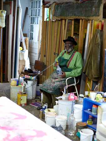
Fig.25
Frank Bowling in his studio, 2014
Photo: Jäger Arén
As we have seen, Bowling enjoys letting paint find its own path and formations alongside elements of choice and design: the free flow of paint alongside the controlled placement of an embedded object or deliberately placed foam strip; the unexpected chemical interactions of pigment and media alongside the considered stitching on of a coloured border; the inherent variations of the surface gloss of acrylic gel alongside the encouraged cracking and bubbling of the ammonia-diluted paint. This interest in the play of materials and the materiality of painting has been with Bowling since his early days as an artist, and he remains exhilarated by the freedom he has to apply paint in any way he wants (fig.25), making works that are ‘on the way (if not absolutely there) to the best that’s ever been done with paint’.105
